
Matplotlib + NetworkX -在单个图形中绘制2个网络
如果您知道如何使用Matplotlib,那么您可能可以在不了解NetworkX的情况下回答问题。
我有两个网络可以用NetworkX绘制,我想在一个图形中并排画,显示每一个的轴。本质上,这是在Matplotlib中创建两个子图的问题(这是NetworkX用来绘制图形的库)。
网络中每个节点的位置分布在0,area_size的区域内,但通常没有坐标x= 0.0或y= area_size的点。也就是说,点出现在0、area_size或更小的区域内。不是更大。
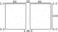
每个子图的比例应为0.8×1.0,用0.16x1.0的面积隔开。
本质上,它应该是这样的(假设area_size = 100)。
然后我必须在这2幅图之间画线,所以我需要一些方法回到每个图中的位置,以便连接它们。
生成、存储和分配节点位置如下
# generate and store node positions
positions = {}
for node_id in G.nodes():
    pos_x = # generate pos_x in [0.0, area_size]
    pos_y = # generate pos_y in [0.0, area_size]

    positions[node_id]['x'] = pos_x
    positions[node_id]['y'] = pos_y

    G.node[node_id]['x'] = pos_x
G.node[node_id]['y'] = pos_y然后将这些位置存储在字典pos = {node_id: (x, y), ...}中。NetworkX获取此结构来绘制nx.draw_network(G, pos=positions)正确位置上的节点。
现在,我要做以下几点:
- 计算第一个网络在0,area_size上的位置,然后将它们扩展到0,area_size*0.8
- 用同样的方法计算第二个网络的位置。
- 将第二个网络的位置移到右边,将area_size*0.8 + area_size*0.16相加到x坐标
- 设置数字大小(以英寸为单位)
plt.figure(figsize=(h, w), dpi=100) - 设置x轴
plt.xlim(0.0, area_size*0.8*2 + area_size*0.16) - 设置y轴
plt.ylim(0.0, area_size) - 绘制第一个网络(传递其位置)
- 绘制第二个网络(传递其位置)
- 在两个网络之间画线
我得到的图有正确的比例,但轴没有显示正确的信息。我应该把轴藏起来,画假的吗?
我可能需要一些更好的程序来画出适当的分图。
我还注意到,当我导出到pdf时,我设置的数字大小并不总是受到尊重。
NetworkX用于绘制图形的函数是这些,特别是我使用的是网络。
如果它们给我带来太多麻烦的话,我真的不介意画出单独的斧头。

回答 1
Stack Overflow用户
发布于 2015-03-18 19:24:26
我发现要使Matplotlib产生精确的比例需要一些调整。通常,它需要做一些简单的计算来计算出你想要的比率(例如,你希望每个子图的高度是1.25它的宽度,通过你的测量)。
至于PDF不尊重数字大小,可能是因为您指定了DPI。不需要指定DPI,因为PDF以向量格式保存。或者您使用的是plt.tight_layout函数,它可能很有用,但可以改变图形大小。
在子情节之间划线是一场噩梦。首先,您必须使用变换从轴坐标系转换为图形坐标系。然后你可以把线直接画到图形上。这个职位可能会有帮助。
下面的代码应该会有帮助。您需要以多种方式对其进行调整,但希望它能够帮助您生成所需的数字。
import networkx as nx
import matplotlib.pyplot as plt
import matplotlib.lines as lines

# Generate some random graphs and positions for demonstrative purposes.
G1 = nx.gnp_random_graph(10, 0.2)
G2 = nx.gnp_random_graph(10, 0.2)
pos1 = nx.spring_layout(G1)
pos2 = nx.spring_layout(G2)

# Set up the figure with two subplots and a figure size of 6.5 by 4 inches.
fig, ax = plt.subplots(1, 2, figsize=(6.5, 4))

# Set the x and y limits for each axis, leaving a 0.2 margin te ensure
# that nodes near the edges of the graph are not clipped.
ax[0].set_xlim([-0.2, 1.2])
ax[0].set_ylim([-0.2, 1.2])
ax[1].set_xlim([-0.2, 1.2])
ax[1].set_ylim([-0.2, 1.2])

# Stretch the subplots up, so that each unit in the y direction appears 1.25
# times taller than the width of each unit in the x direction.
ax[0].set_aspect(1.25)
ax[1].set_aspect(1.25)

# Remove the tick labels from the axes.
ax[0].xaxis.set_visible(False)
ax[0].yaxis.set_visible(False)
ax[1].xaxis.set_visible(False)
ax[1].yaxis.set_visible(False)

# Set the space between the subplots to be 0.2 times their width.
# Also reduce the margins of the figure.
plt.subplots_adjust(wspace=0.2, left=0.05, right=0.95, bottom=0.05, top=0.95)

# Draw the networks in each subplot
nx.draw_networkx(G1, pos1, ax=ax[0], node_color='r')
nx.draw_networkx(G2, pos2, ax=ax[1], node_color='b')

# Now suppose we want to draw a line between nodes 5 in each subplot. First, we need to
# be able to convert from the axes coordinates to the figure coordinates, like so.
# (Read the matplotlib transformations documentation for more detail).
def ax_to_fig(coordinates, axis):
    transFig = fig.transFigure.inverted()
    return transFig.transform((axis.transData.transform((coordinates))))

# Now we can get the figure coordinates for the nodes we want to connect.
line_start = ax_to_fig(pos1[5], ax[0])
line_end = ax_to_fig(pos2[5], ax[1])

# Create the line and draw it on the figure.
line = lines.Line2D((line_start[0], line_end[0]), (line_start[1], line_end[1]), transform=fig.transFigure)
fig.lines = [line]

# Save the figure.
plt.savefig('test_networks.pdf', format='pdf')
编辑
上面的代码似乎并没有精确地在对应节点的中心之间绘制轴线之间的直线。删除ax.set_aspect函数修复了这个问题,但是现在的比例是错误的。为了适应这种情况,您可以手动更改节点的y位置( NetworkX使其变得比应该的要难得多)。接下来,您必须更改ax.set_ymin值以获得正确的比例,如下所示:
# Manually rescale the positions of the nodes in the y-direction only.
for node in pos1:
    pos1[node][1] *= 1.35
for node in pos2:
    pos2[node][1] *= 1.35

# Set the x and y limits for each axis, leaving a 0.2 margin te ensure
# that nodes near the edges of the graph are not clipped.
ax[0].set_xlim([-0.2, 1.2])
ax[0].set_ylim([-0.2, 1.55])
ax[1].set_xlim([-0.2, 1.2])
ax[1].set_ylim([-0.2, 1.55])https://stackoverflow.com/questions/29129636
复制


腾讯云开发者
