Python应用开发——30天学习Streamlit Python包进行APP的构建(9)

Python应用开发——30天学习Streamlit Python包进行APP的构建(9)

此星光明
发布于 2024-06-28 09:44:13
发布于 2024-06-28 09:44:13
st.area_chart
显示区域图。
这是围绕 st.altair_chart 的语法糖。主要区别在于该命令使用数据自身的列和指数来计算图表的 Altair 规格。因此,在许多 "只需绘制此图 "的情况下,该命令更易于使用,但可定制性较差。
如果 st.area_chart 无法正确猜测数据规格,请尝试使用 st.altair_chart 指定所需的图表。
Function signature[source] | |
|---|---|
st.area_chart(data=None, *, x=None, y=None, color=None, width=None, height=None, use_container_width=True) | |
Parameters | |
data (pandas.DataFrame, pandas.Styler, pyarrow.Table, numpy.ndarray, pyspark.sql.DataFrame, snowflake.snowpark.dataframe.DataFrame, snowflake.snowpark.table.Table, Iterable, or dict) | Data to be plotted. |
x (str or None) | Column name to use for the x-axis. If None, uses the data index for the x-axis. |
y (str, Sequence of str, or None) | Column name(s) to use for the y-axis. If a Sequence of strings, draws several series on the same chart by melting your wide-format table into a long-format table behind the scenes. If None, draws the data of all remaining columns as data series. |
color (str, tuple, Sequence of str, Sequence of tuple, or None) | The color to use for different series in this chart. For an area chart with just 1 series, this can be: None, to use the default color. A hex string like "#ffaa00" or "#ffaa0088". An RGB or RGBA tuple with the red, green, blue, and alpha components specified as ints from 0 to 255 or floats from 0.0 to 1.0. For an area chart with multiple series, where the dataframe is in long format (that is, y is None or just one column), this can be: None, to use the default colors. The name of a column in the dataset. Data points will be grouped into series of the same color based on the value of this column. In addition, if the values in this column match one of the color formats above (hex string or color tuple), then that color will be used. For example: if the dataset has 1000 rows, but this column only contains the values "adult", "child", and "baby", then those 1000 datapoints will be grouped into three series whose colors will be automatically selected from the default palette. But, if for the same 1000-row dataset, this column contained the values "#ffaa00", "#f0f", "#0000ff", then then those 1000 datapoints would still be grouped into 3 series, but their colors would be "#ffaa00", "#f0f", "#0000ff" this time around. For an area chart with multiple series, where the dataframe is in wide format (that is, y is a Sequence of columns), this can be: None, to use the default colors. A list of string colors or color tuples to be used for each of the series in the chart. This list should have the same length as the number of y values (e.g. color=["#fd0", "#f0f", "#04f"] for three lines). |
width (int or None) | Desired width of the chart expressed in pixels. If width is None (default), Streamlit sets the width of the chart to fit its contents according to the plotting library, up to the width of the parent container. If width is greater than the width of the parent container, Streamlit sets the chart width to match the width of the parent container. |
height (int or None) | Desired height of the chart expressed in pixels. If height is None (default), Streamlit sets the height of the chart to fit its contents according to the plotting library. |
use_container_width (bool) | Whether to override width with the width of the parent container. If use_container_width is False (default), Streamlit sets the chart's width according to width. If use_container_width is True, Streamlit sets the width of the chart to match the width of the parent container. |
- None, to use the default color.
- A hex string like "#ffaa00" or "#ffaa0088".
- An RGB or RGBA tuple with the red, green, blue, and alpha components specified as ints from 0 to 255 or floats from 0.0 to 1.0.
For an area chart with multiple series, where the dataframe is in long format (that is, y is None or just one column), this can be:
- None, to use the default colors.
- The name of a column in the dataset. Data points will be grouped into series of the same color based on the value of this column. In addition, if the values in this column match one of the color formats above (hex string or color tuple), then that color will be used. For example: if the dataset has 1000 rows, but this column only contains the values "adult", "child", and "baby", then those 1000 datapoints will be grouped into three series whose colors will be automatically selected from the default palette. But, if for the same 1000-row dataset, this column contained the values "#ffaa00", "#f0f", "#0000ff", then then those 1000 datapoints would still be grouped into 3 series, but their colors would be "#ffaa00", "#f0f", "#0000ff" this time around.
For an area chart with multiple series, where the dataframe is in wide format (that is, y is a Sequence of columns), this can be:
- None, to use the default colors.
- A list of string colors or color tuples to be used for each of the series in the chart. This list should have the same length as the number of y values (e.g. color=["#fd0", "#f0f", "#04f"] for three lines).
width (int or None) Desired width of the chart expressed in pixels. If width is None (default), Streamlit sets the width of the chart to fit its contents according to the plotting library, up to the width of the parent container. If width is greater than the width of the parent container, Streamlit sets the chart width to match the width of the parent container. height (int or None) Desired height of the chart expressed in pixels. If height is None (default), Streamlit sets the height of the chart to fit its contents according to the plotting library. use_container_width (bool) Whether to override width with the width of the parent container. If use_container_width is False (default), Streamlit sets the chart's width according to width. If use_container_width is True, Streamlit sets the width of the chart to match the width of the parent container.
代码
import streamlit as st
import pandas as pd
import numpy as np
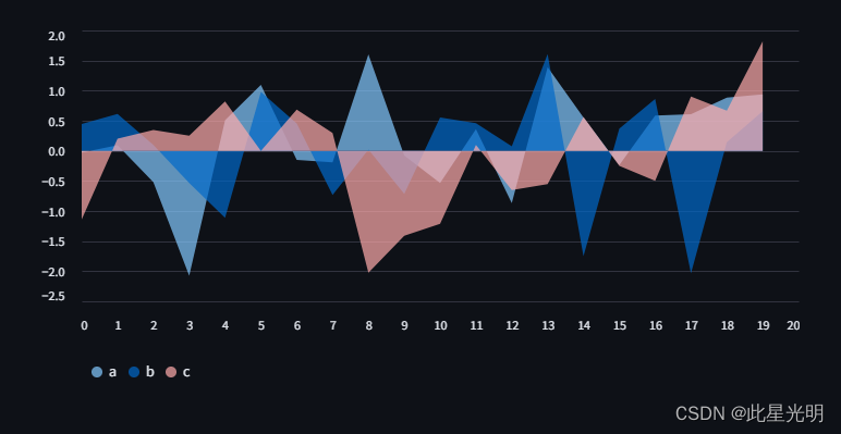
chart_data = pd.DataFrame(np.random.randn(20, 3), columns=["a", "b", "c"])
st.area_chart(chart_data)这段代码使用了Streamlit库来创建一个简单的Web应用程序。首先导入了streamlit、pandas和numpy库。然后创建了一个包含20行3列随机数的DataFrame,并命名为chart_data,列名分别为"a"、"b"和"c"。最后使用Streamlit的area_chart函数将chart_data作为参数,创建了一个面积图展示在Web应用程序上。
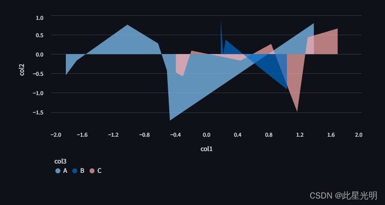
您还可以为 x 和 y 选择不同的列,以及根据第三列动态设置颜色(假设您的数据帧是长格式):
import streamlit as st
import pandas as pd
import numpy as np

chart_data = pd.DataFrame(
   {
       "col1": np.random.randn(20),
       "col2": np.random.randn(20),
       "col3": np.random.choice(["A", "B", "C"], 20),
   }
)

st.area_chart(chart_data, x="col1", y="col2", color="col3")
这段代码使用了Streamlit库来创建一个简单的数据可视化应用。首先导入了需要的库,包括streamlit、pandas和numpy。然后创建了一个包含随机数据的DataFrame对象chart_data,其中包括了三列数据:col1、col2和col3。接下来使用Streamlit的area_chart函数将这些数据可视化为一个面积图,其中x轴为col1,y轴为col2,颜色由col3决定。最终,这段代码将会在Streamlit应用中展示一个面积图,显示出col1和col2之间的关系,并用不同的颜色表示col3的取值。
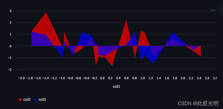
最后,如果您的数据帧是宽格式,您可以在 y 参数下对多列进行分组,以不同的颜色显示多个序列:
import streamlit as st
import pandas as pd
import numpy as np

chart_data = pd.DataFrame(np.random.randn(20, 3), columns=["col1", "col2", "col3"])

st.area_chart(
   chart_data, x="col1", y=["col2", "col3"], color=["#FF0000", "#0000FF"]  # Optional
)
这段代码使用Streamlit库创建了一个面积图。首先,它导入了streamlit、pandas和numpy库。然后,它使用numpy生成了一个包含随机数据的DataFrame,并将其命名为chart_data。随后,使用st.area_chart()函数创建了一个面积图,其中x轴使用"col1"列的数据,y轴使用"col2"和"col3"列的数据,同时可以选择性地指定颜色参数来设置面积图的颜色。
element.add_rows
将一个数据帧连接到当前数据帧的底部。
Function signature[source] | |
|---|---|
element.add_rows(data=None, **kwargs) | |
Parameters | |
data (pandas.DataFrame, pandas.Styler, pyarrow.Table, numpy.ndarray, pyspark.sql.DataFrame, snowflake.snow | |
本文参与 腾讯云自媒体同步曝光计划,分享自作者个人站点/博客。
原始发表:2024-06-28,如有侵权请联系 cloudcommunity@tencent.com 删除
评论
登录后参与评论
推荐阅读
目录
腾讯云开发者

Copyright © 2013 - 2026 Tencent Cloud. All Rights Reserved. 腾讯云 版权所有
深圳市腾讯计算机系统有限公司 ICP备案/许可证号:粤B2-20090059 ![]() 粤公网安备44030502008569号
粤公网安备44030502008569号
腾讯云计算(北京)有限责任公司 京ICP证150476号 | 京ICP备11018762号