
图例中的颜色被覆盖
提问于 2016-08-26 23:16:51
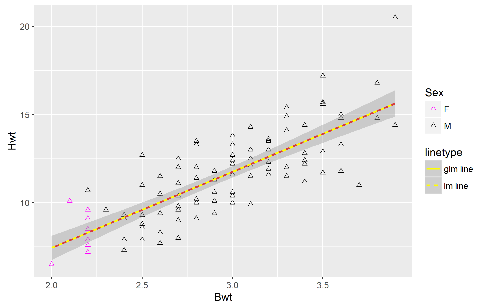
虽然情节中显示了不同的颜色,但图例只显示了一种颜色。我的目标是向大家展示传奇。另外,我是,而不是,希望使用21到25之间的形状。我想用不同的形状,例如形状= 2。
下面是源代码:
#catsM dataset is in MASS package that is shipped by CRAN
     testM<-catsM
     testM[1:10,"Sex"] <- "F"
     ggplot(testM,aes(Bwt,Hwt)) +
      geom_point(aes(color=Sex), shape = 2) +
        geom_smooth(method = "glm", se = FALSE,
                    aes(linetype = "glm line"), color = "red") +
        geom_smooth(method = "lm", span = 0.5,
                    aes(linetype = "lm line"), color = "yellow") +
scale_color_manual(values = c("magenta","black"))这是输出。我们可以看到,第二行lm的颜色代码覆盖了glm的红色。有什么解决办法吗?我很感激你的想法。
我正在张贴dput():
dput(catsM)
structure(list(Sex = structure(c(2L, 2L, 2L, 2L, 2L, 2L, 2L,
2L, 2L, 2L, 2L, 2L, 2L, 2L, 2L, 2L, 2L, 2L, 2L, 2L, 2L, 2L, 2L,
2L, 2L, 2L, 2L, 2L, 2L, 2L, 2L, 2L, 2L, 2L, 2L, 2L, 2L, 2L, 2L,
2L, 2L, 2L, 2L, 2L, 2L, 2L, 2L, 2L, 2L, 2L, 2L, 2L, 2L, 2L, 2L,
2L, 2L, 2L, 2L, 2L, 2L, 2L, 2L, 2L, 2L, 2L, 2L, 2L, 2L, 2L, 2L,
2L, 2L, 2L, 2L, 2L, 2L, 2L, 2L, 2L, 2L, 2L, 2L, 2L, 2L, 2L, 2L,
2L, 2L, 2L, 2L, 2L, 2L, 2L, 2L, 2L, 2L), .Label = c("F", "M"), class = "factor"),
    Bwt = c(2, 2, 2.1, 2.2, 2.2, 2.2, 2.2, 2.2, 2.2, 2.2, 2.2,
    2.3, 2.4, 2.4, 2.4, 2.4, 2.4, 2.5, 2.5, 2.5, 2.5, 2.5, 2.5,
    2.5, 2.5, 2.6, 2.6, 2.6, 2.6, 2.6, 2.6, 2.7, 2.7, 2.7, 2.7,
    2.7, 2.7, 2.7, 2.7, 2.7, 2.8, 2.8, 2.8, 2.8, 2.8, 2.8, 2.8,
    2.9, 2.9, 2.9, 2.9, 2.9, 3, 3, 3, 3, 3, 3, 3, 3, 3, 3.1,
    3.1, 3.1, 3.1, 3.1, 3.1, 3.2, 3.2, 3.2, 3.2, 3.2, 3.2, 3.3,
    3.3, 3.3, 3.3, 3.3, 3.4, 3.4, 3.4, 3.4, 3.4, 3.5, 3.5, 3.5,
    3.5, 3.5, 3.6, 3.6, 3.6, 3.6, 3.7, 3.8, 3.8, 3.9, 3.9), Hwt = c(6.5,
    6.5, 10.1, 7.2, 7.6, 7.9, 8.5, 9.1, 9.6, 9.6, 10.7, 9.6,
    7.3, 7.9, 7.9, 9.1, 9.3, 7.9, 8.6, 8.8, 8.8, 9.3, 11, 12.7,
    12.7, 7.7, 8.3, 9.4, 9.4, 10.5, 11.5, 8, 9, 9.6, 9.6, 9.8,
    10.4, 11.1, 12, 12.5, 9.1, 10, 10.2, 11.4, 12, 13.3, 13.5,
    9.4, 10.1, 10.6, 11.3, 11.8, 10, 10.4, 10.6, 11.6, 12.2,
    12.4, 12.7, 13.3, 13.8, 9.9, 11.5, 12.1, 12.5, 13, 14.3,
    11.6, 11.9, 12.3, 13, 13.5, 13.6, 11.5, 12, 14.1, 14.9, 15.4,
    11.2, 12.2, 12.4, 12.8, 14.4, 11.7, 12.9, 15.6, 15.7, 17.2,
    11.8, 13.3, 14.8, 15, 11, 14.8, 16.8, 14.4, 20.5)), .Names = c("Sex",
"Bwt", "Hwt"), row.names = c("1", "2", "3", "4", "5", "6", "7",
"8", "9", "10", "11", "12", "13", "14", "15", "16", "17", "18",
"19", "20", "21", "22", "23", "24", "25", "26", "27", "28", "29",
"30", "31", "32", "33", "34", "35", "36", "37", "38", "39", "40",
"41", "42", "43", "44", "45", "46", "47", "48", "49", "50", "51",
"52", "53", "54", "55", "56", "57", "58", "59", "60", "61", "62",
"63", "64", "65", "66", "67", "68", "69", "70", "71", "72", "73",
"74", "75", "76", "77", "78", "79", "80", "81", "82", "83", "84",
"85", "86", "87", "88", "89", "90", "91", "92", "93", "94", "95",
"96", "97"), class = "data.frame")
回答 2
Stack Overflow用户
回答已采纳
发布于 2016-08-27 04:18:45
我仍然没有完全理解ggplot2 2传说中的所有怪癖,但是如果您想强制使用它,guides选项将允许您手动设置它:
testM <- catsM testM 1:10,“性别”<- "F“格图(testM,aes(Bwt,Hwt)) + geom_point(aes(color=Sex),shape = 2) + geom_smooth(method = "glm",se = FALSE,aes(linetype = "glm line"),色= "red") +geom_smooth(方法=lm”,span = 0.5,aes(linetype = "lm line"),Scale_color_manual= guide_legend(override.aes =c(“红色”,“黄色”)
Stack Overflow用户
发布于 2016-08-27 02:02:50
对于离散变量,将美学映射到shape是另一种选择。不知道在设计美学和美国方面它会有多好:
  ggplot(testM,aes(Bwt,Hwt)) +
  geom_point(aes(shape= Sex)) +
  geom_smooth(method = "glm", se = FALSE,
              aes(linetype = "glm", color  = 'glm')) +
  geom_smooth(method = "lm", span = 0.5,
              aes(linetype = "lm", color ='lm'), size = 4) +

  scale_linetype_discrete(name = "Method") +
scale_color_manual(name = "Method", values = c('red', 'yellow'))页面原文内容由Stack Overflow提供。腾讯云小微IT领域专用引擎提供翻译支持
原文链接:
https://stackoverflow.com/questions/39178525
复制相关文章


腾讯云开发者
