将不同类型的图组合在一起(R)
我正在努力学习如何在R编程语言中将不同类型的图形组合在一起。假设我有以下数据:
library(dplyr)
library(ggplot2)

date= seq(as.Date("2014/1/1"), as.Date("2016/1/1"),by="day")

var <- rnorm(731,10,10)


group <- sample( LETTERS[1:4], 731, replace=TRUE, prob=c(0.25, 0.22, 0.25, 0.25) )

data = data.frame(date, var, group)

data$year = as.numeric(format(data$date,'%Y'))
data$year = as.factor(data$year)
我总结了这些数据,生成了不同类型的图表。例如:
1) Pie Charts:

    ###Pie

    Pie_2014 <- data %>% filter((data$year == "2014"))
    Pie_2014 %>%
      group_by(group) %>%
      summarise(n = n())

    Pie_2014_graph = ggplot(Pie_2014, aes(x="", y=n, fill=group)) +
      geom_bar(stat="identity", width=1) +
      coord_polar("y", start=0) +ggtitle( "Pie Chart 2014")


    Pie_2015 <- data %>% filter((data$year == "2015"))
    Pie_2015 %>%
      group_by(group) %>%
      summarise(n = n())

    Pie_2015_graph = ggplot(Pie_2015, aes(x="", y=n, fill=group)) +
      geom_bar(stat="identity", width=1) +
      coord_polar("y", start=0) +ggtitle( "Pie Chart 2015")


    Pie_total = data %>%
      group_by(group) %>%
      summarise(n = n())

    Pie_total_graph = ggplot(data, aes(x="", y=n, fill=group)) +
      geom_bar(stat="identity", width=1) +
coord_polar("y", start=0) +ggtitle( "Pie Chart Average") - 条形图:
Bar_years = data %>% group_by(年,组) %>%汇总(平均值=均值(Var)) Bar_years_plot = ggplot(Bar_years,aes(fill=group,y=mean,x=year)) + geom_bar(position="dodge",stat="identity") +ggtitle(“所有年份的条形图”) Bar_total = data %>% group_by(group) %>%汇总(mean=n() Bar_total_plot =ggplot(group_by,aes,x=year))(group_by,,(fill=group)+ geom_bar(stat="identity")+theme_minimal() +ggtitle(“条形图平均”)
- 时间序列情节:
New <- data %>%
  mutate(date = as.Date(date)) %>%
  group_by(group, month = format(date, "%Y-%m")) %>%
  summarise( Mean = mean(var, na.rm = TRUE), Count = n())

#Plot
ts_1 <- ggplot(New) +
  geom_line(aes(x=month, y=Mean, colour=group,group=1))+
  scale_colour_manual(values=c("red","green","blue", "purple"))+
  theme(axis.text.x = element_text(angle=90))  + ggtitle("time seres 1")

ts_2 <- ggplot(New) +
  geom_line(aes(x=month, y=Count, colour=group,group=1))+
  scale_colour_manual(values=c("red","green","blue", "purple"))+
  theme(axis.text.x = element_text(angle=90)) + ggtitle("time seres 2")
所有这些图表都工作得很完美。现在我正在寻找一种更好的方式来呈现它们。我的问题是:是否可以使用R和ggplot2将所有这些图整齐地排列到一个窗口中?
例如:
第1行:所有派图(Pie_2014_graph,Pie_2015_graph,pie_total_graph)
第2行:所有条形图(Bar_years_plot,Bar_total_plot)
第3行:所有时间序列图(ts_1,ts_2)
现在,我单独创建所有这些图表,将它们粘贴到MS油漆中,然后手动重新排列它们。
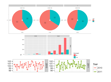
像这样吗?
我们非常感谢所有的帮助。谢谢
回答 1
Stack Overflow用户
发布于 2021-01-12 05:11:12
上面发布的代码失败了,因为您试图使用变量n,但是在summarise(n = n())步骤之后没有为饼图数据分配数据。
您可以直接将汇总的数据导入ggplot,也可以使用这样的方法来分配中间步骤;
Pie_2014 <- data %>%
  filter((data$year == "2014")) %>%
  group_by(group) %>%
  summarise(n = n())

Pie_2014_graph = ggplot(Pie_2014, aes(x="", y=n, fill=group)) +
  geom_bar(stat="identity", width=1) +
  coord_polar("y", start=0) +ggtitle( "Pie Chart 2014")


Pie_2015 <- data %>%
  filter((data$year == "2015")) %>%
  group_by(group) %>%
  summarise(n = n())

Pie_2015_graph = ggplot(Pie_2015, aes(x="", y=n, fill=group)) +
  geom_bar(stat="identity", width=1) +
  coord_polar("y", start=0) +ggtitle( "Pie Chart 2015")


Pie_total = data %>%
  group_by(group) %>%
  summarise(n = n())

Pie_total_graph = ggplot(Pie_total, aes(x="", y=n, fill=group)) +
  geom_bar(stat="identity", width=1) +
  coord_polar("y", start=0) +ggtitle( "Pie Chart Average")
在那之后,用拼凑的包把子情节安排在一起是非常简单的。像这样的事情会让你更亲近;
# combine plots

# install.packages('patchwork')
library(patchwork)

(Pie_2014_graph | Pie_2015_graph | Pie_total_graph) /
  (Bar_years_plot | Bar_total_plot) /
(ts_1 | ts_2)编辑:下面是对非修补程序替代方案的请求,下面是让您开始使用牛仔的版本。
library(cowplot)

# arrange subplots in rows
top_row <- plot_grid(Pie_2014_graph, Pie_2015_graph, Pie_total_graph, nrow = 1)
middle_row <- plot_grid(Bar_years_plot, Bar_total_plot)
bottom_row <- plot_grid(ts_1, ts_2)

# arrange our new rows into combined plot
p <- plot_grid(top_row, middle_row, bottom_row, nrow = 3)
phttps://stackoverflow.com/questions/65676788
复制


相似问题
用R将不同的表组合在一起
如何组合R中的(Add)2同维矩阵?
R中的图组合
R in图中的组合图
将不同类型的多个numpy数组组合在一起
领取专属 10元无门槛券
AI混元助手 在线答疑

洞察 腾讯核心技术
剖析业界实践案例

腾讯云开发者
