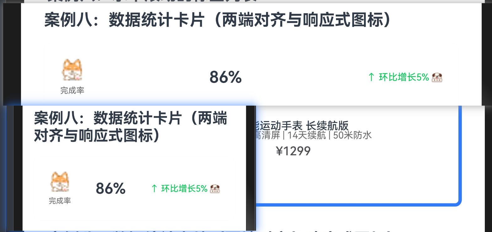
40.[HarmonyOS NEXT Row案例八] 打造专业数据统计卡片:两端对齐与响应式图标的完美结合

40.[HarmonyOS NEXT Row案例八] 打造专业数据统计卡片:两端对齐与响应式图标的完美结合

全栈若城
发布于 2025-06-02 09:31:16
发布于 2025-06-02 09:31:16
项目已开源,开源地址: https://gitcode.com/nutpi/HarmonyosNextCaseStudyTutorial , 欢迎fork & star
效果演示
1. 概述
在数据分析、金融、健康等应用中,数据统计卡片是展示关键指标和趋势的重要UI组件。本教程将详细讲解如何使用HarmonyOS NEXT的Row组件创建一个专业的数据统计卡片,实现两端对齐布局和响应式图标,打造出既美观又实用的数据可视化界面。
2. 数据统计卡片的设计原则
在设计数据统计卡片时,需要考虑以下几个关键原则:
- 信息层级:突出核心数据,辅助信息(如趋势、单位等)可以用较小字体或浅色显示。
- 视觉平衡:卡片内部元素的排列要平衡,避免一侧过于拥挤或空旷。
- 色彩编码:使用颜色区分不同类型的数据或趋势(如上升用绿色,下降用红色)。
- 响应式设计:卡片应能适应不同屏幕尺寸,保持良好的可读性。
- 一致性:在整个应用中保持统计卡片的一致样式,提升用户体验。
3. 案例分析:数据统计卡片
本案例展示了如何创建一个包含图标、数值和趋势信息的数据统计卡片,通过Row组件实现两端对齐布局,通过条件渲染实现响应式图标。
3.1 完整代码
@Component
export struct StatCardExample {
  @Prop title: string = '总销售额'
  @Prop value: string = '¥ 126,560'
  @Prop trend: number = 12.3 // 正数表示上升,负数表示下降
  @Prop timeRange: string = '周同比'

  build() {
    Row() {
      // 左侧:图标和标题
      Row({ space: 8 }) {
        Image($r('app.media.ic_stats'))
          .width(24)
          .height(24)
          .objectFit(ImageFit.Contain)

        Text(this.title)
          .fontSize(16)
          .fontColor('#333333')
      }

      // 右侧:数值和趋势
      Column() {
        Text(this.value)
          .fontSize(20)
          .fontWeight(FontWeight.Bold)
          .fontColor('#333333')
          .margin({ bottom: 4 })

        Row({ space: 4 }) {
          Text(this.timeRange)
            .fontSize(12)
            .fontColor('#999999')

          Text(`${this.trend > 0 ? '+' : ''}${this.trend}%`)
            .fontSize(12)
            .fontColor(this.trend >= 0 ? '#52C41A' : '#F5222D')

          // 趋势图标
          Image(this.trend >= 0 ? $r('app.media.ic_trend_up') : $r('app.media.ic_trend_down'))
            .width(12)
            .height(12)
            .objectFit(ImageFit.Contain)
        }
      }
      .alignItems(HorizontalAlign.End)
    }
    .width('100%')
    .justifyContent(FlexAlign.SpaceBetween)
    .backgroundColor('#FFFFFF')
    .borderRadius(12)
    .padding(16)
    .shadow({
      radius: 6,
      color: 'rgba(0, 0, 0, 0.1)',
      offsetX: 0,
      offsetY: 2
    })
  }
}
3.2 代码详解
3.2.1 组件声明与数据定义
@Component
export struct StatCardExample {
  @Prop title: string = '总销售额'
  @Prop value: string = '¥ 126,560'
  @Prop trend: number = 12.3 // 正数表示上升,负数表示下降
@Prop timeRange: string = '周同比'这部分代码声明了一个名为StatCardExample的自定义组件,并定义了四个属性:
属性 | 类型 | 说明 | 默认值 |
|---|---|---|---|
title | string | 统计指标的标题 | ‘总销售额’ |
value | string | 统计指标的数值 | ‘¥ 126,560’ |
trend | number | 趋势变化百分比,正数表示上升,负数表示下降 | 12.3 |
timeRange | string | 时间范围说明 | ‘周同比’ |
使用@Prop装饰器定义这些属性,使它们可以从外部传入,同时提供默认值。这种设计使组件更加灵活,可以用于展示不同类型的统计数据。
3.2.2 外层Row容器设置
Row() {
  // 子组件
}
.width('100%')
.justifyContent(FlexAlign.SpaceBetween)
.backgroundColor('#FFFFFF')
.borderRadius(12)
.padding(16)
.shadow({
  radius: 6,
  color: 'rgba(0, 0, 0, 0.1)',
  offsetX: 0,
  offsetY: 2
})
这部分代码创建了一个Row容器,作为数据统计卡片的根容器。Row容器的属性设置如下:
属性 | 值 | 说明 |
|---|---|---|
width | ‘100%’ | 容器宽度为父容器的100% |
justifyContent | FlexAlign.SpaceBetween | 子组件在主轴(水平方向)上两端对齐 |
backgroundColor | ‘#FFFFFF’ | 设置背景色为白色 |
borderRadius | 12 | 设置边框圆角为12vp |
padding | 16 | 设置内边距为16vp |
shadow | { radius: 6, color: ‘rgba(0, 0, 0, 0.1)’, offsetX: 0, offsetY: 2 } | 设置阴影效果 |
这些设置确保了数据统计卡片有足够的空间和适当的内边距,白色背景、圆角边框和阴影效果使卡片在视觉上更加突出。最关键的是justifyContent属性设置为FlexAlign.SpaceBetween,实现了左右两端对齐的布局。
3.2.3 左侧区域设置
Row({ space: 8 }) {
  Image($r('app.media.ic_stats'))
    .width(24)
    .height(24)
    .objectFit(ImageFit.Contain)

  Text(this.title)
    .fontSize(16)
    .fontColor('#333333')
}
这部分代码创建了一个Row容器,用于水平排列左侧的图标和标题。Row容器的属性设置如下:
属性 | 值 | 说明 |
|---|---|---|
space | 8 | 子组件之间的间距为8vp |
内部包含两个子组件:
- Image组件:显示统计指标的图标
- width: 24 - 设置宽度为24vp
- height: 24 - 设置高度为24vp
- objectFit: ImageFit.Contain - 设置图片填充模式为包含,保持宽高比
- Text组件:显示统计指标的标题
- fontSize: 16 - 设置字体大小为16fp
- fontColor: ‘#333333’ - 设置字体颜色为深灰色
这些设置确保了图标和标题有适当的大小和间距,形成一个紧凑的左侧区域。
3.2.4 右侧区域设置
Column() {
  Text(this.value)
    .fontSize(20)
    .fontWeight(FontWeight.Bold)
    .fontColor('#333333')
    .margin({ bottom: 4 })

  Row({ space: 4 }) {
    Text(this.timeRange)
      .fontSize(12)
      .fontColor('#999999')

    Text(`${this.trend > 0 ? '+' : ''}${this.trend}%`)
      .fontSize(12)
      .fontColor(this.trend >= 0 ? '#52C41A' : '#F5222D')

    // 趋势图标
    Image(this.trend >= 0 ? $r('app.media.ic_trend_up') : $r('app.media.ic_trend_down'))
      .width(12)
      .height(12)
      .objectFit(ImageFit.Contain)
  }
}
.alignItems(HorizontalAlign.End)
这部分代码创建了一个Column容器,用于垂直排列右侧的数值和趋势信息。Column容器的属性设置如下:
属性 | 值 | 说明 |
|---|---|---|
alignItems | HorizontalAlign.End | 子组件在水平方向上右对齐 |
内部包含两个子组件:
- Text组件:显示统计指标的数值
- fontSize: 20 - 设置字体大小为20fp
- fontWeight: FontWeight.Bold - 设置字体粗细为粗体
- fontColor: ‘#333333’ - 设置字体颜色为深灰色
- margin: { bottom: 4 } - 设置底部外边距为4vp
- Row容器:水平排列时间范围、趋势百分比和趋势图标
- space: 4 - 子组件之间的间距为4vp
- 内部包含三个子组件:
- Text组件:显示时间范围
- fontSize: 12 - 设置字体大小为12fp
- fontColor: ‘#999999’ - 设置字体颜色为浅灰色
- Text组件:显示趋势百分比
- fontSize: 12 - 设置字体大小为12fp
- fontColor: 动态设置,上升趋势为绿色(#52C41A),下降趋势为红色(#F5222D)
- Image组件:显示趋势图标
- width: 12 - 设置宽度为12vp
- height: 12 - 设置高度为12vp
- objectFit: ImageFit.Contain - 设置图片填充模式为包含,保持宽高比
- Text组件:显示时间范围
这些设置确保了数值和趋势信息有适当的大小和间距,形成一个紧凑的右侧区域,并且通过alignItems(HorizontalAlign.End)使内部元素右对齐。
4. 两端对齐布局的实现原理
在HarmonyOS NEXT中,两端对齐布局主要通过Row容器的justifyContent属性实现。
4.1 justifyContent属性
justifyContent属性控制子组件在主轴(对于Row容器来说是水平方向)上的对齐方式。当设置为FlexAlign.SpaceBetween时,子组件会分布在容器的两端,中间留有空白。
.justifyContent(FlexAlign.SpaceBetween)FlexAlign枚举提供了多种对齐方式:
值 | 说明 |
|---|---|
Start | 子组件在主轴起点对齐 |
Center | 子组件在主轴中心对齐 |
End | 子组件在主轴终点对齐 |
SpaceBetween | 子组件在主轴上均匀分布,首尾子组件分别贴近容器两端 |
SpaceAround | 子组件在主轴上均匀分布,包括首尾子组件与容器两端的间距 |
SpaceEvenly | 子组件在主轴上均匀分布,所有间距相等 |
在本案例中,我们使用FlexAlign.SpaceBetween实现两端对齐,使左侧的图标和标题靠左显示,右侧的数值和趋势信息靠右显示,中间留有空白,形成视觉上的平衡。
4.2 两端对齐的应用场景
两端对齐布局在以下场景中特别有用:
- 标题和操作按钮:左侧显示标题,右侧显示操作按钮。
- 列表项的主要信息和次要信息:左侧显示主要信息,右侧显示次要信息或状态。
- 表单的标签和输入框:左侧显示标签,右侧显示输入框。
- 统计卡片的指标和数值:左侧显示指标名称,右侧显示数值。
在本案例中,我们使用两端对齐布局展示统计指标的标题和数值,使卡片内容更加清晰和有条理。
5. 响应式图标的实现原理
在HarmonyOS NEXT中,响应式图标主要通过条件渲染实现,根据数据的不同状态显示不同的图标。
5.1 条件渲染
条件渲染是指根据条件动态决定渲染什么内容。在本案例中,我们根据趋势值的正负显示不同的图标:
Image(this.trend >= 0 ? $r('app.media.ic_trend_up') : $r('app.media.ic_trend_down'))这行代码使用三元运算符根据this.trend的值决定显示上升趋势图标还是下降趋势图标:
- 当
this.trend >= 0时,显示上升趋势图标 - 当
this.trend < 0时,显示下降趋势图标
5.2 动态样式
除了图标本身,我们还可以根据数据状态动态设置样式,如文字颜色:
.fontColor(this.trend >= 0 ? '#52C41A' : '#F5222D')这行代码使用三元运算符根据this.trend的值决定文字颜色:
- 当
this.trend >= 0时,文字颜色为绿色(#52C41A) - 当
this.trend < 0时,文字颜色为红色(#F5222D)
通过这种方式,我们可以创建出响应数据变化的UI元素,提升用户体验。
5.3 响应式设计的优势
响应式设计有以下优势:
- 信息传达更直观:通过颜色和图标的变化,用户可以更快地理解数据的含义。
- 减少认知负担:用户不需要仔细阅读数字,就能通过视觉元素了解趋势。
- 提升用户体验:动态变化的UI元素使应用更加生动和有吸引力。
- 适应不同数据:同一组件可以适应不同的数据状态,提高代码复用性。
在本案例中,我们通过响应式图标和颜色,直观地表达了数据的上升或下降趋势,使用户能够更快地理解数据的含义。
6. 数据统计卡片的样式优化
为了提升数据统计卡片的视觉效果和用户体验,我们可以进行以下优化:
6.1 卡片阴影优化
适当的阴影可以增强卡片的层次感:
.shadow({
  radius: 6,
  color: 'rgba(0, 0, 0, 0.1)',
  offsetX: 0,
  offsetY: 2
})这些设置创建了一个轻微的阴影效果,使卡片看起来像是悬浮在背景上,增强了层次感。阴影的offsetY设置为正值,模拟了光源从上方照射的效果,符合用户的视觉习惯。
6.2 卡片边框优化
添加边框可以使卡片更加清晰:
.border({
  width: 1,
  color: '#EEEEEE',
  radius: 12
})
这些设置添加了一个浅色边框,使卡片的边界更加清晰,特别是在白色背景上。
6.3 卡片内边距优化
适当的内边距可以使卡片内容更加舒适:
.padding({
  left: 16,
  right: 16,
  top: 12,
  bottom: 12
})
这些设置使卡片内容有足够的呼吸空间,不会显得拥挤。水平内边距通常大于垂直内边距,符合用户的阅读习惯。
6.4 文字大小和颜色优化
适当的文字大小和颜色可以突出重要信息:
// 数值
Text(this.value)
  .fontSize(24) // 增大字体
  .fontWeight(FontWeight.Bold)
  .fontColor('#333333')
  .margin({ bottom: 4 })

// 趋势
Text(`${this.trend > 0 ? '+' : ''}${this.trend}%`)
  .fontSize(14) // 增大字体
  .fontWeight(FontWeight.Medium) // 增加字重
  .fontColor(this.trend >= 0 ? '#52C41A' : '#F5222D')
这些设置使数值和趋势更加突出,便于用户快速获取关键信息。
7. 数据统计卡片的交互优化
为了提升数据统计卡片的交互体验,我们可以添加以下功能:
7.1 点击查看详情
添加点击事件,使用户可以查看详细数据:
.onClick(() => {
  // 处理点击事件,如跳转到详情页面
})
.stateStyles({
  pressed: {
    opacity: 0.8,
    backgroundColor: '#F8F8F8'
  }
})
这些设置使卡片在被点击时有明显的视觉反馈,提示用户点击操作已被识别。
7.2 长按查看说明
添加长按事件,显示指标的说明信息:
.gesture(
  LongPressGesture()
    .onAction(() => {
      // 显示指标说明
    })
)
这些设置使用户可以通过长按卡片查看指标的详细说明,了解数据的含义和计算方式。
8. 数据统计卡片的扩展功能
基于本案例的基本结构,我们可以扩展更多功能:
8.1 历史趋势图表
在卡片中添加迷你趋势图表,直观展示数据的历史变化:
@Component
struct MiniTrendChart {
  @Prop data: number[] = []
  @Prop color: string = '#52C41A'

  build() {
    Row() {
      ForEach(this.data, (value, index) => {
        Column() {
          // 绘制柱状图
          Column()
            .width(4)
            .height(value * 20) // 根据数值设置高度
            .backgroundColor(this.color)
            .borderRadius(2)
        }
        .height(20)
        .alignItems(HorizontalAlign.Center)
        .justifyContent(FlexAlign.End)
      })
    }
    .width(60)
    .height(20)
    .margin({ left: 8 })
  }
}
然后在数据统计卡片中使用这个组件:
Row({ space: 4 }) {
  Text(this.timeRange)
    .fontSize(12)
    .fontColor('#999999')

  Text(`${this.trend > 0 ? '+' : ''}${this.trend}%`)
    .fontSize(12)
    .fontColor(this.trend >= 0 ? '#52C41A' : '#F5222D')

  // 趋势图标
  Image(this.trend >= 0 ? $r('app.media.ic_trend_up') : $r('app.media.ic_trend_down'))
    .width(12)
    .height(12)
    .objectFit(ImageFit.Contain)

  // 迷你趋势图表
  MiniTrendChart({
    data: [0.2, 0.5, 0.3, 0.8, 0.6],
    color: this.trend >= 0 ? '#52C41A' : '#F5222D'
  })
}
8.2 目标完成度
在卡片中添加目标完成度指示器,展示当前数值与目标的对比:
@Component
struct ProgressIndicator {
  @Prop current: number = 0
  @Prop target: number = 100
  @Prop color: string = '#1890FF'

  build() {
    Column({ space: 4 }) {
      Row() {
        Text('目标完成度')
          .fontSize(12)
          .fontColor('#999999')

        Text(`${Math.round(this.current / this.target * 100)}%`)
          .fontSize(12)
          .fontColor(this.color)
      }
      .width('100%')
      .justifyContent(FlexAlign.SpaceBetween)

      Row() {
        Row()
          .width(`${this.current / this.target * 100}%`)
          .height(4)
          .backgroundColor(this.color)
          .borderRadius(2)
      }
      .width('100%')
      .height(4)
      .backgroundColor('#F0F0F0')
      .borderRadius(2)
    }
    .width('100%')
    .margin({ top: 8 })
  }
}
然后在数据统计卡片中使用这个组件:
Column() {
  // 现有内容

  // 目标完成度指示器
  ProgressIndicator({
    current: 126560,
    target: 200000,
    color: '#1890FF'
  })
}
9. 数据统计卡片组件的封装与复用
为了提高代码复用性,可以将数据统计卡片封装为一个独立的组件:
@Component
export struct StatCard {
  @Prop title: string = ''
  @Prop icon: Resource = $r('app.media.ic_stats')
  @Prop value: string = ''
  @Prop trend: number = 0
  @Prop timeRange: string = ''
  @Prop trendData?: number[] = undefined
  @Prop target?: number = undefined
  onCardClick?: () => void

  build() {
    Row() {
      // 左侧:图标和标题
      Row({ space: 8 }) {
        Image(this.icon)
          .width(24)
          .height(24)
          .objectFit(ImageFit.Contain)

        Text(this.title)
          .fontSize(16)
          .fontColor('#333333')
      }

      // 右侧:数值和趋势
      Column() {
        Text(this.value)
          .fontSize(20)
          .fontWeight(FontWeight.Bold)
          .fontColor('#333333')
          .margin({ bottom: 4 })

        Row({ space: 4 }) {
          Text(this.timeRange)
            .fontSize(12)
            .fontColor('#999999')

          Text(`${this.trend > 0 ? '+' : ''}${this.trend}%`)
            .fontSize(12)
            .fontColor(this.trend >= 0 ? '#52C41A' : '#F5222D')

          // 趋势图标
          Image(this.trend >= 0 ? $r('app.media.ic_trend_up') : $r('app.media.ic_trend_down'))
            .width(12)
            .height(12)
            .objectFit(ImageFit.Contain)

          // 迷你趋势图表(如果有数据)
          if (this.trendData) {
            MiniTrendChart({
              data: this.trendData,
              color: this.trend >= 0 ? '#52C41A' : '#F5222D'
            })
          }
        }

        // 目标完成度指示器(如果有目标)
        if (this.target) {
          ProgressIndicator({
            current: parseFloat(this.value.replace(/[^\d.-]/g, '')),
            target: this.target,
            color: '#1890FF'
          })
        }
      }
      .alignItems(HorizontalAlign.End)
    }
    .width('100%')
    .justifyContent(FlexAlign.SpaceBetween)
    .backgroundColor('#FFFFFF')
    .borderRadius(12)
    .padding(16)
    .shadow({
      radius: 6,
      color: 'rgba(0, 0, 0, 0.1)',
      offsetX: 0,
      offsetY: 2
    })
    .onClick(() => {
      if (this.onCardClick) {
        this.onCardClick()
      }
    })
    .stateStyles({
      pressed: {
        opacity: 0.8,
        backgroundColor: '#F8F8F8'
      }
    })
  }
}
然后在应用中使用这个组件:
@Entry
@Component
struct DashboardPage {
  @State stats: Array<{
    title: string,
    icon: Resource,
    value: string,
    trend: number,
    timeRange: string,
    trendData?: number[],
    target?: number
  }> = [
    {
      title: '总销售额',
      icon: $r('app.media.ic_sales'),
      value: '¥ 126,560',
      trend: 12.3,
      timeRange: '周同比',
      trendData: [0.2, 0.5, 0.3, 0.8, 0.6],
      target: 200000
    },
    {
      title: '访问量',
      icon: $r('app.media.ic_visits'),
      value: '8,846',
      trend: -2.5,
      timeRange: '日同比'
    },
    {
      title: '支付笔数',
      icon: $r('app.media.ic_payments'),
      value: '6,560',
      trend: 3.1,
      timeRange: '周同比'
    }
  ]

  build() {
    Column({ space: 16 }) {
      // 标题
      Text('数据概览')
        .fontSize(20)
        .fontWeight(FontWeight.Bold)
        .padding({ left: 16, top: 16, bottom: 8 })

      // 统计卡片列表
      ForEach(this.stats, (stat) => {
        StatCard({
          title: stat.title,
          icon: stat.icon,
          value: stat.value,
          trend: stat.trend,
          timeRange: stat.timeRange,
          trendData: stat.trendData,
          target: stat.target,
          onCardClick: () => {
            // 处理卡片点击事件
            console.info('点击卡片:' + stat.title)
          }
        })
        .margin({ left: 16, right: 16 })
      })
    }
    .width('100%')
    .height('100%')
    .backgroundColor('#F5F5F5')
  }
}
10. 总结
本教程详细讲解了如何使用HarmonyOS NEXT的Row组件创建专业的数据统计卡片,实现两端对齐布局和响应式图标。通过本案例,我们学习了:
- 数据统计卡片的设计原则
- Row组件在两端对齐布局中的应用
- 条件渲染在响应式图标中的应用
- 动态样式在数据可视化中的应用
- 数据统计卡片的样式优化技巧
- 数据统计卡片的交互优化方法
- 数据统计卡片的扩展功能
- 数据统计卡片组件的封装与复用
掌握这些知识点后,你可以设计出美观、实用的数据统计卡片,提升应用的数据可视化能力和用户体验。在实际开发中,可以根据具体需求调整卡片的样式、布局和功能,创建符合应用设计风格的数据展示界面。
本文参与 腾讯云自媒体同步曝光计划,分享自作者个人站点/博客。
原始发表:2025-06-01,如有侵权请联系 cloudcommunity@tencent.com 删除
评论
登录后参与评论
推荐阅读
目录
腾讯云开发者

Copyright © 2013 - 2026 Tencent Cloud. All Rights Reserved. 腾讯云 版权所有
深圳市腾讯计算机系统有限公司 ICP备案/许可证号:粤B2-20090059  粤公网安备44030502008569号
腾讯云计算(北京)有限责任公司 京ICP证150476号 | 京ICP备11018762号