
如何将数据或数值对象转换为R中的预测对象?
如何将数据或数值对象转换为R中的预测对象?
提问于 2018-04-19 18:41:03
我试图比较R预测包和R Facebook Prophet软件包的预测。
预测包附带了一个方便的自动绘图函数,它似乎只适用于类预测中的对象。
当我试图绘制由先知生成的预测时,我会得到以下错误:
> autoplot(forecast$yhat)
Error: Objects of type numeric not supported by autoplot.
如何将数据帧或向量转换为预测对象,然后使用自动绘图函数显示该对象?
回答 1
Stack Overflow用户
发布于 2018-04-19 22:17:24
第一件事是as.forecast不存在,但是我找到了一个有用的替代方案。
library(prophet)
library(dplyr)
df <- read.csv('https://raw.githubusercontent.com/facebook/prophet/master/examples/example_wp_peyton_manning.csv') %>% mutate(y = log(y))
这就是先知的目标
m <- prophet(df)
Disabling daily seasonality. Run prophet with daily.seasonality=TRUE to override this.
Initial log joint probability = -19.4685
Optimization terminated normally:
  Convergence detected: relative gradient magnitude is below tolerance

future <- make_future_dataframe(m, periods = 365)
library(zoo)
serie <- zoo(df$y, order.by = as.Date(df$ds))
autoplot(serie)
forecast <- predict(m, future)
|======================================================================================|100% ~0 s remaining     > tail(forecast[c('ds', 'yhat', 'yhat_lower', 'yhat_upper')])
             ds     yhat yhat_lower yhat_upper
3265 2017-01-14 7.823991   7.092573   8.580624
3266 2017-01-15 8.205770   7.483129   8.946540
3267 2017-01-16 8.530798   7.791047   9.278295
3268 2017-01-17 8.318204   7.615776   9.016683
3269 2017-01-18 8.150827   7.462445   8.883549
3270 2017-01-19 8.162741 7.494982 8.846622,这是您提到的错误
autoplot(forecast$yhat)
Error: Objects of type numeric not supported by autoplot.使用预测库和函数ggfortify包的autoplot
plot(m, forecast)
library(forecast)
mod <- auto.arima(serie)
autoplot(forecast(mod, h = 365))

df2 <- data.frame(ds = c(as.Date(df$ds),as.Date(forecast$ds)), y = c(df$y,forecast$yhat))
par(mar=c(3,3,2,2),mgp=c(1.6,.6,0))
plot(df2$ds,df2$y, type = "n", ylab = "y", xlab = "ds", las = 1, cex.axis = 0.7)
rect(par("usr")[1], par("usr")[3],par("usr")[2],par("usr")[4],col=gray(.9,.9),
      border='white');grid(lty=1, col='white')
lines(as.Date(df$ds),df$y)
lines(as.Date(tail(forecast$ds, n = 365)),tail(forecast$yhat, n = 365), col = "blue4")
lines(as.Date(tail(forecast$ds, n = 365)),tail(forecast$yhat_lower, n = 365), col = "grey40")
lines(as.Date(tail(forecast$ds, n = 365)),tail(forecast$yhat_upper, n = 365), col = "grey40")
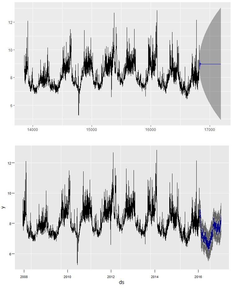
乍一看,差别很小,没有人注意到。虽然您可以使用ggplot2,但它与autoplot相同。
页面原文内容由Stack Overflow提供。腾讯云小微IT领域专用引擎提供翻译支持
原文链接:
https://stackoverflow.com/questions/49928063
复制相关文章
相似问题
腾讯云开发者

Copyright © 2013 - 2026 Tencent Cloud. All Rights Reserved. 腾讯云 版权所有
深圳市腾讯计算机系统有限公司 ICP备案/许可证号:粤B2-20090059 ![]() 粤公网安备44030502008569号
粤公网安备44030502008569号
腾讯云计算(北京)有限责任公司 京ICP证150476号 | 京ICP备11018762号