
如何用海运绘制破碎的y轴图形?
如何用海运绘制破碎的y轴图形?
提问于 2020-09-03 14:54:08
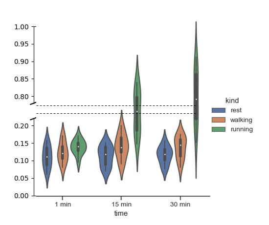
我寻找用y轴断裂的海运来绘制小提琴情节的连环画(因为我有一个因果过程,作用在两个不同的尺度上:一个在0,0.2到2,12之间,我的定量y-变量)。
我从这个答案是没有实现容易的特性,允许这样的地块在海上(还?)中理解,所以我尝试了不同的方法,但不成功,将同一数据集的两幅图叠加在一起,但有两个不同的比例。
探索了失败的尝试
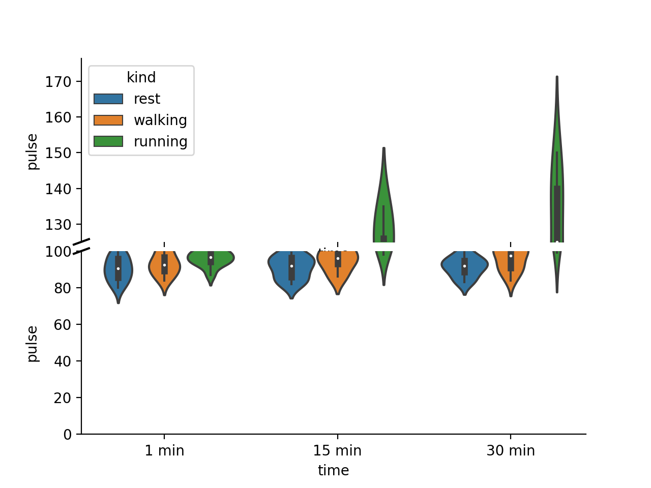
让我们使用标准数据集“练习”,我试过:
import seaborn as sns
import numpy as np
import matplotlib.pyplot as plt
exercise = sns.load_dataset("exercise")
f, (ax1, ax2) = plt.subplots(ncols=2, nrows=1, sharey=True)
f = sns.catplot(x="time", y="pulse", hue="kind",data=exercise, kind="violin",ax=ax1)
f = sns.catplot(x="time", y="pulse", hue="kind",data=exercise, kind="violin",ax=ax2)
ax1.set_ylim(0, 6.5)   # those limits are fake
ax2.set_ylim(13.5, 20)
plt.subplots_adjust(wspace=0, hspace=0)
plt.show()
我也试着用面罩,但没有成功。
import seaborn as sns
import numpy as np
import matplotlib.pyplot as plt
exercise = sns.load_dataset("exercise")
g = sns.FacetGrid(exercise, col="kind",row="time")
g.map(sns.catplot, x="time", y="pulse", hue="kind",data=exercise, kind="violin")
plt.show()
在这里,它给了我正确的基础的网格图,但情节发生在其他数字。
回答 1
Stack Overflow用户
回答已采纳
发布于 2020-09-03 18:58:53
如果要在子图上绘图,则不能使用catplot,这是一个图形级函数。相反,您需要直接使用violinplot。此外,如果您想要两个不同的y-比例,您不能使用sharey=True时,您创建您的子图。
其余的几乎都是从matplotlib断轴教程复制/粘贴的。
import seaborn as sns
import numpy as np
import matplotlib.pyplot as plt
exercise = sns.load_dataset("exercise")
f, (ax_top, ax_bottom) = plt.subplots(ncols=1, nrows=2, sharex=True, gridspec_kw={'hspace':0.05})
sns.violinplot(x="time", y="pulse", hue="kind",data=exercise, ax=ax_top)
sns.violinplot(x="time", y="pulse", hue="kind",data=exercise, ax=ax_bottom)
ax_top.set_ylim(bottom=125)   # those limits are fake
ax_bottom.set_ylim(0,100)

sns.despine(ax=ax_bottom)
sns.despine(ax=ax_top, bottom=True)

ax = ax_top
d = .015  # how big to make the diagonal lines in axes coordinates
# arguments to pass to plot, just so we don't keep repeating them
kwargs = dict(transform=ax.transAxes, color='k', clip_on=False)
ax.plot((-d, +d), (-d, +d), **kwargs)        # top-left diagonal

ax2 = ax_bottom
kwargs.update(transform=ax2.transAxes)  # switch to the bottom axes
ax2.plot((-d, +d), (1 - d, 1 + d), **kwargs)  # bottom-left diagonal

#remove one of the legend
ax_bottom.legend_.remove()
plt.show()
页面原文内容由Stack Overflow提供。腾讯云小微IT领域专用引擎提供翻译支持
原文链接:
https://stackoverflow.com/questions/63726234
复制相关文章
相似问题
腾讯云开发者

Copyright © 2013 - 2026 Tencent Cloud. All Rights Reserved. 腾讯云 版权所有
深圳市腾讯计算机系统有限公司 ICP备案/许可证号:粤B2-20090059 ![]() 粤公网安备44030502008569号
粤公网安备44030502008569号
腾讯云计算(北京)有限责任公司 京ICP证150476号 | 京ICP备11018762号