
Bokeh image()绘图有什么问题?它成功了,但没有显示出任何图形。
Bokeh image()绘图有什么问题?它成功了,但没有显示出任何图形。
提问于 2022-01-28 22:42:05
最初,我有一个星火数据库,其中有这样的数据:
+-------------------+--------------+------+-----+
|window_time        |delayWindowEnd|values|index|
+-------------------+--------------+------+-----+
|2022-01-24 18:00:00|999           |999   |2    |
|2022-01-24 19:00:00|999           |999   |1    |
|2022-01-24 20:00:00|999           |999   |3    |
|2022-01-24 21:00:00|999           |999   |4    |
|2022-01-24 22:00:00|999           |999   |5    |
|2022-01-24 18:00:00|998           |998   |4    |
|2022-01-24 19:00:00|998           |998   |5    |
|2022-01-24 20:00:00|998           |998   |3    |
我想用Apache中的以下代码将其绘制为热图:
%spark.pyspark
import bkzep
import numpy as np
from bokeh.io import output_notebook, show
from bokeh.plotting import figure
from bokeh.models import ColumnDataSource, ColorBar, LogColorMapper
from bokeh.layouts import gridplot
from pyspark.sql.functions import col, coalesce, lit, monotonically_increasing_id
from pyspark.sql import DataFrame
from pyspark.sql.functions import *

output_notebook(notebook_type='zeppelin')
然后
%电火花
从pyspark.sql.functions进口*
def plot_summaries(sensor, dfName):
    df = sqlContext.table(dfName)
    pdf = df.toPandas()
    source = ColumnDataSource(pdf)

    color_mapper = LogColorMapper(palette="Viridis256", low=1, high=10)

    plot = figure(toolbar_location=None,x_axis_type='datetime')
    plot.image(x='window_time', y='delayWindowEnd', source=source, image='index',dw=1,dh=1,  color_mapper=color_mapper)

    color_bar = ColorBar(color_mapper=color_mapper, label_standoff=12)

    plot.add_layout(color_bar, 'right')
    show(gridplot([plot], ncols=1, plot_width=1000, plot_height=400))

sensors = [
"all"
]
然后最后
%pyspark
from pyspark.sql.functions import *
keyCol = "month_day_hour"
sensors = [
"all"]
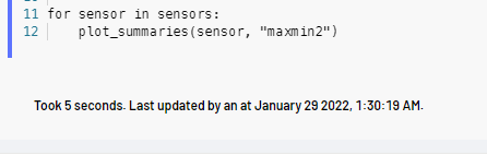
for sensor in sensors:
plot_summaries(sensor, "maxmin2") 最近的一次成功了,但我没有看到任何图表。
这可能是因为参数的误用。
是否可以使用dataframe列作为图像参数(而其他两个参数是x和y轴)。df和dw是否正确初始化?用X轴做时间戳是可以的吗?
如果原因是浏览器呈现,则会出现如下所示的JS错误:
polyfills.d42c9551b0788083cd69.js:1 Uncaught Error: Error rendering Bokeh model: could not find #fb19be38-e25a-4ebf-a488-593cd2e9a4d6 HTML tag
    at o (bokeh-1.3.4.min.js:31:143801)
    at Object.n._resolve_root_elements (bokeh-1.3.4.min.js:31:144274)
    at Object.n.embed_items_notebook (bokeh-1.3.4.min.js:31:147281)
    at embed_document (<anonymous>:6:20)
    at <anonymous>:15:9
    at e.invokeTask (polyfills.d42c9551b0788083cd69.js:1:8063)
    at t.runTask (polyfills.d42c9551b0788083cd69.js:1:3241)
    at t.invokeTask (polyfills.d42c9551b0788083cd69.js:1:9170)
    at i.useG.invoke (polyfills.d42c9551b0788083cd69.js:1:9061)
    at n.args.<computed> (polyfills.d42c9551b0788083cd69.js:1:38948)
尽管Zeppelin后端的响应带有执行和绘图结果,但通过websocket应用程序到达浏览器时,看起来很漂亮,而且相当正确:
回答 1
Stack Overflow用户
回答已采纳
发布于 2022-01-30 07:02:54
答案是:https://discourse.bokeh.org/t/cant-render-heatmap-data-for-apache-zeppelins-pyspark-dataframe/8844
详细的解释是错误的在上面的链接。很快,我就没有将所需的2D数组应用到Bokeh上,我不得不用pandas的pivot和numpy来生成它。以下是解决办法:
dft = sqlContext.table(dfName)
pdf = dft.toPandas()
import pandas as pd
rowIDs = pdf['values']
colIDs = pdf['window_time']
A = pdf.pivot_table('index', 'values', 'window_time', fill_value=0)
source = ColumnDataSource(data={'x':[pd.to_datetime('Jan 24 2022')] #left most
,'y':[0] #bottom most
,'dw':[pdf['window_time'].max()-pdf['window_time'].min()] #TOTAL width of image
#,'dh':[df['delayWindowEnd'].max()] #TOTAL height of image
,'dh':[1000] #TOTAL height of image
,'im':[A.to_numpy()] #2D array using to_numpy() method on pivotted df
})
color_mapper = LogColorMapper(palette="Viridis256", low=1, high=20)
plot = figure(toolbar_location=None,x_axis_type='datetime')
plot.image(x='x', y='y', source=source, image='im',dw='dw',dh='dh', color_mapper=color_mapper)
color_bar = ColorBar(color_mapper=color_mapper, label_standoff=12)
plot.add_layout(color_bar, 'right')
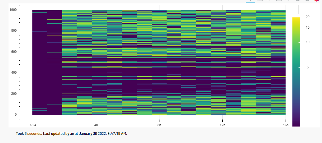
show(gridplot([plot], ncols=1, plot_width=1000, plot_height=400)) 结果对我来说很漂亮:
页面原文内容由Stack Overflow提供。腾讯云小微IT领域专用引擎提供翻译支持
原文链接:
https://stackoverflow.com/questions/70901069
复制相关文章
相似问题
腾讯云开发者

Copyright © 2013 - 2026 Tencent Cloud. All Rights Reserved. 腾讯云 版权所有
深圳市腾讯计算机系统有限公司 ICP备案/许可证号:粤B2-20090059 ![]() 粤公网安备44030502008569号
粤公网安备44030502008569号
腾讯云计算(北京)有限责任公司 京ICP证150476号 | 京ICP备11018762号