ConversationPreview 用于对于会话列表中单条会话内容进行预览,组件负责显示会话信息、未读计数以及提供会话操作功能。借助原子化的信息展示组件,您可以自由地设计和组合出您所期望的
ConversationPreview 布局。同时,您还可以通过
onConversationSelect 函数来自定义选中会话时的行为。Props
参数名 | 类型 | 默认值 | 说明 |
conversation(Required) | ConversationInfo | - | 必选参数,标识当前渲染的会话列表项。 |
isSelected | Boolean | false | 控制会话列表项 UI 是否处于选中状态。 |
enableActions | Boolean | true | 控制会话操作功能是否显示。 |
actionsConfig | - | 用于自定义会话操作配置。 | |
highlightMatchString | String | - | 会话列表项 Title 高亮匹配关键词,常用于会话搜索结果高亮。 |
Title | String | JSX.Element | ConversationPreviewTitle | 渲染会话列表项标题区域。 |
LastMessageAbstract | String | JSX.Element | ConversationPreviewAbstract | 渲染会话列表项最新消息摘要区域。 |
LastMessageTimestamp | String | JSX.Element | ConversationPreviewTimestamp | 渲染会话列表项最新消息时间戳区域。 |
Unread | String | JSX.Element | ConversationPreviewUnread | 渲染会话列表项消息未读标识区域。 |
ConversationActions | ReactElement | ConversationActions | 渲染会话列表项会话操作区域。 |
Avatar | ReactElement | Avatar | 渲染会话列表项头像区域。 |
onConversationSelect | (conversation: ConversationModel) => void; | - | 指定在选择对话列表中的对话时接收回调的属性。 |
className | String | - | 指定根元素类的 CSS 自定义名称。 |
style | React.CSSProperties | - | 指定根元素样式的自定义样式。 |
自定义案例
类 Discord 风格
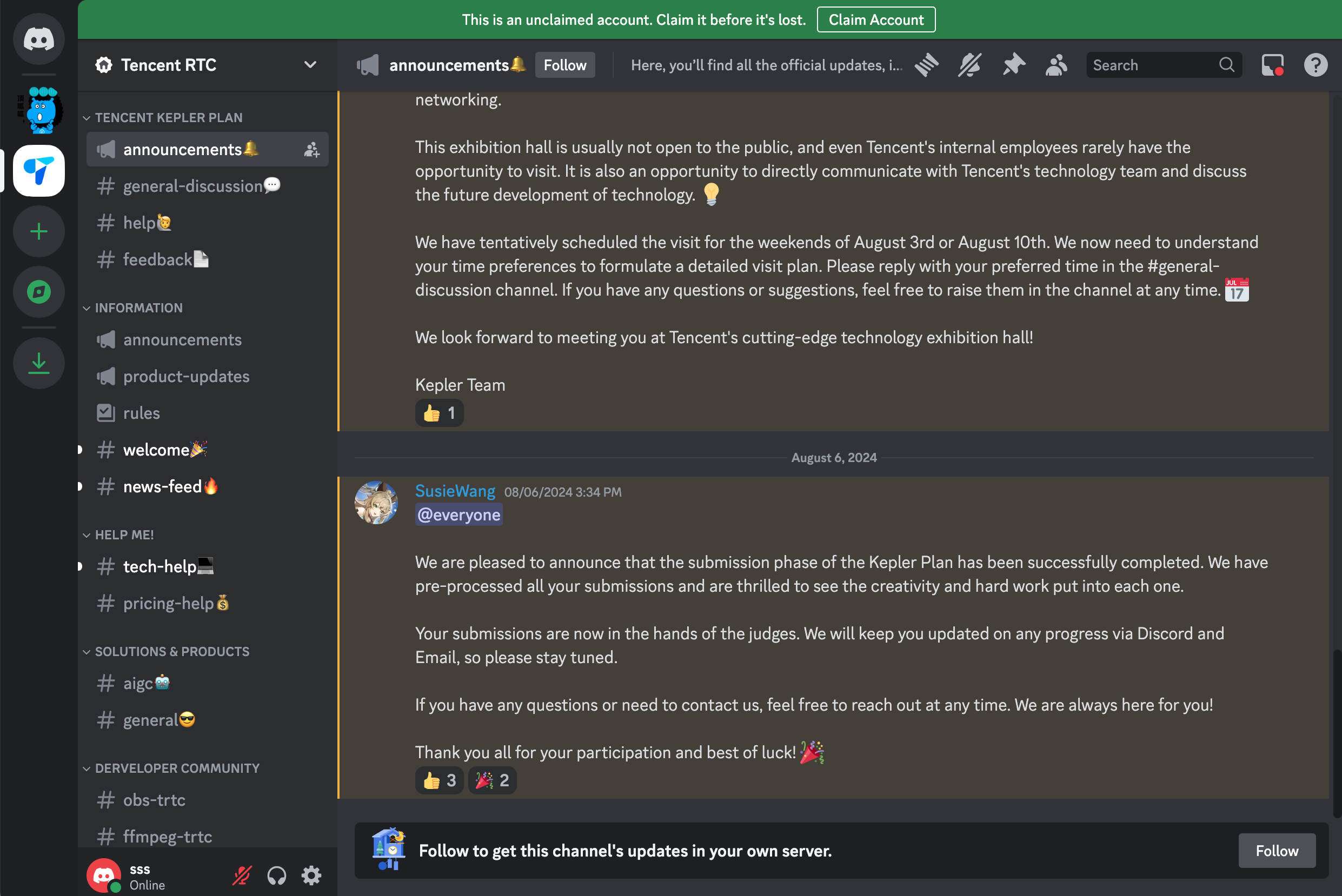
Discord 是一个流行的聊天应用程序,类似于 Skype 或 Telegram。Discord 中的聊天内容如下图所示:
通过对
ConversationPreview 布局、功能以及样式的定制,我们可以快速实现类 Discord 效果。1. 定制
ConversationListPreview 2. 切换主题到深色模式
import { UIKitProvider, ConversationList, ConversationPreviewUI } from '@tencentcloud/chat-uikit-react';type ConversationPreviewUIProps = Parameters<typeof ConversationPreviewUI>[0];const CustomConversationPreview = (props: ConversationPreviewUIProps) => {const { Title } = props;return (<ConversationPreviewUI {...props}><span> # </span><span>{Title}</span></ConversationPreviewUI>);};const App = () => {<UIKitProvider theme={'dark'}><ConversationListstyle={{ maxWidth: '300px', height: '600px' }}Preview={CustomConversationPreviewUI}/>...</UIKitProvider>}
.custom-preview-ui {height: 34px;border-radius: 6px;padding: 10px;margin: 0 10px;.custom-preview-ui__tag {margin-right: 10px;font-size: 16px;color: #b3b3b4;}.custom-preview-ui__title {font-size: 14px;color: #b3b3b4;}&.uikit-conversation-preview--active {background-color: #3b3d43;.custom-preview-ui__tag {color: #ffffff;}.custom-preview-ui__title {.uikit-conversation-preview__title {color: #ffffff;}}}}
ConversationListPreview 定制后效果如下:修改前 | 修改后 |
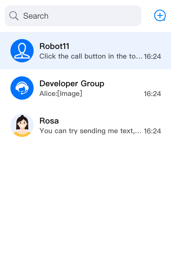 | 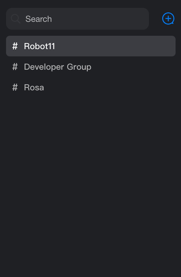 |


