利用折线图探索全球消费者信心指数变化趋势

利用折线图探索全球消费者信心指数变化趋势

HsuHeinrich
发布于 2025-11-20 11:43:07
发布于 2025-11-20 11:43:07
利用折线图探索全球消费者信心指数变化趋势
import matplotlib.pyplot as plt
import pandas as pd
import datetime
数据探索
以下数据如果有需要的同学可关注公众号HsuHeinrich,回复【数据可视化】自动获取~
# 导入数据
url = "https://raw.githubusercontent.com/holtzy/the-python-graph-gallery/master/static/data/dataConsumerConfidence.csv"
df = pd.read_csv(url)

# 数据转化(宽格式转长格式)
df = df.melt(id_vars=['Time'], var_name='country', value_name='value')

# 转换日期格式
df['Time'] = pd.to_datetime(df['Time'], format='%b-%Y')

df = df.dropna()

df.head()

image-20240129182145447
image-20240129182145447
绘制基本的多面板子图
# 国家数量与颜色
num_countries = len(df['country'].unique())
colors = plt.cm.get_cmap('tab10', num_countries)

# 初始化3*3面板
fig, ax = plt.subplots(nrows=3, ncols=3, figsize=(6, 10))

# 循环绘制每个国家的子图
for i, (group, ax) in enumerate(zip(df['country'].unique(), ax.flatten())):

    # 生成该国家与其他国家的df
    filtered_df = df[df['country'] == group]
    other_groups = df['country'].unique()[df['country'].unique() != group]

    # 绘制其他组
    for other_group in other_groups:

        # 获取坐标数值
        other_y = df['value'][df['country'] == other_group]
        other_x = df['Time'][df['country'] == other_group]

        # 绘制线图
        ax.plot(other_x, other_y, color=colors(i))

    # 绘制指定组(黑色)
    x = filtered_df['Time']
    y = filtered_df['value']
    ax.plot(x, y, color='black')

    # 移除边框
    ax.spines[['right', 'top', 'left', 'bottom']].set_visible(False)

    # 移除轴刻度及标签
    ax.set_yticks([])
    ax.set_xticks([])

    # 添加标题
    ax.set_title(f'{group}', fontsize=12)

# 调整布局
plt.tight_layout()

plt.show()
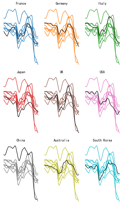
output_6_0
output_6_0
添加不透明度并修改样式
# 国家数量与颜色
num_countries = len(df['country'].unique())
colors = plt.cm.get_cmap('tab10', num_countries)

# 初始化3*3面板
fig, ax = plt.subplots(nrows=3, ncols=3, figsize=(8, 12))

# 循环绘制每个国家的子图
for i, (group, ax) in enumerate(zip(df['country'].unique(), ax.flatten())):

    # 生成指定国家df
    filtered_df = df[df['country'] == group]
    x = filtered_df['Time']
    y = filtered_df['value']

    # 设置背景色
    ax.set_facecolor('seashell')
    fig.set_facecolor('seashell')

    # 绘制线图
    ax.plot(x, y, color=colors(i))

    # 其他组绘制
    other_groups = df['country'].unique()[df['country'].unique() != group]
    for other_group in other_groups:

        # 过滤出其他组
        other_y = df['value'][df['country'] == other_group]
        other_x = df['Time'][df['country'] == other_group]

        # 降低透明度
        ax.plot(other_x, other_y, color=colors(i), alpha=0.2)

    # 移除边框
    ax.spines[['right', 'top', 'left', 'bottom']].set_visible(False)

    # 添加标题
    ax.set_title(f'{group}', fontsize=12, fontweight='bold')

    # 移除轴刻度及标签
    ax.set_yticks([])
    ax.set_xticks([])

# 调整布局
plt.tight_layout()

plt.show()
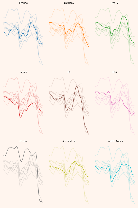
output_8_0
output_8_0
额外的信息
# 国家数量与颜色
num_countries = len(df['country'].unique())
colors = plt.cm.get_cmap('tab10', num_countries)

# 初始化3*3面板
fig, ax = plt.subplots(nrows=3, ncols=3, figsize=(8, 12))

# 标题
fig.suptitle('\nConsumer \nConfidence \nAround the \nWorld\n\n',
             fontsize=40,
             fontweight='bold',
             x=0.05,
             ha='left'
            )

# 文本注释
paragraph_text = (
    "The consumer confidence indicator\n"
    "provided an indication of future\n"
    "developments of households'.\n"
    "consumption and saving. An\n"
    "indicator above 100 signals a boost\n"
    "in the consumers' confidence\n"
    "towards the future economic\n"
    "situation. Values below 100 indicate\n"
    "a pessimistic attitude towards future\n"
    "developments in the economy,\n"
    "possibly resulting in a tendency to\n"
    "save more and consume less. During\n"
    "2022, the consuer confidence\n"
    "indicators have declined in many\n"
    "major economies around the world.\n"
)
fig.text(0.55, 0.9,
         paragraph_text,
         fontsize=12,
         va='top',
         ha='left',
        )

# 循环绘制每个国家的子图
for i, (group, ax) in enumerate(zip(df['country'].unique(), ax.flatten())):

    # 生成指定国家df
    filtered_df = df[df['country'] == group]
    x = filtered_df['Time']
    y = filtered_df['value']

    # 获取最后一个数值
    sorted_df = filtered_df.sort_values(by='Time')
    last_value = sorted_df.iloc[-1]['value']
    last_date = sorted_df.iloc[-1]['Time']

    # 设置背景色
    ax.set_facecolor('seashell')
    fig.set_facecolor('seashell')

    # 绘制线图
    ax.plot(x, y, color=colors(i))

    # 添加最终值的点
    ax.plot(last_date,
            last_value,
            marker='o',
            markersize=5,
            color=colors(i),
           )

    # 添加最终值的数值
    ax.text(last_date,
             last_value*1.005,
             f'{round(last_value)}',
             fontsize=7,
             color=colors(i),
             fontweight='bold',
           )

    # 添加文本‘100’
    ax.text(sorted_df.iloc[0]['Time'] - pd.Timedelta(days=300),
             100,
             '100',
             fontsize=10,
             color='black',)

    # 添加线
    sorted_df = df.sort_values(by='Time')
    start_x_position = sorted_df.iloc[0]['Time']
    end_x_position = sorted_df.iloc[-1]['Time']
    ax.plot([start_x_position, end_x_position],
            [100, 100],
            color='black',
            alpha=0.8,
            linewidth=0.8,
           )

    # 绘制其他组(较浅的颜色,低透明度)
    other_groups = df['country'].unique()[df['country'].unique() != group]
    for other_group in other_groups:

        # 过滤出其他组
        other_y = df['value'][df['country'] == other_group]
        other_x = df['Time'][df['country'] == other_group]

        # 绘制其他组
        ax.plot(other_x, other_y, color=colors(i), alpha=0.2)

    # 移除边框
    ax.spines[['right', 'top', 'left', 'bottom']].set_visible(False)

    # 添加子标题
    ax.set_title(f'{group}', fontsize=12, fontweight='bold')

    # 移除轴刻度及标签
    ax.set_yticks([])
    ax.set_xticks([])

# 添加著作信息
fig.text(0.0, -0.01,
         "Design:",
         fontsize=10,
         va='bottom',
         ha='left',
         fontweight='bold',)
fig.text(0.1, -0.01,
         "Gilbert Fontana",
         fontsize=10,
         va='bottom',
         ha='left')
fig.text(0.0, -0.025,
         "Data:",
         fontsize=10,
         va='bottom',
         ha='left',
         fontweight='bold',)
fig.text(0.07, -0.025,
         "OECD, 2022",
         fontsize=10,
         va='bottom',
         ha='left')

#调整布局
plt.tight_layout()

plt.show()
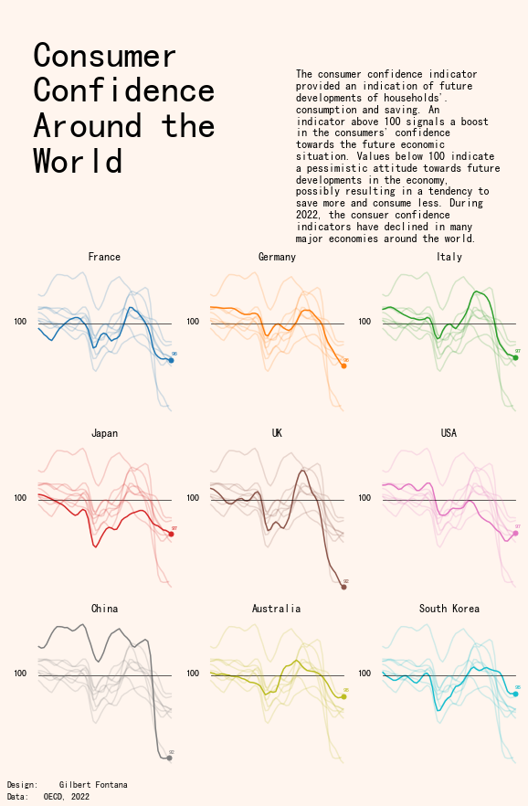
output_10_0
参考:Line chart with small multiple[1]
共勉~
参考资料
[1]
Line chart with small multiple: https://python-graph-gallery.com/web-line-chart-small-multiple/
本文参与 腾讯云自媒体同步曝光计划,分享自微信公众号。
原始发表:2025-11-10,如有侵权请联系 cloudcommunity@tencent.com 删除
评论
登录后参与评论
推荐阅读
目录
腾讯云开发者

Copyright © 2013 - 2026 Tencent Cloud. All Rights Reserved. 腾讯云 版权所有
深圳市腾讯计算机系统有限公司 ICP备案/许可证号:粤B2-20090059 ![]() 粤公网安备44030502008569号
粤公网安备44030502008569号
腾讯云计算(北京)有限责任公司 京ICP证150476号 | 京ICP备11018762号