一招搞定!轻松优雅地关闭 TabControl 的 Tab 页

一招搞定!轻松优雅地关闭 TabControl 的 Tab 页

郑子铭
发布于 2025-01-15 21:33:44
发布于 2025-01-15 21:33:44
一招搞定!轻松优雅地关闭 TabControl 的 Tab 页
控件名:TabControl 作 者:WPFDevelopersOrg - 驚鏵 原文链接[1]:https://github.com/WPFDevelopersOrg/WPFDevelopers 码云链接[2]:https://gitee.com/WPFDevelopersOrg/WPFDevelopers
- 框架支持
.NET4 至 .NET8; Visual Studio 2022;
逻辑实现
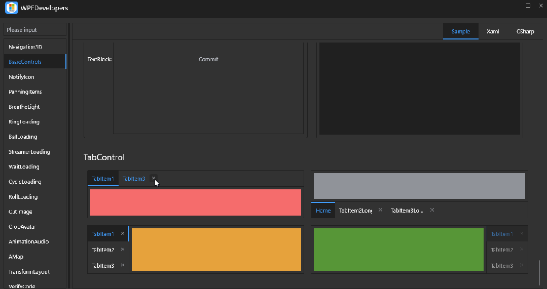
在本篇将介绍如何在 TabControl 中为每个 TabItem 添加一个关闭按钮。将使用一个附加属性来控制关闭按钮的显示和隐藏。通过自定义 ControlTemplate,可以为 Tab 页提供关闭操作。
TabItem 逻辑如下
- 在每个
TabItem的右侧添加一个关闭按钮。 - 使用附加属性来控制关闭按钮的
显示和隐藏。
1. 定义 TabItem 样式
- 通过
XAML中的样式为TabItem设置外观,并添加一个关闭按钮。
<Style x:Key="WD.BaseTAndBTabItem"
       BasedOn="{StaticResource WD.ControlBasicStyle}"
       TargetType="{x:Type TabItem}">
    <Setter Property="HorizontalContentAlignment" Value="Stretch" />
    <Setter Property="VerticalContentAlignment" Value="Stretch" />
    <Setter Property="Background" Value="Transparent" />
    <Setter Property="Padding" Value="{StaticResource WD.DefaultPadding}" />
    <Setter Property="BorderThickness" Value="{StaticResource WD.TabItemBorderThickness}" />
    <Setter Property="Template">
        <Setter.Value>
            <ControlTemplate TargetType="{x:Type TabItem}">
                <controls:SmallPanel Width="{TemplateBinding Width}"
                                     Height="{TemplateBinding Height}"
                                     Background="{TemplateBinding Background}">
                    <Border x:Name="PART_Border" BorderThickness="{TemplateBinding BorderThickness}" />
                    <Grid>
                        <Grid.ColumnDefinitions>
                            <ColumnDefinition />
                            <ColumnDefinition Width="Auto" />
                        </Grid.ColumnDefinitions>
                        <ContentPresenter x:Name="PART_ContentPresenter"
                                          Margin="{TemplateBinding Padding}"
                                          HorizontalAlignment="{Binding Path=HorizontalContentAlignment, RelativeSource={RelativeSource AncestorType={x:Type ItemsControl}}}"
                                          VerticalAlignment="{Binding Path=VerticalContentAlignment, RelativeSource={RelativeSource AncestorType={x:Type ItemsControl}}}"
                                          ContentSource="Header"
                                          SnapsToDevicePixels="{TemplateBinding SnapsToDevicePixels}" />
                        <!-- 关闭按钮 -->
                        <Button x:Name="PART_CloseButton"
                                Grid.Column="1"
                                Width="20"
                                Height="20"
                                Margin="0,0,4,0"
                                helpers:ElementHelper.CornerRadius="4"
                                helpers:ElementHelper.IsClear="{Binding Path=(helpers:ElementHelper.IsClear), RelativeSource={RelativeSource TemplatedParent}}"
                                Style="{StaticResource WD.NormalButton}"
                                ToolTip="{Binding [Close], Source={x:Static resx:LanguageManager.Instance}}"
                                Visibility="Collapsed">
                            <controls:PathIcon Width="10"
                                               Height="10"
                                               Foreground="{DynamicResource WD.SecondaryTextSolidColorBrush}"
                                               Kind="WindowClose" />
                        </Button>
                    </Grid>
                </controls:SmallPanel>
                <ControlTemplate.Triggers>
                    <!-- 选中状态触发器 -->
                    <Trigger Property="IsSelected" Value="True">
                        <Setter TargetName="PART_Border" Property="BorderBrush" Value="{DynamicResource WD.PrimaryNormalSolidColorBrush}" />
                        <Setter Property="Background" Value="{DynamicResource WD.DefaultBackgroundSolidColorBrush}" />
                        <Setter TargetName="PART_ContentPresenter" Property="TextElement.Foreground" Value="{DynamicResource WD.PrimaryNormalSolidColorBrush}" />
                    </Trigger>
                    <!-- 鼠标悬停状态触发器 -->
                    <Trigger Property="IsMouseOver" Value="True">
                        <Setter TargetName="PART_ContentPresenter" Property="TextElement.Foreground" Value="{DynamicResource WD.PrimaryNormalSolidColorBrush}" />
                    </Trigger>
                    <!-- 控制是否显示关闭按钮的触发器 -->
                    <Trigger Property="helpers:ElementHelper.IsClear" Value="True">
                        <Setter TargetName="PART_CloseButton" Property="Visibility" Value="Visible" />
                    </Trigger>
                </ControlTemplate.Triggers>
            </ControlTemplate>
        </Setter.Value>
    </Setter>
</Style>
2. 使用附加属性来控制关闭按钮- 定义附加属性
IsClear
IsClearpublic static readonly DependencyProperty IsClearProperty =
DependencyProperty.RegisterAttached("IsClear", typeof(bool), typeof(ElementHelper),
new PropertyMetadata(false, OnIsClearChanged));
- 判断
IsClear的新值e.NewValue是否为true(按钮是否应当具有关闭功能)。 - 如果
true,则为Button添加Click事件处理器ButtonClear_Click,即点击该按钮时将触发关闭功能。 - 如果
false,则移除Click事件处理器,按钮不再响应点击事件。
private static void OnIsClearChanged(DependencyObject d, DependencyPropertyChangedEventArgs e)
{
    var button = d as Button;
    if (button != null)
    {
        if ((bool)e.NewValue)
            button.Click += ButtonClear_Click;
        else
            button.Click -= ButtonClear_Click;
    }
}
- 首先,检查
sender是否是Button类型。 - 然后,通过
button.TemplatedParent获取按钮的模板父元素,通常在这里是TabItem。 - 接下来,获取
TabItem的父控件,应该是TabControl。如果tabControl不为null,表示按钮点击事件有效。 - 最后,通过
tabControl.Items.Remove(tabItem)从TabControl中移除当前的TabItem,即实现了关闭TabItem页的功能。
private static void ButtonClear_Click(object sender, RoutedEventArgs e)
{
    if (sender is Button button)
    {
        if (button.TemplatedParent is TabItem tabItem)
        {
            var tabControl = tabItem.Parent as TabControl;
            if (tabControl != null)
                tabControl.Items.Remove(tabItem);
        }
    }
}
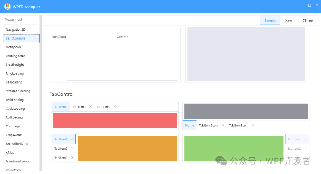
XAML 示例
示例引入 WPFDevelopers 的 Nuget 正式包
- 可以使用附加属性
helpers:ElementHelper.IsClear来绑定或控制TabItem是否显示关闭按钮。
<UserControl
    x:Class="WPFDevelopers.Samples.ExampleViews.DateRangePickerExample"
    xmlns="http://schemas.microsoft.com/winfx/2006/xaml/presentation"
    xmlns:x="http://schemas.microsoft.com/winfx/2006/xaml"
    xmlns:controls="clr-namespace:WPFDevelopers.Samples.Controls"
    xmlns:d="http://schemas.microsoft.com/expression/blend/2008"
    xmlns:local="clr-namespace:WPFDevelopers.Samples.ExampleViews"
    xmlns:mc="http://schemas.openxmlformats.org/markup-compatibility/2006"
    xmlns:wd="https://github.com/WPFDevelopersOrg/WPFDevelopers"
    d:DesignHeight="450"
    d:DesignWidth="800"
    mc:Ignorable="d">
       <UniformGrid
    Margin="0,10"
    Columns="2"
    Rows="2">
    <TabControl Margin="4" wd:ElementHelper.CornerRadius="3">
        <TabItem Padding="10" Header="TabItem1">
            <Rectangle Fill="{DynamicResource WD.DangerSolidColorBrush}" />
        </TabItem>
        <TabItem
            Padding="10"
            wd:ElementHelper.IsClear="True"
            Header="TabItem2">
            <Rectangle Fill="{DynamicResource WD.InfoSolidColorBrush}" />
        </TabItem>
        <TabItem
            Padding="10"
            wd:ElementHelper.IsClear="True"
            Header="TabItem3">
            <Rectangle Fill="{DynamicResource WD.WarningSolidColorBrush}" />
        </TabItem>
    </TabControl>
    <TabControl Margin="4" TabStripPlacement="Bottom">
        <TabItem
            Padding="10"
            wd:ElementHelper.IsClear="True"
            Header="1">
            <Rectangle Fill="{DynamicResource WD.InfoSolidColorBrush}" />
        </TabItem>
        <TabItem
            x:Name="MyTabItem"
            MaxWidth="120"
            Padding="10"
            wd:ElementHelper.IsClear="True"
            Header="TabItem2LongLongLongLongLongLongLongLong"
            ToolTip="{Binding ElementName=MyTabItem, Path=Header}">
            <Rectangle Fill="{DynamicResource WD.DangerSolidColorBrush}" />
        </TabItem>
        <TabItem
            MaxWidth="120"
            Padding="10"
            wd:ElementHelper.IsClear="True">
            <TabItem.Header>
                <TextBlock
                    VerticalAlignment="Center"
                    Text="TabItem3LongLongLongLongLongLongLongLong"
                    TextTrimming="CharacterEllipsis"
                    TextWrapping="NoWrap"
                    ToolTip="{Binding Text, RelativeSource={RelativeSource Self}}" />
            </TabItem.Header>
            <Rectangle Fill="{DynamicResource WD.WarningSolidColorBrush}" />
        </TabItem>
    </TabControl>
    <TabControl Margin="4" TabStripPlacement="Left">
        <TabItem
            Padding="10"
            wd:ElementHelper.IsClear="True"
            Header="TabItem1">
            <Rectangle Fill="{DynamicResource WD.WarningSolidColorBrush}" />
        </TabItem>
        <TabItem
            Padding="10"
            wd:ElementHelper.IsClear="True"
            Header="TabItem2">
            <Rectangle Fill="{DynamicResource WD.InfoSolidColorBrush}" />
        </TabItem>
        <TabItem
            Padding="10"
            wd:ElementHelper.IsClear="True"
            Header="TabItem3">
            <Rectangle Fill="{DynamicResource WD.DangerSolidColorBrush}" />
        </TabItem>
    </TabControl>
    <TabControl
        Margin="4"
        IsEnabled="False"
        TabStripPlacement="Right">
        <TabItem
            Padding="10"
            wd:ElementHelper.IsClear="True"
            Header="TabItem1">
            <Rectangle Fill="{DynamicResource WD.SuccessSolidColorBrush}" />
        </TabItem>
        <TabItem
            Padding="10"
            wd:ElementHelper.IsClear="True"
            Header="TabItem2">
            <Rectangle Fill="{DynamicResource WD.InfoSolidColorBrush}" />
        </TabItem>
        <TabItem
            Padding="10"
            wd:ElementHelper.IsClear="True"
            Header="TabItem3">
            <Rectangle Fill="{DynamicResource WD.WarningSolidColorBrush}" />
        </TabItem>
    </TabControl>
</UniformGrid>
</UserControl>
GitHub 源码地址[3]
Gitee 源码地址[4]
参考资料
[1]
原文链接: https://github.com/WPFDevelopersOrg/WPFDevelopers
[2]
码云链接: https://gitee.com/WPFDevelopersOrg/WPFDevelopers
[3]
GitHub 源码地址: https://github.com/WPFDevelopersOrg/WPFDevelopers/blob/master/src/WPFDevelopers.Shared/Styles/Styles.TabControl.xaml
[4]
Gitee 源码地址: https://gitee.com/WPFDevelopersOrg/WPFDevelopers/blob/master/src/WPFDevelopers.Shared/Styles/Styles.TabControl.xaml
本文参与 腾讯云自媒体同步曝光计划,分享自微信公众号。
原始发表:2025-01-15,如有侵权请联系 cloudcommunity@tencent.com 删除
评论
登录后参与评论
推荐阅读
目录
腾讯云开发者

Copyright © 2013 - 2026 Tencent Cloud. All Rights Reserved. 腾讯云 版权所有
深圳市腾讯计算机系统有限公司 ICP备案/许可证号:粤B2-20090059  粤公网安备44030502008569号
腾讯云计算(北京)有限责任公司 京ICP证150476号 | 京ICP备11018762号