听说WGCNA官网崩了?那还能做基因共表达分析吗?


WGCNA共表达分析已经深入人心,是非常多数据挖掘文章中经常用来挖掘重要基因模块以及筛选核心hub基因的首选方法。
我们在生信技能树多次写教程分享WGCNA的实战细节,见:
- 一文看懂WGCNA 分析(2019更新版)
- 通过WGCNA作者的测试数据来学习
- 重复一篇WGCNA分析的文章(代码版)
- 重复一篇WGCNA分析的文章(解读版)(逆向收费读文献2019-19)
- 关键问题答疑:WGCNA的输入矩阵到底是什么格式
但,不幸的是wgcna官网现在已经挂了:
http://www.genetics.ucla.edu/labs/horvath/CoexpressionNetwork/Rpackages/WGCNA/Tutorials/index.html

现在网上只能找到一些比较非正式的资料:
https://systemsbio.ucsd.edu/WGCNAdemo/
https://edo98811.github.io/WGCNA_official_documentation/
既然如此,何必在一个树上挂死呢!现在来看看另一个做基因共表达分析的包吧:
Simple Tidy GeneCoEx:https://github.com/cxli233/SimpleTidy_GeneCoEx
文献信息:
Li C, Deans NC, Buell CR. "Simple Tidy GeneCoEx": A gene co-expression analysis workflow powered by tidyverse and graph-based clustering in R. Plant Genome. 2023 Jun;16(2):e20323. doi: 10.1002/tpg2.20323. Epub 2023 Apr 16. PMID: 37063055.
此方法特点:
- 由tidyverse和graph分析工具支持的基因共表达分析工作流程,这个工作流程非常简单和整洁。
现在来进行简单的探索
示例数据
本次分析使用的数据来自: Shinozaki et al., 2018 :https://www.nature.com/articles/s41467-017-02782-9,是一个番茄果实发育转录组数据,包含10个发育阶段和11种组织。
下载地址:https://zenodo.org/records/7536040(国内访问不是很方便)
github上面:https://github.com/cxli233/SimpleTidy_GeneCoEx/tree/main/Data
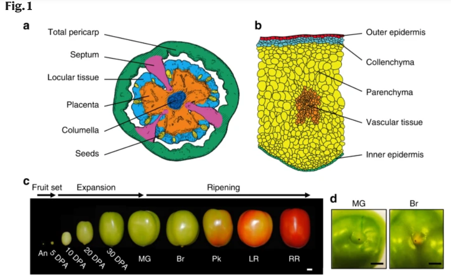
A tissue/cell-based transcript profiling of developing tomato fruit
分析目标:识别与已知果实成熟相关基因共表达的基因
加载包
library(tidyverse)
library(igraph)
library(ggraph)
library(readxl)
library(patchwork)
library(RColorBrewer)
library(viridis)
set.seed(666)
数据输入要求
本教程的数据可以在github上下载:https://github.com/cxli233/SimpleTidy_GeneCoEx/tree/main/Data
- 基因表达矩阵:TPM or FPKM
- Metadata:每个样本的表型信息
- Bait genes:已知的感兴趣的基因,非必须
# 有32496个基因和484列。第一列是基因ID,总共有483个样本
Exp_table <- read_csv("Shinozaki_tpm_representative_transcripts.csv", col_types = cols())
head(Exp_table)
dim(Exp_table)
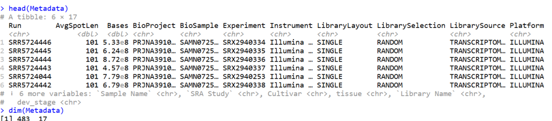
# Metadata
Metadata <- read_excel("SimpleTidy_GeneCoEx-main/Data/Shinozaki_datasets_SRA_info.xlsx")
head(Metadata)
dim(Metadata)
数据如下:有483个样本和17种不同的技术或样本表型
Bait genes
在这个例子中,我们有两个诱饵基因,PG和PSY1。
- PG参与使果实变软:https://www.annualreviews.org/doi/pdf/10.1146/annurev.pp.42.060191.003331。
- PSY1参与产生果实的红色:https://link.springer.com/article/10.1007/BF00047400。
Baits <- read_delim("SimpleTidy_GeneCoEx-main/Data/Genes_of_interest.txt", delim = "\t", col_names = F, col_types = cols())
head(Baits)

# A tibble: 2 × 2
  X1    X2
  <chr> <chr>
1 PG    Solly.M82.10G020850
2 PSY1  Solly.M82.03G005440
理解实验设计
在开始进行任何分析之前,我会首先尝试理解实验设计。对实验设计有良好的理解有助于我决定如何分析和可视化数据。
关键问题包括:
变异的来源是什么? 复制的水平是什么? 这metadata就派上用场了。
Metadata %>%
  group_by(dev_stage) %>%
  count()

# A tibble: 16 × 2
# Groups:   dev_stage [16]
   dev_stage         n
   <chr>         <int>
 1 10 DPA           39
 2 20 DPA           39
 3 30 DPA           24
 4 5 DPA            36
 5 Anthesis         18
 6 Br-equatorial    39
 7 Br-stem          24
 8 Br-stylar        20
 9 LR               39
10 MG-equatorial    39
11 MG-stem          24
12 MG-stylar        20
13 Pk-equatorial    39
14 Pk-stem          24
15 Pk-stylar        20
16 RR               39
根据metadata数据,有16个发育阶段。根据论文,发育阶段的顺序是:这里的数据比文章中的多一些,后面可以筛选一下数据
1. Anthesis
2. 5 DAP
3. 10 DAP
4. 20 DAP
5. 30 DAP
6. MG
7. Br
8. Pk
9. LR
10. RR
总共有11种组织:
Metadata %>%
  group_by(tissue) %>%
  count()

# A tibble: 11 × 2
# Groups:   tissue [11]
   tissue              n
   <chr>           <int>
 1 Collenchyma        24
 2 Columella          51
 3 Inner epidermis    24
 4 Locular tissue     62
 5 Outer epidermis    24
 6 Parenchyma         24
 7 Placenta           62
 8 Seeds              62
 9 Septum             63
10 Total pericarp     63
11 Vascular tissue    24
这是一个双因素实验设计:发育阶段 * 组织。主要的变异来源是发育阶段、组织和重复样本。我通常会制作一个汇总表来指导我的下游分析:
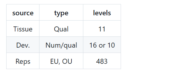
发育阶段可以作为数值变量或定性变量进行分析。
现在我们了解了实验设计,接下来我们将确定实验中变异的主要驱动因素。换句话说,在发育阶段和组织之间,哪个因素对实验中的变异贡献更大?这个问题的答案对于我们如何最有效地可视化数据至关重要。
获得实验全局视图的一个好方法是进行主成分分析(PCA)。
Exp_table_long <- Exp_table %>%
  rename(gene_ID = `...1`) %>%
  pivot_longer(cols = !gene_ID, names_to = "library", values_to = "tpm") %>%
  mutate(logTPM = log10(tpm + 1))

head(Exp_table_long)

# A tibble: 6 × 4
  gene_ID               library      tpm logTPM
  <chr>                 <chr>      <dbl>  <dbl>
1 Solly.M82.08G017810.4 SRR5724446  66.8   1.83
2 Solly.M82.08G017810.4 SRR5724445  67.0   1.83
3 Solly.M82.08G017810.4 SRR5724444  88.0   1.95
4 Solly.M82.08G017810.4 SRR5724443  95.4   1.98
5 Solly.M82.08G017810.4 SRR5724044  92.1   1.97
6 Solly.M82.08G017810.4 SRR5724442 105.    2.03
PCA分析(质量控制)
我们可以简单的看一下这个实验设计,数据的基本情况:
# 数据变换
Exp_table_log_wide <- Exp_table_long %>%
  select(gene_ID, library, logTPM) %>%
  pivot_wider(names_from = library, values_from = logTPM)

head(Exp_table_log_wide)

# pca分析
my_pca <- prcomp(t(Exp_table_log_wide[, -1]))
pc_importance <- as.data.frame(t(summary(my_pca)$importance))
head(pc_importance, 20)

# 绘图
PCA_coord <- my_pca$x[, 1:10] %>%
  as.data.frame() %>%
  mutate(Run = row.names(.)) %>%
  full_join(Metadata %>%
              select(Run, tissue, dev_stage, `Library Name`, `Sample Name`), by = "Run")

head(PCA_coord)

# 选择10个developmental stages
PCA_coord <- PCA_coord %>%
  mutate(stage = case_when(
    str_detect(dev_stage, "MG|Br|Pk") ~ str_sub(dev_stage, start = 1, end = 2),
    T ~ dev_stage
  )) %>%
  mutate(stage = factor(stage, levels = c(
   "Anthesis","5 DPA","10 DPA","20 DPA","30 DPA","MG","Br","Pk","LR","RR"
  ))) %>%
  mutate(dissection_method = case_when(
    str_detect(tissue, "epidermis") ~ "LM",
    str_detect(tissue, "Collenchyma") ~ "LM",
    str_detect(tissue, "Parenchyma") ~ "LM",
    str_detect(tissue, "Vascular") ~ "LM",
    str_detect(dev_stage, "Anthesis") ~ "LM",
    str_detect(dev_stage, "5 DPA") &
      str_detect(tissue, "Locular tissue|Placenta|Seeds") ~ "LM",
    T ~ "Hand"
  ))

head(PCA_coord)
绘图:
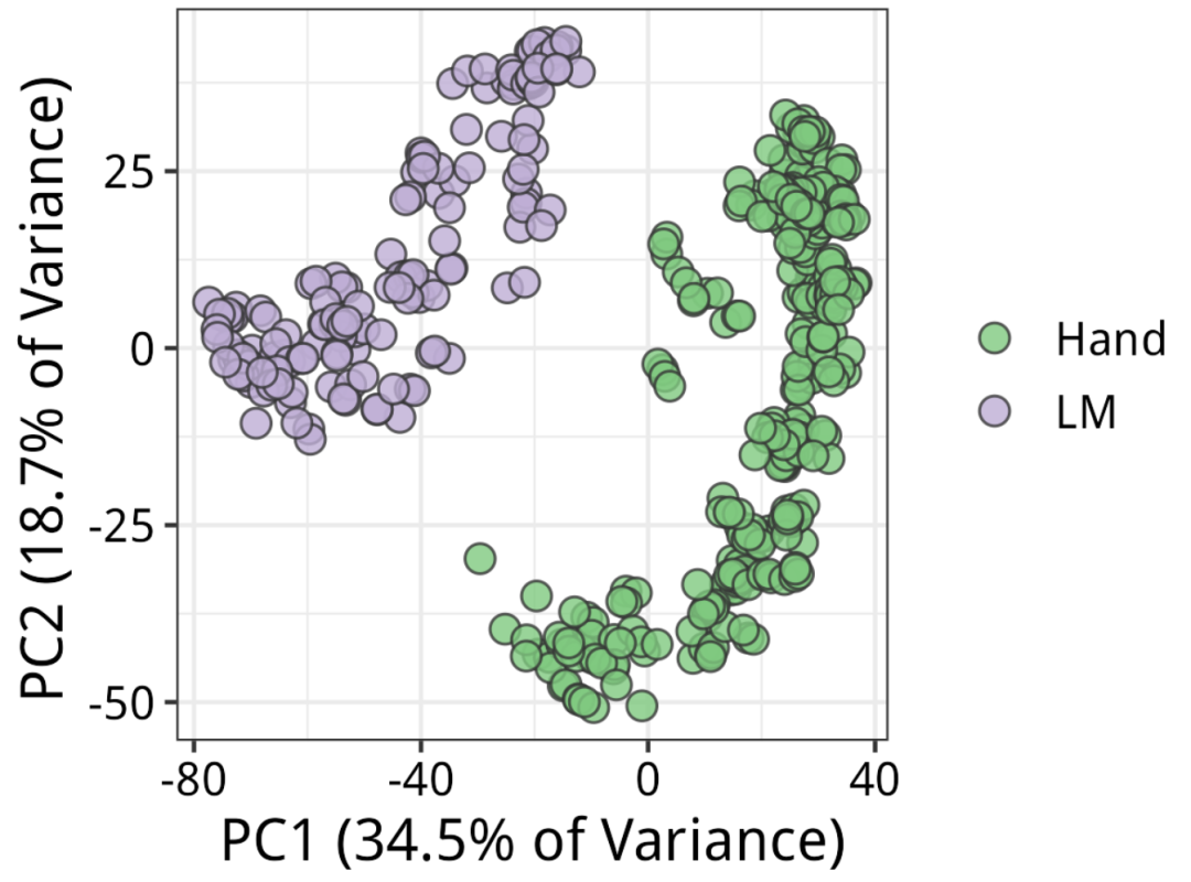
PCA_by_method <- PCA_coord %>%
  ggplot(aes(x = PC1, y = PC2)) +
  geom_point(aes(fill = dissection_method), color = "grey20", shape = 21, size = 3, alpha = 0.8) +
  scale_fill_manual(values = brewer.pal(n = 3, "Accent")) +
  labs(x = paste0("PC1 (", pc_importance[1, 2] %>% signif(3)*100, "% of Variance)"),
       y = paste0("PC2 (", pc_importance[2, 2] %>% signif(3)*100, "% of Variance)", "  "),
       fill = NULL) +
  theme_bw() +
  theme(
    text = element_text(size= 14),
    axis.text = element_text(color = "black")
  )

PCA_by_method

ggsave("PCA_by_dissection_method.png", height = 3, width = 4, bg = "white")
结果如下:根据论文,5个果皮组织是通过激光捕获显微切割(LM)收集的。首先需要注意的是技术差异。看来解剖方法确实是变异的主要来源,与PC1完全对应。
PCA结果
对于生物学解释来说,那么最好查看PC2和PC3:
# by_tissue
PCA_by_tissue <- PCA_coord %>%
  ggplot(aes(x = PC2, y = PC3)) +
  geom_point(aes(fill = tissue), color = "grey20", shape = 21, size = 3, alpha = 0.8) +
  scale_fill_manual(values = brewer.pal(11, "Set3")) +
  labs(x = paste("PC2 (", pc_importance[2, 2] %>% signif(3)*100, "% of Variance)", sep = ""),
       y = paste("PC3 (", pc_importance[3, 2] %>% signif(3)*100, "% of Variance)", "  ", sep = ""),
       fill = "tissue") +
  theme_bw() +
  theme(
    text = element_text(size= 14),
    axis.text = element_text(color = "black")
  )

# by_stage
PCA_by_stage <- PCA_coord %>%
  ggplot(aes(x = PC2, y = PC3)) +
  geom_point(aes(fill = stage), color = "grey20", shape = 21, size = 3, alpha = 0.8) +
  scale_fill_manual(values = viridis(10, option = "D")) +
  labs(x = paste("PC2 (", pc_importance[2, 2] %>% signif(3)*100, "% of Variance)", sep = ""),
       y = paste("PC3 (", pc_importance[3, 2] %>% signif(3)*100, "% of Variance)", "  ", sep = ""),
       fill = "stage") +
  theme_bw() +
  theme(
    text = element_text(size= 14),
    axis.text = element_text(color = "black")
  )

wrap_plots(PCA_by_stage, PCA_by_tissue, nrow = 1)
ggsave("PCA_by_stage_tissue.png", height = 3.5, width = 8.5, bg = "white")
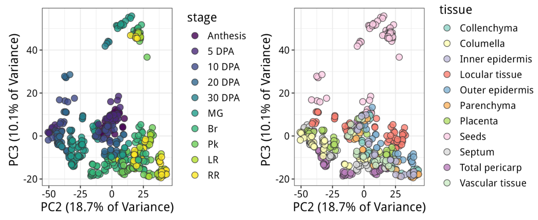
现在x轴(PC2)明显区分了发育阶段:从左到右,从年轻到老年。y轴(PC3)明显区分了种子和所有其他东西。
因此,在变异贡献方面,解剖方法 > 阶段 > 组织。我们将使用这些信息来指导下游的可视化。为了最好地区分生物学变异和技术变异,我们应该对手收集和LM样本进行单独的基因共表达分析。
下面使用手收集的样本。
Gene co-expression分析(接下来正式进行类似的wgcna的模块分析,共表达)
1.首先对重复的样本进行取均值
这不是一个必须的操作,只因为我们对组织-阶段组合之间的生物学变异感兴趣,而对同一处理中复制品之间的噪声不太感兴趣。(有点类似于mfuzz的时间序列分析)
再次强调,这是一个基于tidyverse的工作流程。
Exp_table_long_averaged <- Exp_table_long %>%
  full_join(PCA_coord %>%
              select(Run, `Sample Name`, tissue, dev_stage, dissection_method),
            by = c("library"="Run")) %>%
  filter(dissection_method == "Hand") %>%
  group_by(gene_ID, `Sample Name`, tissue, dev_stage) %>%
  summarise(mean.logTPM = mean(logTPM)) %>%
  ungroup()

head(Exp_table_long_averaged)
2.Z score
它将每个基因的表达模式标准化为均值 = 0,标准差 = 1。
Exp_table_long_averaged_z <- Exp_table_long_averaged %>%
  group_by(gene_ID) %>%
  mutate(z.score = (mean.logTPM - mean(mean.logTPM))/sd(mean.logTPM)) %>%
  ungroup()

head(Exp_table_long_averaged_z)

# A tibble: 6 × 6
  gene_ID               `Sample Name` tissue         dev_stage mean.logTPM z.score
  <chr>                 <chr>         <chr>          <chr>           <dbl>   <dbl>
1 Solly.M82.00G000010.1 J10           Placenta       10 DPA         0       -0.362
2 Solly.M82.00G000010.1 J11           Locular tissue 10 DPA         0       -0.362
3 Solly.M82.00G000010.1 J12           Seeds          10 DPA         0       -0.362
4 Solly.M82.00G000010.1 J14           Columella      20 DPA         0       -0.362
5 Solly.M82.00G000010.1 J15           Total pericarp 20 DPA         0       -0.362
6 Solly.M82.00G000010.1 J16           Septum         20 DPA         0.0552   2.91
3.Gene selection
下一步是将每个基因与所有其他基因进行相关性分析。相关性的数量会随着基因数量的平方而增加。为了加速,我们可以选择只有高变异基因。背后的理念是,如果一个基因在所有样本中表达水平相似,那么它不太可能特别参与某个特定阶段或组织的生物学过程。
选择高变异基因有多种方法和多个截止值。例如,你可以计算所有基因的logTPM的基因级方差,并取上三分位数。你可以选择在所有组织中具有一定表达水平的基因(比如说> 5 tpm),然后取高变异基因。这些都是任意的。
Biostar创始人István Albert博士的生物信息书籍Biostar Handbook提到了几个原则:
规则1:没有“通用”的规则(所有的阈值都是可以人为指定)
规则2:每个看似基本的范例都有一个或多个例外(什么是基因,什么是非编码,什么是内含子)
规则3:生物信息学方法的有效性取决于数据的未知特征(mRNA表达量是否代表蛋白质表达量)
规则4:生物学总是比你想象的更复杂(比如所谓的通路上下调问题,多组学结合)
你随意选择。
# 高变基因选择
high_var_genes <- Exp_table_long_averaged_z %>%
  group_by(gene_ID) %>%
  summarise(var = var(mean.logTPM)) %>%  # 这计算了每个基因的logTPM的方差。
  ungroup() %>%
  filter(var > quantile(var, 0.667))

head(high_var_genes)
dim(high_var_genes)
本次示例中,我们只取方差最高的5000个基因作为一个快速练习。在实际分析中需要包含更多的基因,但是相关性分析中的基因越多,速度就会越慢。
high_var_genes5000 <- high_var_genes %>%
  slice_max(order_by = var, n = 5000)

head(high_var_genes5000)
检查分析中是否包含了足够多的基因,一个好方法是查看诱饵基因是否在方差最高的基因之中。前面找的两个诱饵基因为PG 、PSY1,都在数据中。
high_var_genes5000 %>%
  filter(str_detect(gene_ID, Baits$X2[1]))

high_var_genes5000 %>%
  filter(str_detect(gene_ID, Baits$X2[2]))

# 提取这5000个基因对应的数据
Exp_table_long_averaged_z_high_var <- Exp_table_long_averaged_z %>%
  filter(gene_ID %in% high_var_genes5000$gene_ID)
head(Exp_table_long_averaged_z_high_var)
4.Gene-wise correlation
现在我们可以将每个基因与所有其他基因进行相关性分析。这个工作流程的本质是简单的,如果你愿意,你可以使用更复杂的方法,比如GENIE3。
# 数据转换
z_score_wide <- Exp_table_long_averaged_z_high_var %>%
  select(gene_ID, `Sample Name`, z.score) %>%
  pivot_wider(names_from = `Sample Name`, values_from = z.score) %>%
  as.data.frame()
row.names(z_score_wide) <- z_score_wide$gene_ID
head(z_score_wide)

# 相关性计算
cor_matrix <- cor(t(z_score_wide[, -1])) # 使用cor()函数
dim(cor_matrix)
cor_matrix[1:5,1:5]
5.Edge selection
并不是所有的相关性都是统计上显著的,也不是所有的相关性在生物学上都是有意义的。我们如何选择在下游分析中使用哪些相关性。我将这一步称为“边的选择”,其中每个基因是一个节点,每个相关性是一条边。我有两种方法可以做到这一点。
- t分布近似 t distribution approximation
- 使用秩分布的经验确定 Empirical determination using rank distribution
t分布近似 t distribution approximation
我们有我们有84个独特的组织-阶段组合样本,从 r 计算t统计量,并使用t分布计算p值。
# 生成上三角矩阵
cor_matrix_upper_tri <- cor_matrix
cor_matrix_upper_tri[lower.tri(cor_matrix_upper_tri)] <- NA


number_of_tissue_stage <- ncol(z_score_wide) - 1 # 样本数
edge_table <- cor_matrix_upper_tri %>%
  as.data.frame() %>%
  mutate(from = row.names(cor_matrix)) %>%
  pivot_longer(cols = !from, names_to = "to", values_to = "r") %>%
  filter(is.na(r) == F) %>%
  filter(from != to) %>%
  mutate(t = r*sqrt((number_of_tissue_stage-2)/(1-r^2))) %>%
  mutate(p.value = case_when(
    t > 0 ~ pt(t, df = number_of_tissue_stage-2, lower.tail = F),
    t <=0 ~ pt(t, df = number_of_tissue_stage-2, lower.tail = T)
  )) %>%
  mutate(FDR = p.adjust(p.value, method = "fdr"))

head(edge_table)

# A tibble: 6 × 6
  from                  to                          r      t  p.value      FDR
  <chr>                 <chr>                   <dbl>  <dbl>    <dbl>    <dbl>
1 Solly.M82.00G000190.3 Solly.M82.00G000220.1 -0.0981 -0.892 1.87e- 1 2.13e- 1
2 Solly.M82.00G000190.3 Solly.M82.00G000230.1 -0.0307 -0.278 3.91e- 1 4.06e- 1
3 Solly.M82.00G000190.3 Solly.M82.00G000270.1  0.703   8.94  4.70e-14 2.81e-13
4 Solly.M82.00G000190.3 Solly.M82.00G000460.1  0.833  13.6   4.85e-23 9.13e-22
5 Solly.M82.00G000190.3 Solly.M82.00G000500.1  0.436   4.38  1.72e- 5 3.73e- 5
6 Solly.M82.00G000190.3 Solly.M82.00G000590.1 -0.116  -1.05  1.48e- 1 1.72e- 1
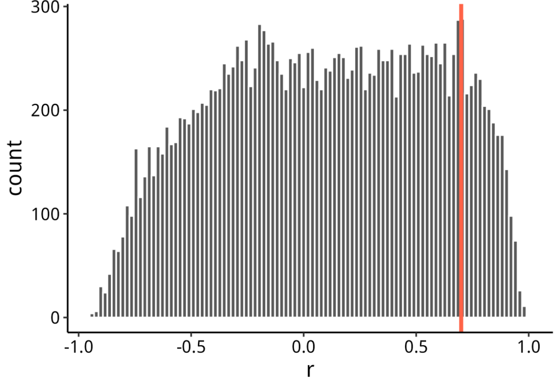
筛选边:查看R值分布
随机抽取了20k条边并绘制了一个直方图。也可以绘制整个边表,当你抽样足够大时,它不会改变分布的形状。看起来在 r>0.7(红线)时,分布迅速减少。因此,使用 r>0.7r作为截止值。
edge_table %>%
  slice_sample(n = 20000) %>%
  ggplot(aes(x = r)) +
  geom_histogram(color = "white", bins = 100) +
  geom_vline(xintercept = 0.7, color = "tomato1", size = 1.2) +
  theme_classic() +
  theme(
    text = element_text(size = 14),
    axis.text = element_text(color = "black")
  )
ggsave("r_histogram.png", height = 3.5, width = 5, bg = "white")

# 选择边
edge_table_select <- edge_table %>%
  filter(r >= 0.7)
dim(edge_table_select)
6.Module detection
使用Leiden算法来检测模块,这是一种基于图的聚类方法。Leiden方法产生的聚类中,成员之间高度相互连接。在基因共表达的术语中,它寻找彼此高度相关的基因组。
我们需要两样东西。
- 来自边表的非冗余基因ID。
- 功能注释,我已经下载了。
M82_funct_anno <- read_delim("SimpleTidy_GeneCoEx-main/Data/M82.functional_annotation.txt", delim = "\t", col_names = F, col_types = cols())
head(M82_funct_anno)

node_table <- data.frame(
  gene_ID = c(edge_table_select$from, edge_table_select$to) %>% unique()
) %>%
  left_join(M82_funct_anno, by = c("gene_ID"="X1")) %>%
  rename(functional_annotation = X2)
head(node_table)
dim(node_table)
创建网络对象
分辨率参数(resolution_parameter)控制你将获得多少个聚类。它的值越大,得到的聚类就越多。
my_network <- graph_from_data_frame(
  edge_table_select,
  vertices = node_table,
  directed = F
)

# Graph based clustering
modules <- cluster_leiden(my_network, resolution_parameter = 2,
                          objective_function = "modularity")
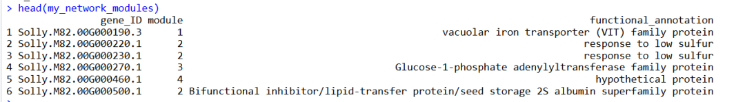
接下来,我们需要将模块成员与基因ID关联起来
my_network_modules <- data.frame(
  gene_ID = names(membership(modules)),
  module = as.vector(membership(modules))
) %>%
  inner_join(node_table, by = "gene_ID")
head(my_network_modules)
接下来,我们将只使用包含5个或更多基因的模块。
module_5 <- my_network_modules %>%
  group_by(module) %>%
  count() %>%
  arrange(-n) %>%
  filter(n >= 5)

my_network_modules <- my_network_modules %>%
  filter(module %in% module_5$module)

head(my_network_modules)
7.Module-treatment correspondance
下一个关键任务是理解聚类的表达模式
Exp_table_long_averaged_z_high_var_modules <- Exp_table_long_averaged_z_high_var %>%
  inner_join(my_network_modules, by = "gene_ID")
head(Exp_table_long_averaged_z_high_var_modules)
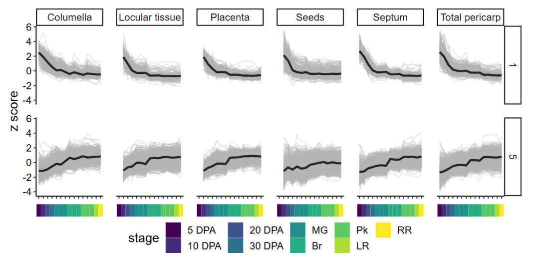
还可以通过折线图来对聚类进行质量控制(QC)。如果绘制所有模块的图,那会太多,所以我们只选择2个模块来查看。
我选择了:
- 模块1,它在5 DAP(天前收获)时表达最高——一个早期表达的聚类。
- 模块5,我们的诱饵基因所在的模块——一个晚期表达的聚类。
## QC
modules_mean_z <- Exp_table_long_averaged_z_high_var_modules %>%
  group_by(module, dev_stage, tissue, `Sample Name`) %>%
  summarise(mean.z = mean(z.score)) %>%
  ungroup()

module_line_plot <- Exp_table_long_averaged_z_high_var_modules %>%
  mutate(order_x = case_when(
    str_detect(dev_stage, "5") ~ 1,
    str_detect(dev_stage, "10") ~ 2,
    str_detect(dev_stage, "20") ~ 3,
    str_detect(dev_stage, "30") ~ 4,
    str_detect(dev_stage, "MG") ~ 5,
    str_detect(dev_stage, "Br") ~ 6,
    str_detect(dev_stage, "Pk") ~ 7,
    str_detect(dev_stage, "LR") ~ 8,
    str_detect(dev_stage, "RR") ~ 9
  )) %>%
  mutate(dev_stage = reorder(dev_stage, order_x)) %>%
  filter(module == "1" |
           module == "5") %>%
  ggplot(aes(x = dev_stage, y = z.score)) +
  facet_grid(module ~ tissue) +
  geom_line(aes(group = gene_ID), alpha = 0.3, color = "grey70") +
  geom_line(
    data = modules_mean_z %>%
      filter(module == "1" |
               module == "5") %>%
      mutate(order_x = case_when(
        str_detect(dev_stage, "5") ~ 1,
        str_detect(dev_stage, "10") ~ 2,
        str_detect(dev_stage, "20") ~ 3,
        str_detect(dev_stage, "30") ~ 4,
        str_detect(dev_stage, "MG") ~ 5,
        str_detect(dev_stage, "Br") ~ 6,
        str_detect(dev_stage, "Pk") ~ 7,
        str_detect(dev_stage, "LR") ~ 8,
        str_detect(dev_stage, "RR") ~ 9
      )) %>%
      mutate(dev_stage = reorder(dev_stage, order_x)),
    aes(y = mean.z, group = module),
    size = 1.1, alpha = 0.8
  ) +
  labs(x = NULL,
       y = "z score") +
  theme_classic() +
  theme(
    text = element_text(size = 14),
    axis.text = element_text(color = "black"),
    axis.text.x = element_blank(),
    panel.spacing = unit(1, "line")
  )

module_lines_color_strip <- expand.grid(
  tissue = unique(Metadata$tissue),
  dev_stage = unique(Metadata$dev_stage),
  stringsAsFactors = F
) %>%
  filter(dev_stage != "Anthesis") %>%
  filter(str_detect(tissue, "epider|chyma|Vasc") == F) %>%
  mutate(order_x = case_when(
    str_detect(dev_stage, "5") ~ 1,
    str_detect(dev_stage, "10") ~ 2,
    str_detect(dev_stage, "20") ~ 3,
    str_detect(dev_stage, "30") ~ 4,
    str_detect(dev_stage, "MG") ~ 5,
    str_detect(dev_stage, "Br") ~ 6,
    str_detect(dev_stage, "Pk") ~ 7,
    str_detect(dev_stage, "LR") ~ 8,
    str_detect(dev_stage, "RR") ~ 9
  )) %>%
  mutate(stage = case_when(
    str_detect(dev_stage, "MG|Br|Pk") ~ str_sub(dev_stage, start = 1, end = 2),
    T ~ dev_stage
  )) %>%
  mutate(stage = factor(stage, levels = c(
    "5 DPA",
    "10 DPA",
    "20 DPA",
    "30 DPA",
    "MG",
    "Br",
    "Pk",
    "LR",
    "RR"
  ))) %>%
  mutate(dev_stage = reorder(dev_stage, order_x)) %>%
  ggplot(aes(x = dev_stage, y = 1)) +
  facet_grid(. ~ tissue) +
  geom_tile(aes(fill = stage)) +
  scale_fill_manual(values = viridis(9, option = "D")) +
  theme_void() +
  theme(
    legend.position = "bottom",
    strip.text = element_blank(),
    text = element_text(size = 14),
    panel.spacing = unit(1, "lines")
  )

wrap_plots(module_line_plot, module_lines_color_strip, nrow = 2, heights = c(1, 0.08))
ggsave("module_line_plots.png", height = 4, width = 8.2, bg = "white")
module_line_plots
聚类热图表示
呈现这些模块的一个好方法是制作热图。
# 数据预处理 This sets z scores > 1.5 or < -1.5 to 1.5 or -1.5, respectively
modules_mean_z <- modules_mean_z %>%
  mutate(mean.z.clipped = case_when(
    mean.z > 1.5 ~ 1.5,
    mean.z < -1.5 ~ -1.5,
    T ~ mean.z
  ))

# Reorder rows and columns
modules_mean_z <- modules_mean_z %>%
  mutate(order_x = case_when(
        str_detect(dev_stage, "5") ~ 1,
        str_detect(dev_stage, "10") ~ 2,
        str_detect(dev_stage, "20") ~ 3,
        str_detect(dev_stage, "30") ~ 4,
        str_detect(dev_stage, "MG") ~ 5,
        str_detect(dev_stage, "Br") ~ 6,
        str_detect(dev_stage, "Pk") ~ 7,
        str_detect(dev_stage, "LR") ~ 8,
        str_detect(dev_stage, "RR") ~ 9
  )) %>%
  mutate(stage = case_when(
    str_detect(dev_stage, "MG|Br|Pk") ~ str_sub(dev_stage, start = 1, end = 2),
    T ~ dev_stage
  )) %>%
  mutate(stage = factor(stage, levels = c(
   "5 DPA",
   "10 DPA",
   "20 DPA",
   "30 DPA",
   "MG",
   "Br",
   "Pk",
   "LR",
   "RR"
  ))) %>%
  mutate(dev_stage = reorder(dev_stage, order_x))
head(modules_mean_z)

module_peak_exp <- modules_mean_z %>%
  group_by(module) %>%
  slice_max(order_by = mean.z, n = 1)
module_peak_exp

module_peak_exp <- module_peak_exp %>%
  mutate(order_y = case_when(
        str_detect(dev_stage, "5") ~ 1,
        str_detect(dev_stage, "10") ~ 2,
        str_detect(dev_stage, "20") ~ 3,
        str_detect(dev_stage, "30") ~ 4,
        str_detect(dev_stage, "MG") ~ 5,
        str_detect(dev_stage, "Br") ~ 6,
        str_detect(dev_stage, "Pk") ~ 7,
        str_detect(dev_stage, "LR") ~ 8,
        str_detect(dev_stage, "RR") ~ 9
  )) %>%
  mutate(peak_exp = reorder(dev_stage, order_y))

modules_mean_z_reorded <- modules_mean_z %>%
  full_join(module_peak_exp %>%
              select(module, peak_exp, order_y), by = c("module")) %>%
  mutate(module = reorder(module, -order_y))

head(modules_mean_z_reorded)

module_heatmap <- modules_mean_z_reorded %>%
  ggplot(aes(x = tissue, y = as.factor(module))) +
  facet_grid(.~ dev_stage, scales = "free", space = "free") +
  geom_tile(aes(fill = mean.z.clipped), color = "grey80") +
  scale_fill_gradientn(colors = rev(brewer.pal(11, "RdBu")), limits = c(-1.5, 1.5),
                       breaks = c(-1.5, 0, 1.5), labels = c("< -1.5", "0", "> 1.5")) +
  labs(x = NULL,
       y = "Module",
       fill = "z score") +
  theme_classic() +
  theme(
    text = element_text(size = 14),
    axis.text = element_text(color = "black"),
    axis.text.x = element_blank(),
    strip.text = element_blank(),
    legend.position = "top",
    panel.spacing = unit(0.5, "lines")
  )

heatmap_color_strip1 <- expand.grid(
  tissue = unique(Metadata$tissue),
  dev_stage = unique(Metadata$dev_stage),
  stringsAsFactors = F
) %>%
  filter(dev_stage != "Anthesis") %>%
  filter(str_detect(tissue, "epider|chyma|Vasc") == F) %>%
  filter((dev_stage == "5 DPA" &
           str_detect(tissue, "Locular tissue|Placenta|Seeds"))==F) %>%
  filter((str_detect(dev_stage, "styla") &
           str_detect(tissue, "Colum"))==F) %>%
  mutate(order_x = case_when(
        str_detect(dev_stage, "5") ~ 1,
        str_detect(dev_stage, "10") ~ 2,
        str_detect(dev_stage, "20") ~ 3,
        str_detect(dev_stage, "30") ~ 4,
        str_detect(dev_stage, "MG") ~ 5,
        str_detect(dev_stage, "Br") ~ 6,
        str_detect(dev_stage, "Pk") ~ 7,
        str_detect(dev_stage, "LR") ~ 8,
        str_detect(dev_stage, "RR") ~ 9
  )) %>%
  mutate(stage = case_when(
    str_detect(dev_stage, "MG|Br|Pk") ~ str_sub(dev_stage, start = 1, end = 2),
    T ~ dev_stage
  )) %>%
  mutate(stage = factor(stage, levels = c(
   "5 DPA",
   "10 DPA",
   "20 DPA",
   "30 DPA",
   "MG",
   "Br",
   "Pk",
   "LR",
   "RR"
  ))) %>%
  mutate(dev_stage = reorder(dev_stage, order_x)) %>%
  ggplot(aes(x = tissue, y = 1)) +
  facet_grid(.~ dev_stage, scales = "free", space = "free") +
  geom_tile(aes(fill = tissue)) +
  scale_fill_manual(values = brewer.pal(8, "Set2")) +
  guides(fill = guide_legend(nrow = 1)) +
  theme_void() +
  theme(
    legend.position = "bottom",
    strip.text = element_blank(),
    text = element_text(size = 14),
    panel.spacing = unit(0.5, "lines"),
    legend.key.height = unit(0.75, "lines")
  )

heatmap_color_strip2 <- expand.grid(
  tissue = unique(Metadata$tissue),
  dev_stage = unique(Metadata$dev_stage),
  stringsAsFactors = F
) %>%
  filter(dev_stage != "Anthesis") %>%
  filter(str_detect(tissue, "epider|chyma|Vasc") == F) %>%
  filter((dev_stage == "5 DPA" &
           str_detect(tissue, "Locular tissue|Placenta|Seeds"))==F) %>%
  filter((str_detect(dev_stage, "styla") &
           str_detect(tissue, "Colum"))==F) %>%
  mutate(order_x = case_when(
        str_detect(dev_stage, "5") ~ 1,
        str_detect(dev_stage, "10") ~ 2,
        str_detect(dev_stage, "20") ~ 3,
        str_detect(dev_stage, "30") ~ 4,
        str_detect(dev_stage, "MG") ~ 5,
        str_detect(dev_stage, "Br") ~ 6,
        str_detect(dev_stage, "Pk") ~ 7,
        str_detect(dev_stage, "LR") ~ 8,
        str_detect(dev_stage, "RR") ~ 9
  )) %>%
  mutate(stage = case_when(
    str_detect(dev_stage, "MG|Br|Pk") ~ str_sub(dev_stage, start = 1, end = 2),
    T ~ dev_stage
  )) %>%
  mutate(stage = factor(stage, levels = c(
   "5 DPA",
   "10 DPA",
   "20 DPA",
   "30 DPA",
   "MG",
   "Br",
   "Pk",
   "LR",
   "RR"
  ))) %>%
  mutate(dev_stage = reorder(dev_stage, order_x)) %>%
  ggplot(aes(x = tissue, y = 1)) +
  facet_grid(.~ dev_stage, scales = "free", space = "free") +
  geom_tile(aes(fill = stage)) +
  scale_fill_manual(values = viridis(9, option = "D")) +
  labs(fill = "stage") +
  guides(fill = guide_legend(nrow = 1)) +
  theme_void() +
  theme(
    legend.position = "bottom",
    strip.text = element_blank(),
    text = element_text(size = 14),
    panel.spacing = unit(0.5, "lines"),
    legend.key.height = unit(0.75, "lines")
  )


wrap_plots(module_heatmap, heatmap_color_strip1, heatmap_color_strip2,
           nrow = 3, heights = c(1, 0.08, 0.08), guides = "collect") &
  theme(
    legend.position = "bottom",
    legend.box = "vertical"
  )
ggsave("module_heatmap.png", height = 4.8, width = 10, bg = "white")
结果如下:被模块9捕获的水果成熟基因,实际上直到Br阶段或之后才开始发挥作用
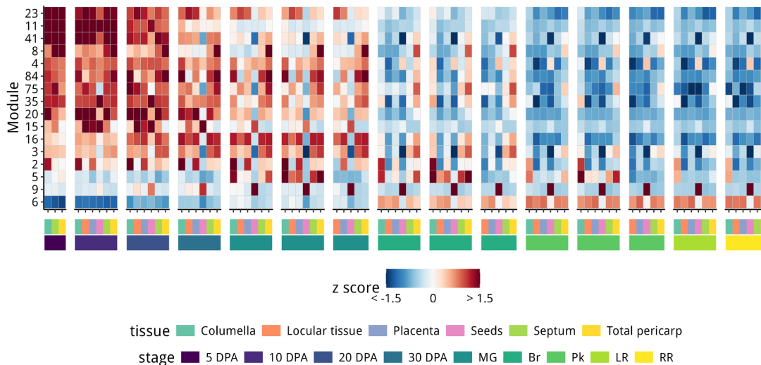
module_heatmap
8.Gene co-expression graphs
使用igraph对共表达网络进行可视化:
# 使用部分数据
neighbors_of_bait <- c(
  neighbors(my_network, v = "Solly.M82.10G020850.1"), # PG
  neighbors(my_network, v = "Solly.M82.03G005440.5"), # PSY1
  neighbors(my_network, v = "Solly.M82.01G041430.1"), #  early fruit - SAUR
  neighbors(my_network, v = "Solly.M82.03G024180.1") # seed specific - "oleosin"
) %>%
  unique()

# make a sub-network object.
subnetwork_edges <- edge_table_select %>%
  filter(from %in% names(neighbors_of_bait) &
           to %in% names(neighbors_of_bait)) %>%
  group_by(from) %>%
  slice_max(order_by = r, n = 5) %>%
  ungroup() %>%
  group_by(to) %>%
  slice_max(order_by = r, n = 5) %>%
  ungroup()

subnetwork_genes <- c(subnetwork_edges$from, subnetwork_edges$to) %>% unique()
length(subnetwork_genes)
dim(subnetwork_edges)

# subset nodes in the network
subnetwork_nodes <- node_table %>%
  filter(gene_ID %in% subnetwork_genes) %>%
  left_join(my_network_modules, by = "gene_ID") %>%
  left_join(module_peak_exp, by = "module") %>%
  mutate(module_annotation = case_when(
    str_detect(module, "114|37|1|14|3|67|19|56") ~ "early fruit",
    module == "9" ~ "seed",
    module == "5" ~ "ripening",
    T ~ "other"
  ))

dim(subnetwork_nodes)

# make sub-network object from subsetted edges and nodes.
my_subnetwork <- graph_from_data_frame(subnetwork_edges,
                                     vertices = subnetwork_nodes,
                                     directed = F)

# Use graph_from_data_frame() from igraph to build the sub-networ
 my_subnetwork %>%
  ggraph(layout = "kk", circular = F) +
  geom_edge_diagonal(color = "grey70", width = 0.5, alpha = 0.5) +
  geom_node_point(alpha = 0.8, color = "white", shape = 21, size = 2,
                  aes(fill = module_annotation)) +
  scale_fill_manual(values = c(brewer.pal(8, "Accent")[c(1,3,6)], "grey30"),
                    limits = c("early fruit", "seed", "ripening", "other")) +
  labs(fill = "Modules") +
  guides(size = "none",
         fill = guide_legend(override.aes = list(size = 4),
                             title.position = "top", nrow = 2)) +
  theme_void()+
  theme(
    text = element_text(size = 14),
    legend.position = "bottom",
    legend.justification = 1,
    title = element_text(size = 12)
  )
ggsave("subnetwork_graph.png", height = 5, width = 4, bg = "white")
结果如下:
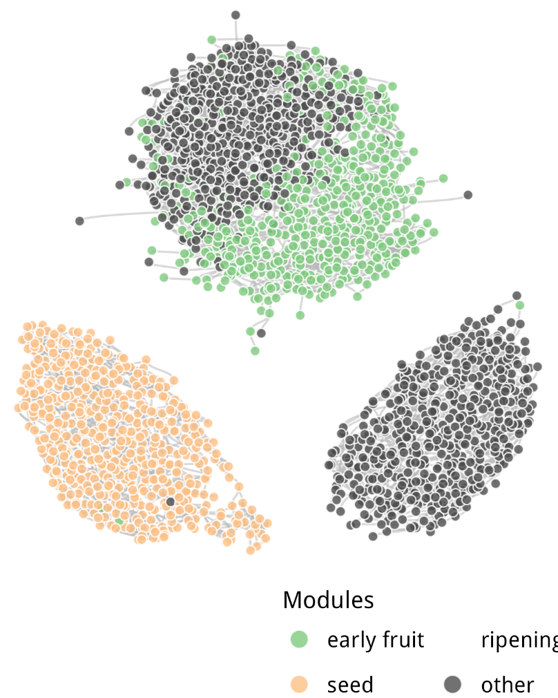
subnetwork_graph
9.平均分离图:候选基因
# Pull out direct neighbors
neighbors_of_PG_PSY1 <- c(
neighbors(my_network, v = "Solly.M82.10G020850.1"), # PG
neighbors(my_network, v = "Solly.M82.03G005440.5") # PSY1
) %>%
unique()
length(neighbors_of_PG_PSY1)
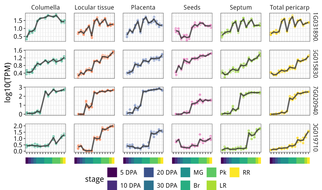
# bHLH and GRAS type TFs
my_TFs <- my_network_modules %>%
filter(gene_ID %in% names(neighbors_of_PG_PSY1)) %>%
filter(str_detect(functional_annotation, "GRAS|bHLH"))
TF_TPM <- Exp_table_long %>%
filter(gene_ID %in% my_TFs$gene_ID) %>%
inner_join(PCA_coord, by = c("library"="Run")) %>%
filter(dissection_method == "Hand") %>%
mutate(order_x = case_when(
str_detect(dev_stage, "5") ~ 1,
str_detect(dev_stage, "10") ~ 2,
str_detect(dev_stage, "20") ~ 3,
str_detect(dev_stage, "30") ~ 4,
str_detect(dev_stage, "MG") ~ 5,
str_detect(dev_stage, "Br") ~ 6,
str_detect(dev_stage, "Pk") ~ 7,
str_detect(dev_stage, "LR") ~ 8,
str_detect(dev_stage, "RR") ~ 9
)) %>%
mutate(dev_stage = reorder(dev_stage, order_x)) %>%
mutate(tag = str_remove(gene_ID, "Solly.M82.")) %>%
ggplot(aes(x = dev_stage, y = logTPM)) +
facet_grid(tag ~ tissue, scales = "free_y") +
geom_point(aes(fill = tissue), color = "white", size = 2,
alpha = 0.8, shape = 21, position = position_jitter(0.1, seed = 666)) +
stat_summary(geom = "line", aes(group = gene_ID),
fun = mean, alpha = 0.8, size = 1.1, color = "grey20") +
scale_fill_manual(values = brewer.pal(8, "Set2")) +
labs(x = NULL,
y = "log10(TPM)") +
theme_bw() +
theme(
legend.position = "none",
panel.spacing = unit(1, "lines"),
text = element_text(size = 14),
axis.text = element_text(color = "black"),
axis.text.x = element_blank(),
strip.background = element_blank()
)
wrap_plots(TF_TPM, module_lines_color_strip, nrow = 2, heights = c(1, 0.05))
ggsave("Candidate_genes_TPM.png", height = 4.8, width = 8, bg = "white")
结果如下:
10.输出结果
Bait_neighors <- M82_funct_anno %>%
  filter(X1 %in% names(neighbors_of_PG_PSY1)) %>%
  rename(Gene_ID = X1,
         annotation = X2)

head(Bait_neighors)
write_excel_csv(Bait_neighors, "PG_PSY1_neighbors.csv", col_names = T)
怎么说呢,感觉我个人不是很喜欢大篇幅使用tidyverse的代码,如果可以,我还是想用WGCNA吧!哈哈哈哈哈哈或。
去试试看,说不定是你的菜!
学徒作业
针对 手把手10分文章WGCNA复现:小胶质细胞亚群在脑发育时髓鞘形成的作用 ,里面的数据集进行wgcna以及我们的提到的Simple Tidy GeneCoEx分析,然后对比这两个模块算法的结果的一致性。这些样本进行了RNASeq测序,数据在GEO可供下载:https://www.ncbi.nlm.nih.gov/geo/query/acc.cgi?acc=GSE78809。当然我偷了个懒,该文章Supplemental material提供了整理之后的csv矩阵,大概1万3千个基因。
该文章对五个处理组,共17个老鼠:
- orange represents neonatal CD11c+ microglia (n = 4),
- green neonatal CD11c microglia (n = 4),
- blue EAE CD11c+ microglia (n = 3),
- purple EAE CD11c microglia (n = 3),
- black adult microglia (n = 3).
本文参与 腾讯云自媒体同步曝光计划,分享自微信公众号。
原始发表:2024-12-13,如有侵权请联系 cloudcommunity@tencent.com 删除
评论
登录后参与评论
推荐阅读
目录
腾讯云开发者

Copyright © 2013 - 2026 Tencent Cloud. All Rights Reserved. 腾讯云 版权所有
深圳市腾讯计算机系统有限公司 ICP备案/许可证号:粤B2-20090059 ![]() 粤公网安备44030502008569号
粤公网安备44030502008569号
腾讯云计算(北京)有限责任公司 京ICP证150476号 | 京ICP备11018762号