一网打尽转录组差异分析!!!
原创
一网打尽转录组差异分析!!!
原创
生信学习者
修改于 2024-06-20 12:38:44
修改于 2024-06-20 12:38:44
欢迎大家关注全网生信学习者系列:
- WX公zhong号:生信学习者
- Xiao hong书:生信学习者
- 知hu:生信学习者
- CDSN:生信学习者2
介绍
差异分析在转录组数据分析中占据着举足轻重的地位,是揭示基因表达变化的关键步骤。然而,面对众多如DESeq2、limma和edgeR等转录组分析R包,分析人员常常面临选择困境。本文旨在深入探讨这些常用差异分析R包的特点、优劣,以及它们与t检验/Wilcox秩和检验(Wilcox-rank-sum test)在差异分析结果上的异同点。
首先,我们需要了解这些R包的基本功能和适用场景。DESeq2、limma和edgeR均是为了应对高通量测序数据中的差异表达分析而开发的,它们各自采用了不同的统计模型和算法来识别样本间基因表达的显著差异。这些R包不仅考虑了测序数据的特性,如计数数据的离散性和高噪声,还提供了丰富的可视化工具和结果解释方法。
在比较这些R包的优劣时,我们需要考虑多个方面。例如,它们的统计模型是否适合你的数据类型和实验设计?它们的计算效率如何?它们是否提供了易于理解和解释的结果?此外,我们还需要考虑这些R包与其他生物信息学工具和流程的兼容性,以便更好地整合和分享你的分析结果。
在差异分析结果上,DESeq2、limma和edgeR与t检验/Wilcox秩和检验之间存在一定的异同点。首先,这些R包通常采用了更为复杂的统计模型来适应高通量测序数据的特性,从而提高了差异检测的灵敏度和特异性。其次,这些R包还提供了多种可视化工具和结果解释方法,使得分析结果更加易于理解和分享。然而,与t检验/Wilcox秩和检验相比,这些R包可能需要更多的计算资源和时间来完成分析。此外,由于它们采用了不同的统计模型和算法,因此可能会产生略有不同的差异检测结果。
综上所述,选择适合你的转录组数据分析的R包需要考虑多个因素,包括数据类型、实验设计、计算资源等。在分析结果时,我们也需要谨慎比较不同方法和工具之间的差异,并结合实际生物学意义进行解释和验证。
大纲
本文要点由以下几点构成:
- 下载以及导入测试数据(批量安装R包);
- 基因表达count矩阵的标准化方法(F(R)PKM/TPM);
- 基因整体水平分布(PCA/tSNE/UMAP;heatmap);
- DESeq2差异分析实现以及结果解析;
- limma差异分析实现以及结果解析;
- edgeR差异分析实现以及结果解析;
- 结合t-test或wilcox-rank-sum-test方法的差异分析实现以及结果解析(是否符合正态分布选择检验方法);
- 不同方法的结果比较(volcano plot+heatmap+venn);
- 总结。
导入R包
本次分析需要在R中批量安装包。先导入基础R包,在后面每个差异分析模块再导入所需要的差异分析R包。
library(dplyr)
library(tibble)
library(data.table)
library(ggplot2)
library(patchwork)
library(cowplot)


# rm(list = ls())
options(stringsAsFactors = F)
options(future.globals.maxSize = 1000 * 1024^2)

grp <- c("Normal", "Tumor")
grp.col <- c("#568875", "#73FAFC")
转录组数据
本文下载的TCGA-HNSC转录组数据是通过本人先前撰写的R脚本实现的,大家通过以下链接下载:
- 百度网盘链接:https://pan.baidu.com/s/178NlWqOa7mrl2QYq48N4WA
- 提取码: 请关注WX公zhong号生信学习者后台发送 转录组差异方法 获取提取码
phenotype <- fread("TCGA-HNSC-post_mRNA_clinical.csv")
count <- fread("TCGA-HNSC-post_mRNA_profile.tsv")

table(phenotype$Group)
标准化
标准化的目的是为了降低测序深度以及基因长度对基因表达谱下游分析的影响。测序深度越高则map到基因的reads也越多,同理基因长度越长则map到的reads也越多,最后对应的counts数目也越多。
- RPM/CPM: Reads/Counts of exon model per Million mapped reads (每百万映射读取的reads)
$$RPM = \frac{ExonMappedReads * 10^{6}}{TotalMappedReads}$$
- RPKM: Reads Per Kilobase of exon model per Million mapped reads (每千个碱基的转录每百万映射读取的reads)
$$RPKM = \frac{ExonMappedReads * 10^{9}}{TotalMappedReads * ExonLength}$$
- FPKM: Fragments Per Kilobase of exon model per Million mapped fragments(每千个碱基的转录每百万映射读取的fragments), 适用于PE测序。
$$FPKM = \frac{ExonMappedFragments * 10^{9}}{TotalMappedFragments * ExonLength}$$
- TPM:Transcripts Per Kilobase of exon model per Million mapped reads (每千个碱基的转录每百万映射读取的Transcripts)
$$TPM= \frac{N_i/L_i * 10^{6}}{sum(N_1/L_1+N_2/L_2+...+N_j/L_j+...+N_n/L_n)}$$ $N_i$为比对到第i个exon的reads数; $L_i$为第i个exon的长度;sum()为所有 (n个)exon按长度进行标准化之后数值的和
- 获取gene length表:对Homo_sapiens.GRCh38.101版本数据处理获取gene length数据;human_gene_all.tsv是使用biomart包获取gene symbol和ensembleID的对应关系表。
geneLength <- fread("Homo_sapiens.GRCh38.101.genelength.tsv")
geneIdAll <- fread("human_gene_all.tsv")

geneIdLength <- geneIdAll %>% filter(transcript_biotype == "protein_coding") %>%
    dplyr::select(ensembl_gene_id, external_gene_name) %>%
    inner_join(geneLength, by = c("ensembl_gene_id"="V1")) %>%
    dplyr::select(-ensembl_gene_id) %>%
    dplyr::distinct() %>%
    dplyr::rename(Length=V2)

geneIdLengthUniq <- geneIdLength[pmatch(count$Feature, geneIdLength$external_gene_name), ] %>%
    filter(!is.na(Length)) %>%
    arrange(external_gene_name)

count_cln <- count %>% filter(Feature%in%geneIdLengthUniq$external_gene_name) %>%
  arrange(Feature) %>% column_to_rownames("Feature")

if(!any(geneIdLengthUniq$external_gene_name == rownames(count_cln))){
  message("Order of GeneName is wrong")
}

gene_lengths <-geneIdLengthUniq$Length
head(geneIdLengthUniq)
- RPKM/FPKM/TPM 转换
countToFpkm <- function(counts, lengths){

  pm <- sum(counts) /1e6
  rpm <- counts/pm
  rpm/(lengths/1000)
}

countToTpm <- function(counts, lengths) {

  rpk <- counts/(lengths/1000)
  coef <- sum(rpk) / 1e6
  rpk/coef
}

# FPKM
count_FPKM <- apply(count_cln, 2, function(x){countToFpkm(x, gene_lengths)}) %>%
  data.frame()

# TPM
count_TPM <- apply(count_cln, 2, function(x){countToTpm(x, gene_lengths)}) %>%
  data.frame()
head(count_cln)
head(count_FPKM)
head(count_TPM)
整体水平比较
在做差异分析前,一般可以对数据做一个降维处理,然后看不同分组是否能在二维展开平面区分开。
ExpressionSet
先将数据存成ExpressionSet格式,ExpressionSet对象数据包含表达谱和metadata等数据,这方便后期分析。
getExprSet <- function(metadata=phenotype,
                       profile=count_cln,
                       occurrence=0.2){

  # metadata=phenotype
  # profile=count_cln
  # occurrence=0.2

  sid <- intersect(metadata$SampleID, colnames(profile))

  # phenotype
  phe <- metadata %>% filter(SampleID%in%sid) %>%
    column_to_rownames("SampleID")

  # profile by occurrence
  prf <- profile %>% rownames_to_column("tmp") %>%
    filter(apply(dplyr::select(., -one_of("tmp")), 1, function(x) {
            sum(x != 0)/length(x)}) > occurrence) %>%
    dplyr::select(c(tmp, rownames(phe))) %>%
    column_to_rownames("tmp")

  # determine the right order between profile and phenotype
  for(i in 1:ncol(prf)){
    if (!(colnames(prf)[i] == rownames(phe)[i])) {
      stop(paste0(i, " Wrong"))
    }
  }

  require(convert)
  exprs <- as.matrix(prf)
  adf <-  new("AnnotatedDataFrame", data=phe)
  experimentData <- new("MIAME",
        name="Hua ", lab="UCAS",
        contact="hua@outlook.com",
        title="TCGA-HNSC",
        abstract="The gene ExpressionSet",
        url="www.hua.top",
        other=list(notes="Created from text files"))
  expressionSet <- new("ExpressionSet", exprs=exprs,
                       phenoData=adf,
                       experimentData=experimentData)

  return(expressionSet)
}

ExprSet_count <- getExprSet(profile=count_cln)
ExprSet_FPKM <- getExprSet(profile=count_FPKM)
ExprSet_TPM <- getExprSet(profile=count_TPM)
ExprSet_count
ExprSet_FPKM
ExprSet_TPM
降维分析
高纬度数据降维方法很多,我们这里选择了PCA+tSNE+UMAP分别展示降维后的结果。
- PCA
PCAFun <- function(dataset = ExprSet_count){

  # dataset = ExprSet_count

  require(convert)
  metadata <- pData(dataset)
  profile <- exprs(dataset)

  # pca
  pca <- prcomp(scale(t(profile), center = T, scale = T))
  require(factoextra)
  eig <- get_eig(pca)
  # explains variable
  explains <- paste0(paste0("PC", seq(2)), "(", paste0(round(eig[1:2, 2], 2), "%"), ")")
  # principal component score of each sample
  score <- inner_join(pca$x %>% data.frame() %>%
                        dplyr::select(c(1:2)) %>%
                        rownames_to_column("SampleID"),
                      metadata %>% rownames_to_column("SampleID"),
                      by = "SampleID") %>%
    mutate(Group=factor(Group, levels = grp))


  # PERMANOVA
  require(vegan)
  set.seed(123)
  if(any(profile < 0)){
    res_adonis <- adonis(vegdist(t(profile), method = "manhattan") ~ metadata$Group, permutations = 999)
  }else{
    res_adonis <- adonis(vegdist(t(profile), method = "bray") ~ metadata$Group, permutations = 999)
  }
  adn_pvalue <- res_adonis[[1]][["Pr(>F)"]][1]
  adn_rsquared <- round(res_adonis[[1]][["R2"]][1],3)
  #use the bquote function to format adonis results to be annotated on the ordination plot.
  signi_label <- paste(cut(adn_pvalue,breaks=c(-Inf, 0.001, 0.01, 0.05, Inf), label=c("***", "**", "*", ".")))
  adn_res_format <- bquote(atop(atop("PERMANOVA",R^2==~.(adn_rsquared)),
                                  atop("p-value="~.(adn_pvalue)~.(signi_label), phantom())))


  pl <- ggplot(score, aes(x=PC1, y=PC2))+
              geom_point(aes(fill=Group), size=2, shape=21, stroke = .8, color = "black")+
              stat_ellipse(aes(color=Group), level = 0.95, linetype = 1, size = 1.5)+
              labs(x=explains[1], y=explains[2])+
              scale_color_manual(values = grp.col)+
              scale_fill_manual(name = "Condition",
                                values = grp.col)+
              annotate("text", x = max(score$PC1) - 8,
                       y = min(score$PC1),
                       label = adn_res_format,
                       size = 6)+
              guides(color="none")+
              theme_classic()+
              theme(axis.title = element_text(size = 10, color = "black", face = "bold"),
                    axis.text = element_text(size = 9, color = "black"),
                    text = element_text(size = 8, color = "black", family = "serif"),
                    strip.text = element_text(size = 9, color = "black", face = "bold"),
                    panel.grid = element_blank(),
                    legend.title = element_text(size = 11, color = "black", family = "serif"),
                    legend.text = element_text(size = 10, color = "black", family = "serif"),
                    legend.position = c(0, 0),
                    legend.justification = c(0, 0),
                    legend.background = element_rect(color = "black", fill = "white", linetype = 2, size = 0.5))
  return(pl)
}

PCA_count <- PCAFun(dataset = ExprSet_count)
PCA_FPKM <- PCAFun(dataset = ExprSet_FPKM)
PCA_TPM <- PCAFun(dataset = ExprSet_TPM)
plot_grid(PCA_count, PCA_FPKM, PCA_TPM, nrow=1, align="hv", labels=c("Counts", "FPKM", "TPM"))
Notes: PCA的结果在三类数据中表现都不是很好,也就是组间区分不是明显,但是PERMANOVA的检验结果显示p值是显著差异的,可是$R^2$却偏低,也就是解释度很低。
- tSNE
RtsneFun <- function(dataset = ExprSet_count,
                     perpl = 30){

  # dataset = ExprSet_count
  # perpl = 10

  require(convert)
  metadata <- pData(dataset)
  profile <- t(exprs(dataset))

  # Rtsne
  require(Rtsne)
  #set.seed(123)
  Rtsne <- Rtsne(profile,
                 dims=2,
                 perplexity=perpl,
                 verbose=TRUE,
                 max_iter=500,
                 eta=200)
  point <- Rtsne$Y %>% data.frame() %>%
    dplyr::select(c(1:2)) %>%
    setNames(c("tSNE1", "tSNE2"))
  rownames(point) <- rownames(profile)
  score <- inner_join(point %>% rownames_to_column("SampleID"),
                      metadata %>% rownames_to_column("SampleID"),
                      by = "SampleID") %>%
    mutate(Group=factor(Group, levels = grp))

  # PERMANOVA
  require(vegan)
  set.seed(123)
  if(any(profile < 0)){
    res_adonis <- adonis(vegdist(profile, method = "manhattan") ~ metadata$Group, permutations = 999)
  }else{
    res_adonis <- adonis(vegdist(profile, method = "bray") ~ metadata$Group, permutations = 999)
  }
  adn_pvalue <- res_adonis[[1]][["Pr(>F)"]][1]
  adn_rsquared <- round(res_adonis[[1]][["R2"]][1],3)
  #use the bquote function to format adonis results to be annotated on the ordination plot.
  signi_label <- paste(cut(adn_pvalue,breaks=c(-Inf, 0.001, 0.01, 0.05, Inf), label=c("***", "**", "*", ".")))
  adn_res_format <- bquote(atop(atop("PERMANOVA",R^2==~.(adn_rsquared)),
                                  atop("p-value="~.(adn_pvalue)~.(signi_label), phantom())))

  pl <- ggplot(score, aes(x=tSNE1, y=tSNE2))+
              geom_point(aes(fill=Group), size=3.5, shape=21, stroke = .8, color = "black")+
              stat_ellipse(aes(color=Group), level = 0.95, linetype = 1, size = 1.5)+
              scale_color_manual(values = grp.col)+
              scale_fill_manual(name = "Condition",
                                values = grp.col)+
              annotate("text", x = max(score$tSNE1) - 8,
                       y = max(score$tSNE2)-5,
                       label = adn_res_format,
                       size = 6)+
              guides(color="none")+
              theme_classic()+
              theme(axis.title = element_text(size = 10, color = "black", face = "bold"),
                    axis.text = element_text(size = 9, color = "black"),
                    text = element_text(size = 8, color = "black", family = "serif"),
                    strip.text = element_text(size = 9, color = "black", face = "bold"),
                    panel.grid = element_blank(),
                    legend.title = element_text(size = 11, color = "black", family = "serif"),
                    legend.text = element_text(size = 10, color = "black", family = "serif"),
                    legend.position = c(0, 0),
                    legend.justification = c(0, 0),
                    legend.background = element_rect(color = "black", fill = "white", linetype = 2, size = 0.5))
  return(pl)
}

Rtsne_count <- RtsneFun(dataset = ExprSet_count)
Rtsne_FPKM <- RtsneFun(dataset = ExprSet_FPKM)
Rtsne_TPM <- RtsneFun(dataset = ExprSet_TPM)
plot_grid(Rtsne_count, Rtsne_FPKM, Rtsne_TPM, nrow=1, align="hv", labels=c("Counts", "FPKM", "TPM"))- UMAP
UMAPFun <- function(dataset = ExprSet_count){

  # dataset = ExprSet_count

  metadata <- pData(dataset)
  profile <- t(exprs(dataset))

  # umap
  require(umap)
  umap <- umap::umap(profile)

  point <- umap$layout %>% data.frame() %>%
    setNames(c("UMAP1", "UMAP2"))
  rownames(point) <- rownames(profile)
  score <- inner_join(point %>% rownames_to_column("SampleID"),
                      metadata %>% rownames_to_column("SampleID"),
                      by = "SampleID") %>%
    mutate(Group=factor(Group, levels = grp))

  # PERMANOVA
  require(vegan)
  set.seed(123)
  if(any(profile < 0)){
    res_adonis <- adonis(vegdist(profile, method = "manhattan") ~ metadata$Group, permutations = 999)
  }else{
    res_adonis <- adonis(vegdist(profile, method = "bray") ~ metadata$Group, permutations = 999)
  }
  adn_pvalue <- res_adonis[[1]][["Pr(>F)"]][1]
  adn_rsquared <- round(res_adonis[[1]][["R2"]][1],3)
  #use the bquote function to format adonis results to be annotated on the ordination plot.
  signi_label <- paste(cut(adn_pvalue,breaks=c(-Inf, 0.001, 0.01, 0.05, Inf), label=c("***", "**", "*", ".")))
  adn_res_format <- bquote(atop(atop("PERMANOVA",R^2==~.(adn_rsquared)),
                                  atop("p-value="~.(adn_pvalue)~.(signi_label), phantom())))

  pl <- ggplot(score, aes(x=UMAP1, y=UMAP2))+
              geom_point(aes(fill=Group), size=2, shape=21, stroke = .8, color = "black")+
              stat_ellipse(aes(color=Group), level = 0.95, linetype = 1, size = 1.5)+
              scale_color_manual(values = grp.col)+
              scale_fill_manual(name = "Condition",
                                values = grp.col)+
              annotate("text", x = max(score$UMAP1),
                       y = min(score$UMAP2),
                       label = adn_res_format,
                       size = 6)+
              guides(color="none")+
              theme_classic()+
              theme(axis.title = element_text(size = 10, color = "black", face = "bold"),
                    axis.text = element_text(size = 9, color = "black"),
                    text = element_text(size = 8, color = "black", family = "serif"),
                    strip.text = element_text(size = 9, color = "black", face = "bold"),
                    panel.grid = element_blank(),
                    legend.title = element_text(size = 11, color = "black", family = "serif"),
                    legend.text = element_text(size = 10, color = "black", family = "serif"),
                    legend.position = c(0, 0),
                    legend.justification = c(0, 0),
                    legend.background = element_rect(color = "black", fill = "white", linetype = 2, size = 0.5))
  return(pl)
}

UMAP_count <- UMAPFun(dataset = ExprSet_count)
UMAP_FPKM <- UMAPFun(dataset = ExprSet_FPKM)
UMAP_TPM <- UMAPFun(dataset = ExprSet_TPM)
(UMAP_count + UMAP_FPKM + UMAP_TPM) + plot_layout(nrow = 1, guides = "collect")
总结:综合上述三种聚类分析方法,后两种基于非线性模型的方法具有较好的区分样本效果,而且TPM的区分效果貌似比Count和FPKM标准化方法更好。我后面应该度降维方法做一个原理上的总结。
热图
heatFun <- function(datset=ExprSet_count){

  # datset=ExprSet_count

  pheno <- pData(datset) %>% data.frame() %>%
    rownames_to_column("SampleID") %>%
    mutate(Group=factor(Group, levels = grp)) %>%
    arrange(Group) %>%
    column_to_rownames("SampleID")

  edata <- exprs(datset) %>% data.frame()

  # scale data: z-score
  scale_rows <- function (x) {
      m = apply(x, 1, mean, na.rm = T)
      s = apply(x, 1, sd, na.rm = T)
      return((x - m)/s)
  }
  edata_scaled <- t(scale_rows(edata))
  require(circlize)
  col_fun <- colorRamp2(c(round(range(edata_scaled)[1]), 0,
                          round(range(edata_scaled)[2])),
                        c("blue", "white", "red"))
  # row split
  dat_status <- table(pheno$Group)
  dat_status_number <- as.numeric(dat_status)
  dat_status_name <- names(dat_status)
  row_split <- c()
  for (i in 1:length(dat_status_number)) {
    row_split <- c(row_split, rep(i, dat_status_number[i]))
  }
  require(ComplexHeatmap)
  pl <- Heatmap(
          edata_scaled,
          #col = col_fun,
          cluster_rows = FALSE,
          row_order = rownames(pheno),
          show_column_names = FALSE,
          show_row_names = FALSE,
          row_names_gp = gpar(fontsize = 12),
          row_names_side = "right",
          row_dend_side = "left",
          column_title = NULL,
          heatmap_legend_param = list(
            title = "Abundance",
            title_position = "topcenter",
            border = "black",
            legend_height = unit(10, "cm"),
            direction = "horizontal"),
         row_split = row_split,
        left_annotation = rowAnnotation(foo = anno_block(gp = gpar(fill = 2:4),
            labels = grp,
            labels_gp = gpar(col = "black", fontsize = 12))),
         column_km = 2
    )
  return(pl)
}

Heat_count <- heatFun(datset = ExprSet_count)
Heat_FPKM <- heatFun(datset = ExprSet_FPKM)
Heat_TPM <- heatFun(datset = ExprSet_TPM)
Heat_count 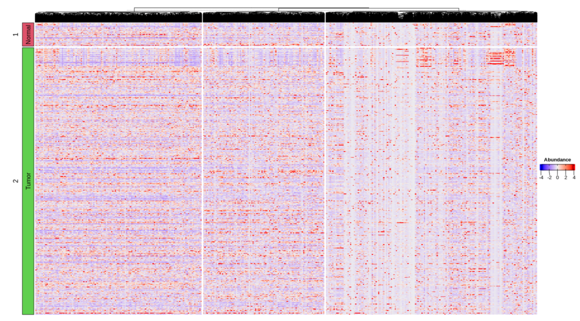
Note: 19000+基因呈现出来的heatmap太大了,暂时展示counts矩阵的结果。从这图能看出还是有部分区块基因是存在富聚集的。
DESeq2
DESeq2包输入的数据需要是counts矩阵,它使用负二项分布广义线性模型处理测序深度影响。
计算差异结果
- DESeqDataSetFromMatrix构建DESeq函数所需要的包含count矩阵的数据对象;
- DESeq函数进行差异分析。
DESeq2Fun <- function(datset=ExprSet_count){

  # datset=ExprSet_count

  profile <- exprs(datset)
  metadata <- pData(datset)

  sid <- intersect(rownames(metadata), colnames(profile))
  colData <- metadata %>% rownames_to_column("SampleID") %>%
    dplyr::select(SampleID, Group) %>%
    filter(SampleID%in%sid) %>%
    mutate(Group=factor(Group, levels = grp)) %>%
    column_to_rownames("SampleID")

  countData <- profile %>% data.frame() %>%
    dplyr::select(all_of(sid)) %>%
    as.matrix()

  if(!all(rownames(colData) == colnames(countData))){
    stop("Order is wrong please check your data")
  }

  ddsm <- DESeqDataSetFromMatrix(countData = countData,
                                 colData = colData,
                                 design = ~ Group)

  dds <- DESeq(ddsm)
  return(dds)
}

DESeq_dds <- DESeq2Fun(datset=ExprSet_count)
DESeq_dds
Notes: DESeq2_1.28.1更新了构建DESeqDataSetFromMatrix函数,原来需要将feature单独成一列,现在则不需要了,但需要保障colData的行名和countData的列名保持一致并且都是样本名字。
提取结果
DESeq_result <- results(DESeq_dds, contrast = c("Group", rev(grp)))
按照教程运行报错了,后来才发现是DESeq2_1.28.1版本的问题,更新到更高级的版本可解决该问题。这里因为是在Linux Rstudio server分析的,为了快捷安装我采用了conda模式。
conda search DEseq2

conda install -c bioconda bioconductor-deseq2=1.30.0 -y
也可以通过BiocManager::install安装
remove.packages("DESeq2")
BiocManager::install("DESeq2")
library(DESeq2)
在安装完成后,我们重新运行上述R代码,提取出DESeq2的结果文件。
DESeq_dds <- DESeq2Fun(datset=ExprSet_count)- 提取结果
DESeq_result <- results(DESeq_dds, contrast = c("Group", rev(grp)))
head(DESeq_result)
差异分组
设置差异基因过滤阈值(Foldchange+adjPval),上图设置的比较组顺序是Tumor vs Normal,所以log2foldchange > 0是Tumor组,反之则是Normal组。
DESeq_result_df <- DESeq_result %>% data.frame() %>% arrange(log2FoldChange, padj)

log2fc_threshold <- with(DESeq_result_df, mean(abs(log2FoldChange)) + 1.5 * sd(abs(log2FoldChange)))
message(paste("Threshold of log2Foldchange [Mean+1.5(SD)] is", log2fc_threshold))
pval <- 0.05
DESeq_result_df[which(DESeq_result_df$log2FoldChange >= log2fc_threshold & DESeq_result_df$padj < pval), "Enrichment"] <- grp[2]
DESeq_result_df[which(DESeq_result_df$log2FoldChange <= -log2fc_threshold & DESeq_result_df$padj < pval), "Enrichment"] <- grp[1]
DESeq_result_df[which(abs(DESeq_result_df$log2FoldChange) < log2fc_threshold | DESeq_result_df$padj >= pval), "Enrichment"] <- "Nonsignf"
table(DESeq_result_df$Enrichment)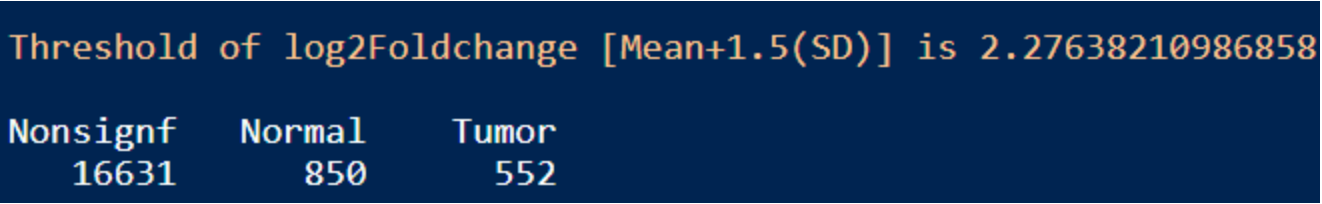
结果:差异显著的基因数目在Tumor和Normal组分别是552和850,可通过火山图展示差异基因。
Volcano plot
library(ggrepel)

VolcanoFun <- function(datset=DESeq_result_df,
                       genelist=c("SMR3B", "BPIFA2", "HTN1", "NOBOX", "MAGEA9B", "MAGEA10"),
                       group_name=grp,
                       group_col=grp.col,
                       Pval=0.05,
                       LogFC=round(log2fc_threshold, 2)){

  # datset=DESeq_result_df
  # genelist=c("SMR3B", "BPIFA2", "HTN1", "NOBOX", "MAGEA9B", "MAGEA10")
  # group_name=grp
  # group_col=grp.col
  # Pval=0.05
  # LogFC=log2fc_threshold

  dat <- datset %>% rownames_to_column("FeatureID") %>%
    mutate(color=factor(Enrichment,
                        levels = c(group_name, "Nonsignif")))
  # print(table(dat$color))
  dat_status <- table(dat$color)
  dat_status_number <- as.numeric(dat_status)
  dat_status_name <- names(dat_status)
  legend_label <- c(paste0(dat_status_name[1], " (", dat_status_number[1], ")"),
                    paste0(dat_status_name[2], " (", dat_status_number[2], ")"),
                    paste0("Nonsignif", " (", dat_status_number[3], ")"))

  dat.signif <- subset(dat, padj < Pval & abs(log2FoldChange) > LogFC) %>%
    filter(FeatureID%in%genelist)
  print(table(dat.signif$color))

  group_col_new <- c(rev(group_col), "grey80")
  group_name_new <- levels(dat$color)

  xlabel <- paste0("log2(", paste(rev(group_name), collapse="/"), ")")

  # Make a basic ggplot2 object with x-y values
  pl <- ggplot(dat, aes(x=log2FoldChange, y=-log10(padj), color=color))+
          geom_point(size=1, alpha=1, stroke=1)+
          scale_color_manual(name=NULL,
                             values=group_col_new,
                             labels=c(legend_label, "Nonsignif"))+
          xlab(xlabel) +
          ylab(expression(-log[10]("adjusted p-value")))+
          geom_hline(yintercept=-log10(Pval), alpha=.8, linetype=2, size=.7)+
          geom_vline(xintercept=LogFC, alpha=.8, linetype=2, size=.7)+
          geom_vline(xintercept=-LogFC, alpha=.8, linetype=2, size=.7)+
          geom_text_repel(data = dat.signif,
                          aes(label = FeatureID),
                          size = 4,
                          max.overlaps = getOption("ggrepel.max.overlaps", default = 80),
                          segment.linetype = 1,
                          segment.curvature = -1e-20,
                          box.padding = unit(0.35, "lines"),
                          point.padding = unit(0.3, "lines"),
                          arrow = arrow(length = unit(0.005, "npc")),
                          color = "black",     # text color
                          bg.color = "white", # shadow color
                          bg.r = 0.15)+
          annotate("text", x=min(dat$log2FoldChange), y=-log10(Pval), label=Pval, size=6, color="red")+
          annotate("text", x=LogFC, y=0, label=LogFC, size=6, color="red")+
          annotate("text", x=-LogFC, y=0, label=-LogFC, size=6, color="red")+
          scale_y_continuous(trans = "log1p")+
          guides(color=guide_legend(override.aes = list(size = 3)))+
          theme_bw()+
          theme(axis.title = element_text(color = "black", size = 12),
                axis.text = element_text(color = "black", size = 10),
                text = element_text(size = 8, color = "black", family="serif"),
                panel.grid = element_blank(),
                #legend.position = "right",
                legend.position = c(.15, .1),
                legend.key.height = unit(0.6,"cm"),
                legend.text = element_text(face = "bold", color = "black", size = 8),
                strip.text = element_text(face = "bold", size = 14))
  return(pl)
}

VolcanoFun(datset=DESeq_result_df, genelist=c("SMR3B", "BPIFA2", "HTN1", "NOBOX", "MAGEA9B", "MAGEA10"))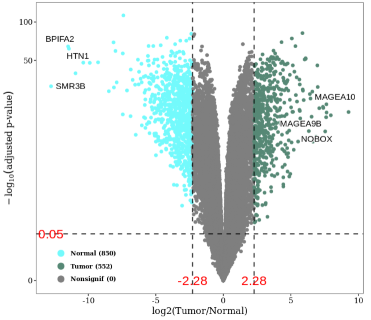
Notes: log2Foldchange > 0是富集在Tumor组,图上表示NOBOX, MAGEA9B, MAGEA10 是富集在Tumor组,也可以从公式log2(Tumor/Normal)看出。为了验证上述结论,使用boxplot图展示结果。
boxplot
BoxplotFun <- function(datset=ExprSet_count,
                       genelist=c("SMR3B", "BPIFA2", "HTN1", "NOBOX", "MAGEA9B", "MAGEA10"),
                       group_name=grp,
                       group_col=grp.col){

  # datset=ExprSet_count
  # genelist=c("SMR3B", "BPIFA2", "HTN1", "NOBOX", "MAGEA9B", "MAGEA10")
  # group_name=grp
  # group_col=grp.col

  pheno <- pData(datset) %>%
      rownames_to_column("SampleID") %>%
      filter(Group%in%group_name) %>%
      mutate(Group=factor(Group, levels = group_name)) %>%
      column_to_rownames("SampleID")

  print(table(pheno$Group))

  edata <- data.frame(exprs(datset)) %>%
            dplyr::select(rownames(pheno)) %>%
            rownames_to_column("FeatureID") %>%
            filter(FeatureID%in%genelist) %>%
            column_to_rownames("FeatureID")

  mdat <- pheno %>% dplyr::select(Group) %>%
    rownames_to_column("SampleID") %>%
    inner_join(t(edata) %>% data.frame() %>% rownames_to_column("SampleID"), by = "SampleID") %>%
    column_to_rownames("SampleID")

  plotdata <- mdat %>% tidyr::gather(key="FeatureID", value="value", -Group) %>%
    mutate(Group=factor(Group, levels = group_name))
  plotdata$FeatureID <- factor(plotdata$FeatureID, levels = genelist)

  pl <- ggplot(plotdata, aes(x=Group, y=value, fill=Group))+
          stat_boxplot(geom="errorbar", width=0.15,
                       position=position_dodge(0.4)) +
          geom_boxplot(width=0.4,
                       outlier.colour="black",
                       outlier.shape=21,
                       outlier.size=.5)+
          scale_fill_manual(values=group_col)+
          #ggpubr::stat_compare_means(method = "wilcox.test", comparisons = group_name)+
          facet_wrap(facets="FeatureID", scales="free_y", nrow=2)+
          labs(x="", y="Gene Count")+
          guides(fill="none")+
          theme_bw()+
          theme(axis.title = element_text(color="black", size=12),
                axis.text.x = element_text(color="black", size=10, hjust=.5, vjust=.5, angle=60),
                text = element_text(size=8, color="black", family="serif"),
                panel.grid = element_blank(),
                strip.text = element_text(face="bold", size=12))

  return(pl)
}

BoxplotFun(datset=ExprSet_count,
           genelist=c("SMR3B", "BPIFA2", "HTN1", "NOBOX", "MAGEA9B", "MAGEA10"))
Notes: 从图中可以看出,最显著富集的基因在另一组的表达值(counts数目)几乎都为0,这说明这些基因是某组独有的基因(需要进一步查看出现率判断是否是独有还是仅仅低丰度而已,因为Tumor组样本数目要远远大于Normal组),而DESeq2通过标准化因子能区分出来,而用wilcox-test检验会出现not enough observations的警告信息,因此注释掉stat_compare_means函数。
总结:表达谱矩阵是count matrix的时,可以使用DESeq2包做假设检验(差异分析)。以前做扩增子分析的时候,OTU table也是count matrix,其实也可以用该包做假设检验,但是如果转换成Relative abundance则不可。除此之外,输入参数design还可以添加协变量进行校正处理,后面有时间再写另一篇专门介绍怎么用DESeq2(limma/edgeR)校正协变量的博客吧。
limma
limma最初是用于微阵列芯片基因表达的差异分析,但后来它提供的voom函数使其可以应用于转录组等差异分析(limma-voom模型),那我们肯定好奇voom函数的原理是什么。
Voom功能
这里要着重介绍下voom函数的作用:
- 标准化counts成CPM:log2 transform;
- 计算每个基因的log2CPM的线性模型残差(residuals = observed - fitted);
- 通过平均表达值拟合残差标准差(residual standard deviation);
- 结合拟合平滑曲线获得的每个基因的权重和log2CPM值用于后续差异分析。

计算过程
- 构建分组矩阵;
- 构建DGEList对象;
- 计算Counts标准化因子;
- voom标准化;
- 线性模型计算每个基因在分组的weighted least square;
- 构建比较对象;
- 计算每个基因在比较对象间的比较结果;
- 在基因的平均标准误基础上,使用经典贝叶斯算法缩小基因组间比较结果的最大最小标准误差;
- 提取最终差异结果。
library(limma)
Limma2Fun <- function(datset=ExprSet_count){
# datset=ExprSet_count
profile <- exprs(datset)
metadata <- pData(datset)
sid <- intersect(rownames(metadata), colnames(profile))
colData <- metadata %>% rownames_to_column("SampleID") %>%
dplyr::select(SampleID, Group) %>%
filter(SampleID%in%sid) %>%
mutate(Group=factor(Group, levels = grp)) %>%
column_to_rownames("SampleID")
countData <- profile %>% data.frame() %>%
dplyr::select(all_of(sid)) %>%
as.matrix()
if(!all(rownames(colData) == colnames(countData))){
stop("Order is wrong please check your data")
}
# group matrix
design <- model.matrix(~0 + Group, data = colData)
colnames(design) <- levels(colData$Group)
rownames(design) <- colnames(countData)
# DGEList object: counts-> colnames:Samples; rownames: Features
dge_obj <- edgeR::DGEList(counts = countData)
dge_obj_factors <- edgeR::calcNormFactors(dge_obj)
# voom
dat_voom <- voom(counts = dge_obj_factors,
design = design,
normalize.method = "quantile",
plot = TRUE)
# Linear model to calculate weighted least squares per gene in each group
fit <- lmFit(object = dat_voom,
design = design)
# Comparison between two groups
contr <- paste(rev(levels(colData$Group)), collapse = "-")
contr.matrix <- makeContrasts(contrasts = contr,
levels = design)
# Estimate contrast for each gene
fit.contr <- contrasts.fit(fit, contr.matrix)
# Empirical Bayes smoothing of standard errors
fit.ebay <- eBayes(fit.contr)
# DE result table
res_table <- topTable(fit.ebay, coef = contr, n=Inf, sort.by = "P")
return(res_table)
}
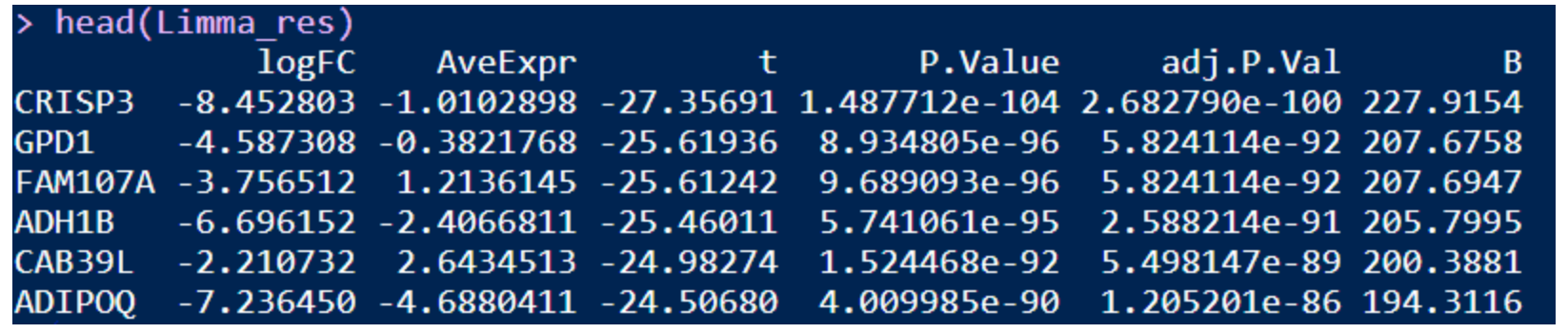
Limma_res <- Limma2Fun(datset=ExprSet_count)
head(Limma_res)查看voom拟合曲线结果:曲线拟合不够平滑,说明需要设置counts或occurrence过滤阈值过滤离群的基因

limma差异结果:
差异分组
设置差异基因过滤阈值(logFC+adj.P.Val)
Limma_res_df <- Limma_res %>% data.frame() %>% arrange(logFC, adj.P.Val)

log2fc_threshold <- with(Limma_res_df, mean(abs(logFC)) + 1.5 * sd(abs(logFC)))
message(paste("Threshold of log2Foldchange [Mean+1.5(SD)] is", log2fc_threshold))
pval <- 0.05
Limma_res_df[which(Limma_res_df$logFC >= log2fc_threshold & Limma_res_df$adj.P.Val < pval), "Enrichment"] <- grp[2]
Limma_res_df[which(Limma_res_df$logFC <= -log2fc_threshold & Limma_res_df$adj.P.Val < pval), "Enrichment"] <- grp[1]
Limma_res_df[which(abs(Limma_res_df$logFC) < log2fc_threshold | Limma_res_df$adj.P.Val >= pval), "Enrichment"] <- "Nonsignf"
table(Limma_res_df$Enrichment)
结果:差异显著的基因数目在Tumor和Normal组分别是583和861,火山图展示差异基因如上图修改代码即可。
edgeR
edgeR包也是基于线性模型做差异分析的包。
计算过程
- 先存储counts成DGEList对象;
- 过滤数据(可选择);
- 标准化counts矩阵;
- 计算离散程度(整体可变性评估estimateGLMCommonDisp;趋势模型estimateGLMTrendedDisp;比较组estimateGLMTagwiseDisp);
- GLM 模型的likelihood ratio test进行差异分析。
library(edgeR)

EdgeR2Fun <- function(datset=ExprSet_count){

  # datset=ExprSet_count

  profile <- exprs(datset)
  metadata <- pData(datset)

  sid <- intersect(rownames(metadata), colnames(profile))
  colData <- metadata %>% rownames_to_column("SampleID") %>%
    dplyr::select(SampleID, Group) %>%
    filter(SampleID%in%sid) %>%
    mutate(Group=factor(Group, levels = grp)) %>%
    column_to_rownames("SampleID")

  countData <- profile %>% data.frame() %>%
    dplyr::select(all_of(sid)) %>%
    as.matrix()

  if(!all(rownames(colData) == colnames(countData))){
    stop("Order is wrong please check your data")
  }

  # group matrix
  design <- model.matrix(~0 + Group, data = colData)
  colnames(design) <- levels(colData$Group)
  rownames(design) <- colnames(countData)

  # Filter data
  # keep <- rowSums(cpm(countData) > 100) >= 2
  # countData <- countData[keep, ]

  # DGEList object: counts-> colnames:Samples; rownames: Features
  dge_obj <- DGEList(counts = countData)
  dge_obj_factors <- calcNormFactors(dge_obj)

  plotMDS(dge_obj_factors, method="bcv", col=as.numeric(colData$Group))
  legend("bottomleft", as.character(unique(colData$Group)), col=1:2, pch=20)

  # GLM estimates of dispersion
  dge <- estimateGLMCommonDisp(dge_obj_factors, design)
  dge <- estimateGLMTrendedDisp(dge, design, method="power")
  # You can change method to "auto", "bin.spline", "power", "spline", "bin.loess".
  # The default is "auto" which chooses "bin.spline" when > 200 tags and "power" otherwise.
  dge <- estimateGLMTagwiseDisp(dge, design)
  plotBCV(dge)

  # GLM testing for differential expression:
  fit <- glmFit(dge, design)
  fit2 <- glmLRT(fit, contrast=c(-1, 1)) # Normal:-1; Tumor:1

  res_table <- topTags(fit2, n=nrow(countData)) %>% data.frame()

  return(res_table)
}

EdgeR_res <- EdgeR2Fun(datset=ExprSet_count)
head(EdgeR_res)
差异分组
设置差异基因过滤阈值(logFC+FDR)
EdgeR_res_df <- EdgeR_res %>% arrange(logFC, FDR)

log2fc_threshold <- with(EdgeR_res_df, mean(abs(logFC)) + 1.5 * sd(abs(logFC)))
message(paste("Threshold of log2Foldchange [Mean+1.5(SD)] is", log2fc_threshold))
pval <- 0.05
EdgeR_res_df[which(EdgeR_res_df$logFC >= log2fc_threshold & EdgeR_res_df$FDR < pval), "Enrichment"] <- grp[2]
EdgeR_res_df[which(EdgeR_res_df$logFC <= -log2fc_threshold & EdgeR_res_df$FDR < pval), "Enrichment"] <- grp[1]
EdgeR_res_df[which(abs(EdgeR_res_df$logFC) < log2fc_threshold | EdgeR_res_df$FDR >= pval), "Enrichment"] <- "Nonsignf"
table(EdgeR_res_df$Enrichment)
结果:差异显著的基因数目在Tumor和Normal组分别是535和842,火山图展示差异基因如上图修改代码即可。
Wilcox-rank-sum test or t-test
判断基因的表达值是否符合正态分布,是则选择t-test,否则选择wilcox-rank-sum test,log2foldchange根据scale结果的两组均值相除获取。
计算差异结果
DEA_test <- function(datset=ExprSet_count,
                     group_info="Group",
                     group_name=grp){

  # datset=ExprSet
  # group_info="Group"
  # group_name=grp


  phenotype <- pData(datset)
  profile <- exprs(datset)
  phenotype_cln <- phenotype %>% dplyr::select(all_of(group_info))
  colnames(phenotype_cln)[which(colnames(phenotype_cln) == group_info)] <- "Group"
  pheno <- phenotype_cln %>%
      rownames_to_column("SampleID") %>%
      filter(Group%in%group_name) %>%
      mutate(Group=factor(Group, levels = group_name)) %>%
      column_to_rownames("SampleID")
  print(table(pheno$Group))

  edata <- profile[, rownames(pheno)]

  if(length(unique(pheno$Group)) != 2){
    stop("Levels of Group must be 2 levels")
  }

  # Checking whether the two groups that where tested were normally distributed using the Shapiro-Wilk test
  shapiro_res <- apply(edata, 1, function(x, y){
    #dat <- data.frame(value=as.numeric(edata[1, ]), group=pheno$Group)
    dat <- data.frame(value=x, group=y)

    nUnique <- tapply(dat$value, dat$group, function(x){length(unique(x))})
    if(nUnique[1] < 5 | nUnique[2] < 5){
      res <- NA
    }else{
      t_res <- tapply(dat$value, dat$group, shapiro.test)
      if(t_res[[1]]$p.value < 0.05){
        res <- FALSE
      }else{
        res <- TRUE
      }
    }
    return(res)
  }, pheno$Group) %>%
    data.frame() %>%
    setNames("Normal") %>%
    rownames_to_column("FeatureID")

  shapiro_res_final <- shapiro_res %>% filter(!is.na(Normal))
  Normal_prof <- edata[rownames(edata)%in%shapiro_res_final$Normal, ]
  Non_Normal_prof <- edata[!rownames(edata)%in%shapiro_res_final$Normal, ]

  if(nrow(Normal_prof) != 0){
    # Normally distributed proteins
    Welch_res <- apply(Normal_prof, 1, function(x, y){

      dat <- data.frame(value=as.numeric(x), group=y)
      mn_GM <- tapply(dat$value_scale, dat$group, compositions::geometricmean) %>%
        data.frame() %>% setNames("value") %>%
        rownames_to_column("Group")
      mn_GM1 <- with(mn_GM, mn_GM[Group%in%group_name[1], "value"])
      mn_GM2 <- with(mn_GM, mn_GM[Group%in%group_name[2], "value"])
      Log2FC_GM <- log2(mn_GM1/mn_GM2)

      # pvalue
      rest <- rstatix::t_test(data = dat, value ~ group)

      return(c(Log2FC_GM, mn_GM1, mn_GM2,
               rest$statistic, rest$p))
    }, pheno$Group) %>%
      t() %>% data.frame() %>%
      setNames(c("logFC", paste0("geometricmean_", group_name),
                 "Statistic", "P.value"))
    Normal_res <- Welch_res %>%
      rownames_to_column("FeatureID") %>%
      arrange(desc(abs(logFC)), P.value)
  }else{
    Normal_res <- data.frame()
  }

  if(nrow(Non_Normal_prof) != 0){
    # non-Normally distributed proteins
    Wilcox_res <- apply(Non_Normal_prof, 1, function(x, y){
      dat <- data.frame(value=as.numeric(x), group=y)

      # Fold2Change
      dat$value_scale <- scale(dat$value, center = TRUE, scale = TRUE)
      mn_GM <- tapply(dat$value_scale, dat$group, compositions::geometricmean) %>%
        data.frame() %>% setNames("value") %>%
        rownames_to_column("Group")
      mn_GM1 <- with(mn_GM, mn_GM[Group%in%group_name[1], "value"])
      mn_GM2 <- with(mn_GM, mn_GM[Group%in%group_name[2], "value"])
      Log2FC_GM <- log2(mn_GM1/mn_GM2)

      # pvalue
      rest <- wilcox.test(data = dat, value ~ group)

      return(c(Log2FC_GM, mn_GM1, mn_GM2,
               rest$statistic, rest$p.value))
    }, pheno$Group) %>%
      t() %>% data.frame() %>%
      setNames(c("logFC", paste0("geometricmean_", group_name),
                 "Statistic", "P.value"))
    Non_Normal_res <- Wilcox_res %>%
      rownames_to_column("FeatureID") %>%
      arrange(desc(abs(logFC)), P.value)
  }else{
    Non_Normal_res <- data.frame()
  }

  # Number & Block
  res <- rbind(Normal_res, Non_Normal_res)
  res$adj.P.Val <- p.adjust(as.numeric(res$P.value), method = "BH")

  dat_status <- table(pheno$Group)
  dat_status_number <- as.numeric(dat_status)
  dat_status_name <- names(dat_status)
  res$Block <- paste(paste(dat_status_number[1], dat_status_name[1], sep = "_"),
                         "vs",
                         paste(dat_status_number[2], dat_status_name[2], sep = "_"))

  res_final <- res %>% dplyr::select(FeatureID, Block, adj.P.Val, P.value, everything()) %>%
    arrange(adj.P.Val)

  return(res_final)
}

Test_res <- DEA_test(datset=ExprSet_count)
head(Test_res)
差异分组
设置差异基因过滤阈值(logFC+adj.P.Va)
Test_res_df <- Test_res %>% filter(!is.nan(logFC)) %>%
  filter(!is.infinite(logFC)) %>%
  filter(is.finite(logFC)) %>%
  arrange(logFC, adj.P.Val)

log2fc_threshold <- with(Test_res_df, mean(abs(logFC)) + 1.5 * sd(abs(logFC)))
message(paste("Threshold of log2Foldchange [Mean+1.5(SD)] is", log2fc_threshold))
pval <- 0.05
Test_res_df[which(Test_res_df$logFC >= log2fc_threshold & Test_res_df$adj.P.Va < pval), "Enrichment"] <- grp[1]
Test_res_df[which(Test_res_df$logFC <= -log2fc_threshold & Test_res_df$adj.P.Va < pval), "Enrichment"] <- grp[2]
Test_res_df[which(abs(Test_res_df$logFC) < log2fc_threshold | Test_res_df$adj.P.Va >= pval), "Enrichment"] <- "Nonsignf"
table(Test_res_df$Enrichment)
结果:差异显著的基因数目在Tumor和Normal组分别是716和294,火山图展示差异基因如上图修改代码即可。
不同方法的结果比较
虽然log2FoldChange值都是使用mean+1.5SD(均值+1.5倍方差),但是会发现四种方法的最后的log2FoldChange的阈值均不相同,这也是导致差异基因数目不同的原因之一。
保存结果
save(DESeq_result_df, Limma_res_df, EdgeR_res_df, Test_res_df, file = "DEA.RData")差异基因数目分布
DEA_status <- data.frame(DESeq2=as.numeric(table(DESeq_result_df$Enrichment)),
                         Limma=as.numeric(table(Limma_res_df$Enrichment)),
                         EdgeR=as.numeric(table(EdgeR_res_df$Enrichment)),
                         T_wilcox=as.numeric(table(Test_res_df$Enrichment)))
rownames(DEA_status) <- c("Non-significant", grp)
#DT::datatable(DEA_status)
DEA_status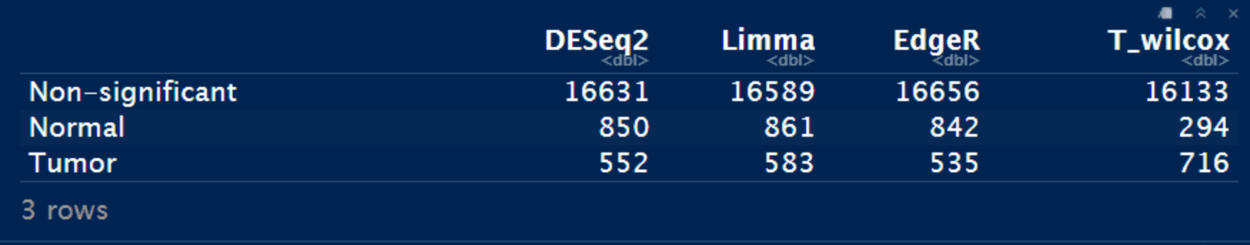
Notes: T_wilcox方法的差异基因数目是最少的。
差异基因交集Venn
Venn画图
DESeq_DEG <- DESeq_result_df %>% filter(Enrichment != "Nonsignf")
Limma_DEG <- Limma_res_df %>% filter(Enrichment != "Nonsignf")
EdgeR_DEG <- EdgeR_res_df %>% filter(Enrichment != "Nonsignf")
Test_DEG <- Test_res_df %>% filter(Enrichment != "Nonsignf")

library(ggVennDiagram)

dat_DEG <- list(
  A = DESeq_DEG$FeatureID,
  B = Limma_DEG$FeatureID,
  C = EdgeR_DEG$FeatureID,
  D = Test_DEG$FeatureID)

ggVennDiagram(dat_DEG, label_alpha = 0,
  category.names = c("DESeq2", "Limma+Voom", "EdgeR", "T-test/WilcoxTest")) +
  scale_fill_gradient(low = "blue", high = "yellow")+
  ggtitle("Comprison of Differential Expression Approaches")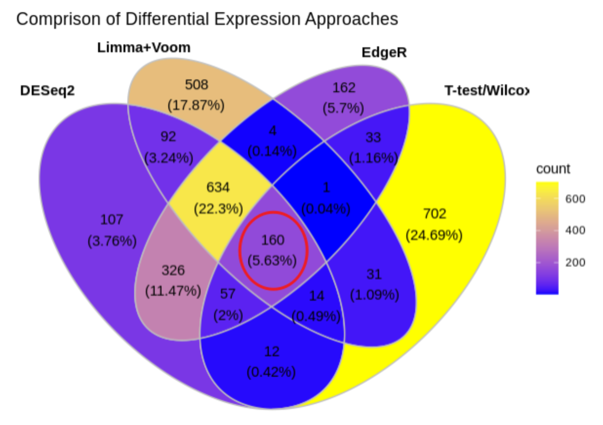
Notes:
- 四种方法重叠的差异基因数目是160个;
- DEseq2和Limma+Voom的重叠差异基因数目:92+634+160+14;
- DEseq2和EdgeR的重叠差异基因数目:634+326+57+160;
- DEseq2和T-test/WilcoxTest的重叠差异基因数目:160+57+12+14;
- DEseq2,Limma+Voom和EdgeR的重叠差异基因数目:634+160;
- T-test/WilcoxTest和其他三种方法的重叠差异基因数目最少。
差异基因heatmap+volcano
library(tinyarray)

dat_count <- exprs(ExprSet_count)
dat_group <- pData(ExprSet_count)

h1 <- draw_heatmap(dat_count[DESeq_DEG$FeatureID, ], factor(dat_group$Group), n_cutoff = 2)
h2 <- draw_heatmap(dat_count[Limma_DEG$FeatureID, ], factor(dat_group$Group), n_cutoff = 2)
h3 <- draw_heatmap(dat_count[EdgeR_DEG$FeatureID, ], factor(dat_group$Group), n_cutoff = 2)
h4 <- draw_heatmap(dat_count[Test_DEG$FeatureID, ], factor(dat_group$Group), n_cutoff = 2)


m2d <- function(x){
  mean(abs(x)) + 1.5 * sd(abs(x))
}

v1 <- draw_volcano(DESeq_result_df %>% column_to_rownames("FeatureID"), pkg = 1, logFC_cutoff = m2d(DESeq_result_df$log2FoldChange))
v2 <- draw_volcano(Limma_res_df %>% column_to_rownames("FeatureID"), pkg = 3, logFC_cutoff = m2d(Limma_res_df$logFC))
v3 <- draw_volcano(EdgeR_res_df %>% column_to_rownames("FeatureID"), pkg = 2, logFC_cutoff = m2d(EdgeR_res_df$logFC))

# convert Test_res_df format into DESeq_result_df format
Test_res_df_DESeq <- Test_res_df %>% dplyr::rename(baseMean=geometricmean_Tumor,
                                                   log2FoldChange=logFC,
                                                   lfcSE=geometricmean_Normal,
                                                   stat=Statistic,
                                                   pvalue=P.value,
                                                   padj=adj.P.Val) %>%
  dplyr::select(FeatureID, baseMean, log2FoldChange, lfcSE, stat, pvalue, padj, Enrichment)

v4 <- draw_volcano(Test_res_df_DESeq %>% column_to_rownames("FeatureID"), pkg = 1, logFC_cutoff = m2d(Test_res_df_DESeq$log2FoldChange))+
  xlab("T-test/WilcoxTest")

(h1 + h2 + h3 + h4 + v1 + v2 + v3 + v4) +
  plot_layout(guides = "collect", nrow = 2) & theme(legend.position = "none")
Notes: 火山图和热图也表明前三种差异检验方法差异基因趋势相对一致,而最后一种与前面三种均存在差异,这提示我们用counts矩阵在t-test/wilcox-rank-sum test中做假设检验时候要非常小心注意(也说明测序深度对假设检验结果影响较大)。
共有差异基因venn
综上,我们提取前三种方法(DEseq2,Limma+Voom和EdgeR)的重叠差异基因做后续分析,鉴别三种方法的优劣。
DESeq_DEG <- DESeq_result_df %>% filter(Enrichment != "Nonsignf")
Limma_DEG <- Limma_res_df %>% filter(Enrichment != "Nonsignf")
EdgeR_DEG <- EdgeR_res_df %>% filter(Enrichment != "Nonsignf")

ExtractDEG <- function(datDEG=DESeq_DEG,
                       tag=grp[1]){

  tmp <- datDEG %>% filter(Enrichment == tag)
  res <- tmp$FeatureID

  return(res)
}
DESeq_DEG_normal <- ExtractDEG(datDEG=DESeq_DEG, tag=grp[1])
DESeq_DEG_tumor <- ExtractDEG(datDEG=DESeq_DEG, tag=grp[2])

Limma_DEG_normal <- ExtractDEG(datDEG=Limma_DEG, tag=grp[1])
Limma_DEG_tumor <- ExtractDEG(datDEG=Limma_DEG, tag=grp[2])

EdgeR_DEG_normal <- ExtractDEG(datDEG=EdgeR_DEG, tag=grp[1])
EdgeR_DEG_tumor <- ExtractDEG(datDEG=EdgeR_DEG, tag=grp[2])


DEG_normal <- intersect(DESeq_DEG_normal, intersect(Limma_DEG_normal, EdgeR_DEG_normal))
DEG_tumor <- intersect(DESeq_DEG_tumor, intersect(Limma_DEG_tumor, EdgeR_DEG_tumor))

draw_venn(list(DESeq2=DESeq_DEG_normal,
               Limma=Limma_DEG_normal,
               EdgeR=EdgeR_DEG_normal),
          "DEG in Normal") +
draw_venn(list(DESeq2=DESeq_DEG_tumor,
               Limma=Limma_DEG_tumor,
               EdgeR=EdgeR_DEG_tumor),
          "DEG in Tumor")
Notes: 三种方法富集在Normal和Tumor组的差异基因还是有区别的。接下来我们用相关性图展示三种方法的差异基因的相关性。
差异基因Log2Foldchange相关性分析
差异基因的Log2Foldchange相关性分析 (参考文章转录组分析5——差异表达分析)
library(corrplot)

All_DEG <- unique(c(DESeq_DEG$FeatureID, Limma_DEG$FeatureID, EdgeR_DEG$FeatureID))
length(All_DEG)

All_DEG_lg2FC <- data.frame(DESeq2=DESeq_result_df[DESeq_result_df$FeatureID%in%All_DEG, 3],
                            Limma=Limma_res_df[Limma_res_df$FeatureID%in%All_DEG, 2],
                            EdgeR=EdgeR_res_df[EdgeR_res_df$FeatureID%in%All_DEG, 2]) %>%
  na.omit()

All_DEG_lg2FC_cor <- cor(All_DEG_lg2FC)
All_DEG_lg2FC_cor

corrplot(All_DEG_lg2FC_cor)
共有差异基因总结
三种方法的差异基因的PCA+heatmap+Venn(参考3大差异分析r包:DESeq2、edgeR和limma)
DEG_normal <- intersect(DESeq_DEG_normal, intersect(Limma_DEG_normal, EdgeR_DEG_normal))
DEG_tumor <- intersect(DESeq_DEG_tumor, intersect(Limma_DEG_tumor, EdgeR_DEG_tumor))

dat_count_log <- log2(cpm(dat_count)+1)
DEG_heatmap <- draw_heatmap(dat_count_log[c(DEG_normal, DEG_tumor), ], factor(dat_group$Group), n_cutoff = 2)
DEG_pca <- draw_pca(dat_count_log[c(DEG_normal, DEG_tumor), ], factor(dat_group$Group))

DEG_Normal_venn <- draw_venn(list(DESeq2=DESeq_DEG_normal,
               Limma=Limma_DEG_normal,
               EdgeR=EdgeR_DEG_normal),
          "DEG in Normal")
DEG_Tumor_venn <- draw_venn(list(DESeq2=DESeq_DEG_tumor,
               Limma=Limma_DEG_tumor,
               EdgeR=EdgeR_DEG_tumor),
          "DEG in Tumor")

(DEG_pca + DEG_heatmap + DEG_Normal_venn + DEG_Tumor_venn) +
  plot_layout(nrow = 2, guides = "collect")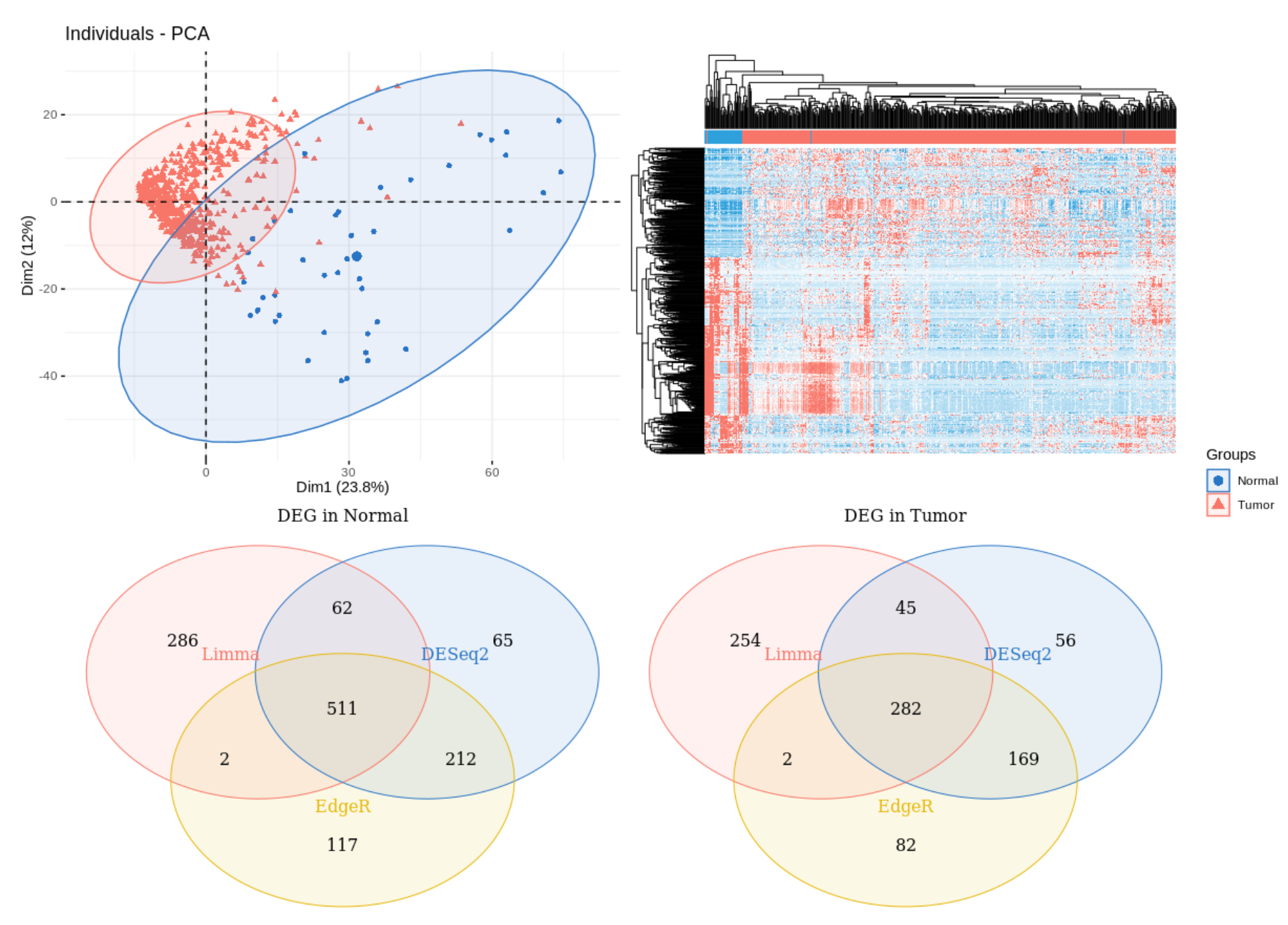
总结
- 有文章说edgeR分析速度快,但是从这次分析看,它反而是最慢的,另外edgeR的假阳性太高;
- DESeq2在计算标准化因子时耗时太久,但它的标准化因子相对来说最合理;
- 三种方法得到的差异基因不是完全重叠的,但再提取它们所有的差异基因log2Foldchange值做相关性分析,发现相似度极高,也就是说明三种方法差异不是很大;
- 最后大家选择适合自己的方法做差异分析即可。
参考
原创声明:本文系作者授权腾讯云开发者社区发表,未经许可,不得转载。
如有侵权,请联系 cloudcommunity@tencent.com 删除。
原创声明:本文系作者授权腾讯云开发者社区发表,未经许可,不得转载。
如有侵权,请联系 cloudcommunity@tencent.com 删除。
评论
登录后参与评论
推荐阅读
目录
腾讯云开发者

Copyright © 2013 - 2026 Tencent Cloud. All Rights Reserved. 腾讯云 版权所有
深圳市腾讯计算机系统有限公司 ICP备案/许可证号:粤B2-20090059 ![]() 粤公网安备44030502008569号
粤公网安备44030502008569号
腾讯云计算(北京)有限责任公司 京ICP证150476号 | 京ICP备11018762号